Do Not Design for Dear - a visual language for a media company with an online and print publication for the curious
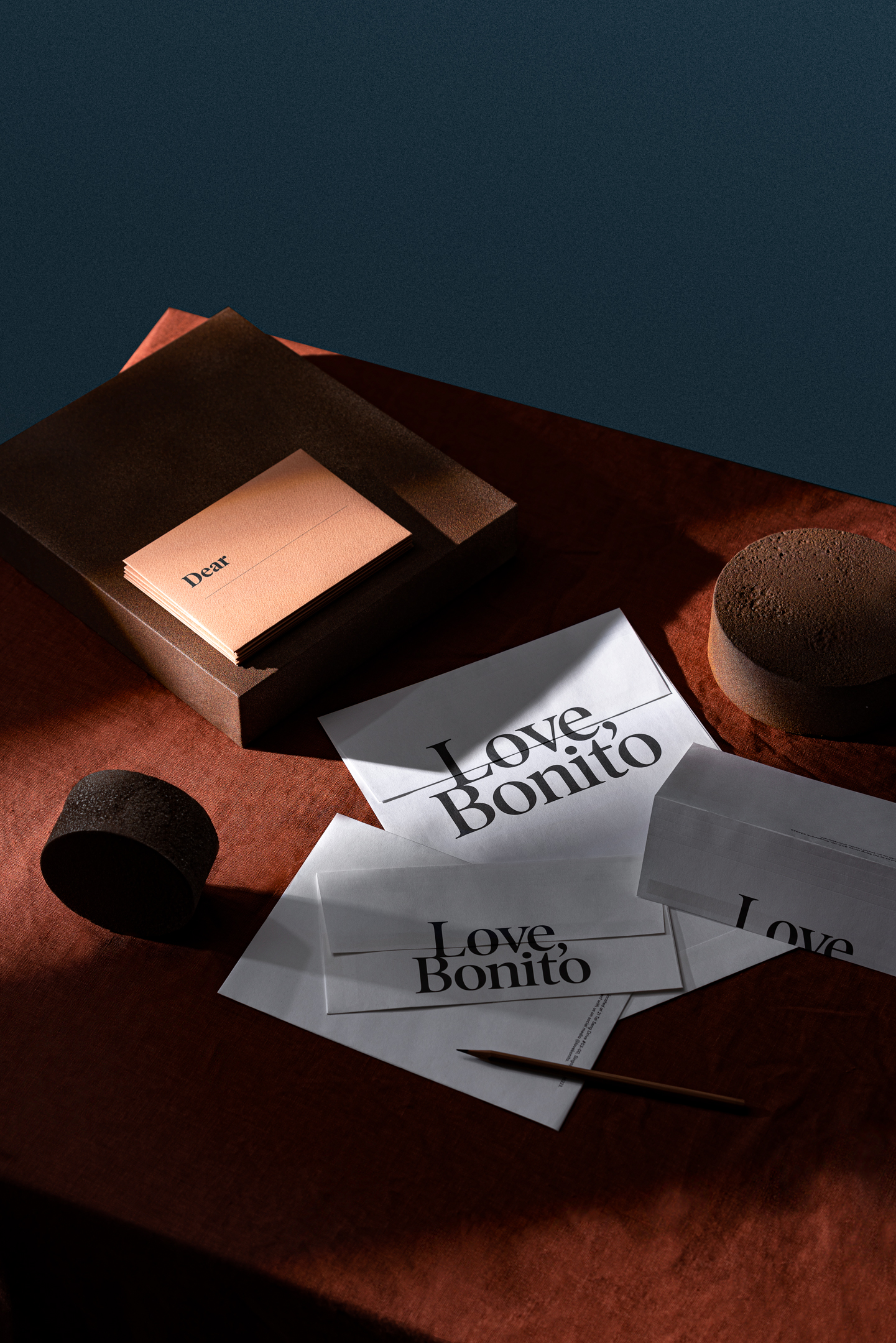
Dear

Services

Brand Audit

Research & Analysis

Brand Identity

Communication Strategy

Creative Direction

Design Direction

User Experience

User Interface

Website

Creative direction

Yanda


Design & Art direction

Yanda / Preston Tham / Edward Harland
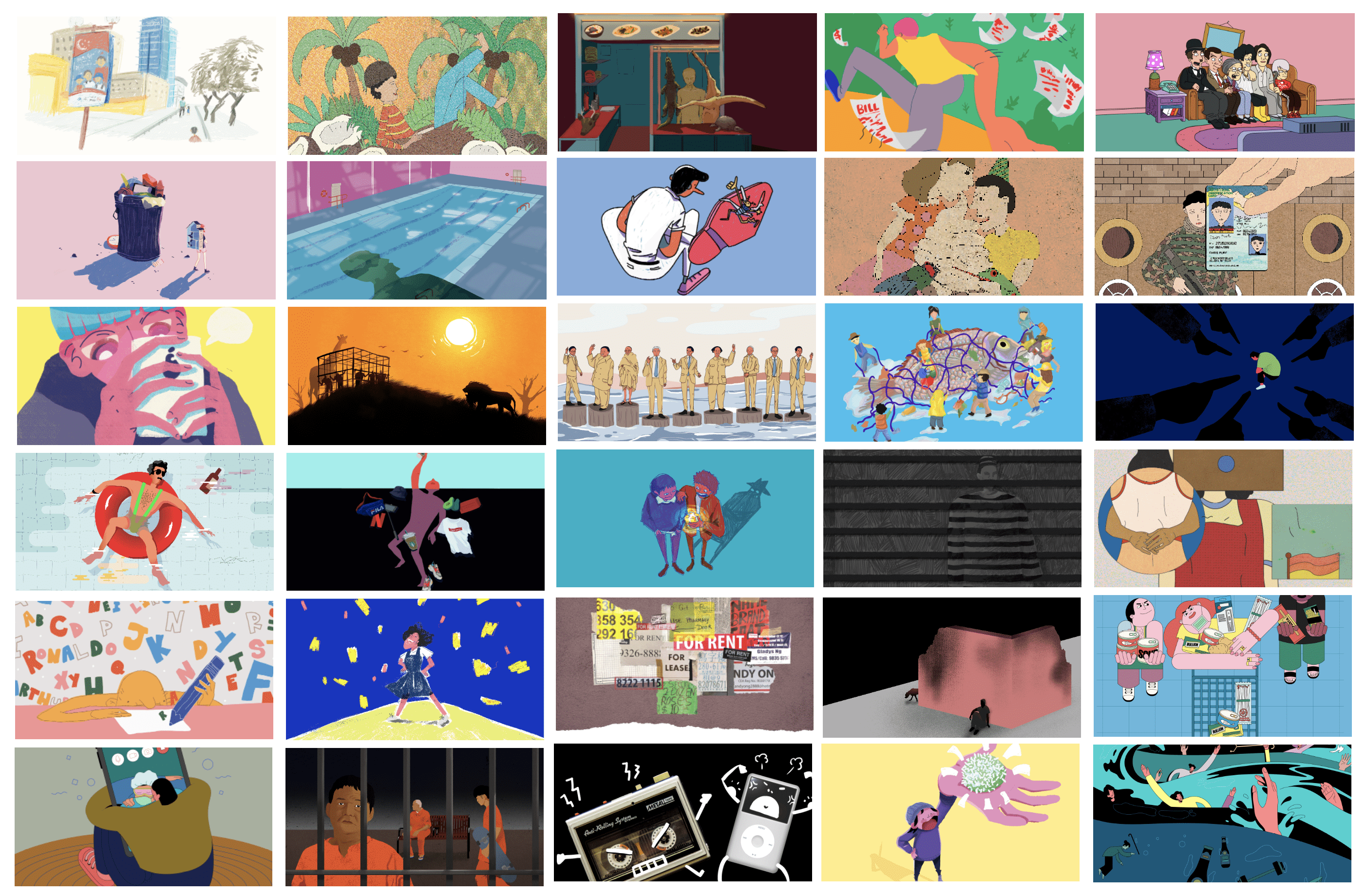


Illustration

Stephanie Christy Lim / Sweet Gamboa / Jordi Ng / Amy Ong


Editorial Writing

Jethro Lim / Joyce Yang / Goh Yanhui / Alicia Tan / Charmaine Poh / Joylene Chai


Collaterals Photography

The Gentle Studio


Printing

Allegro Print


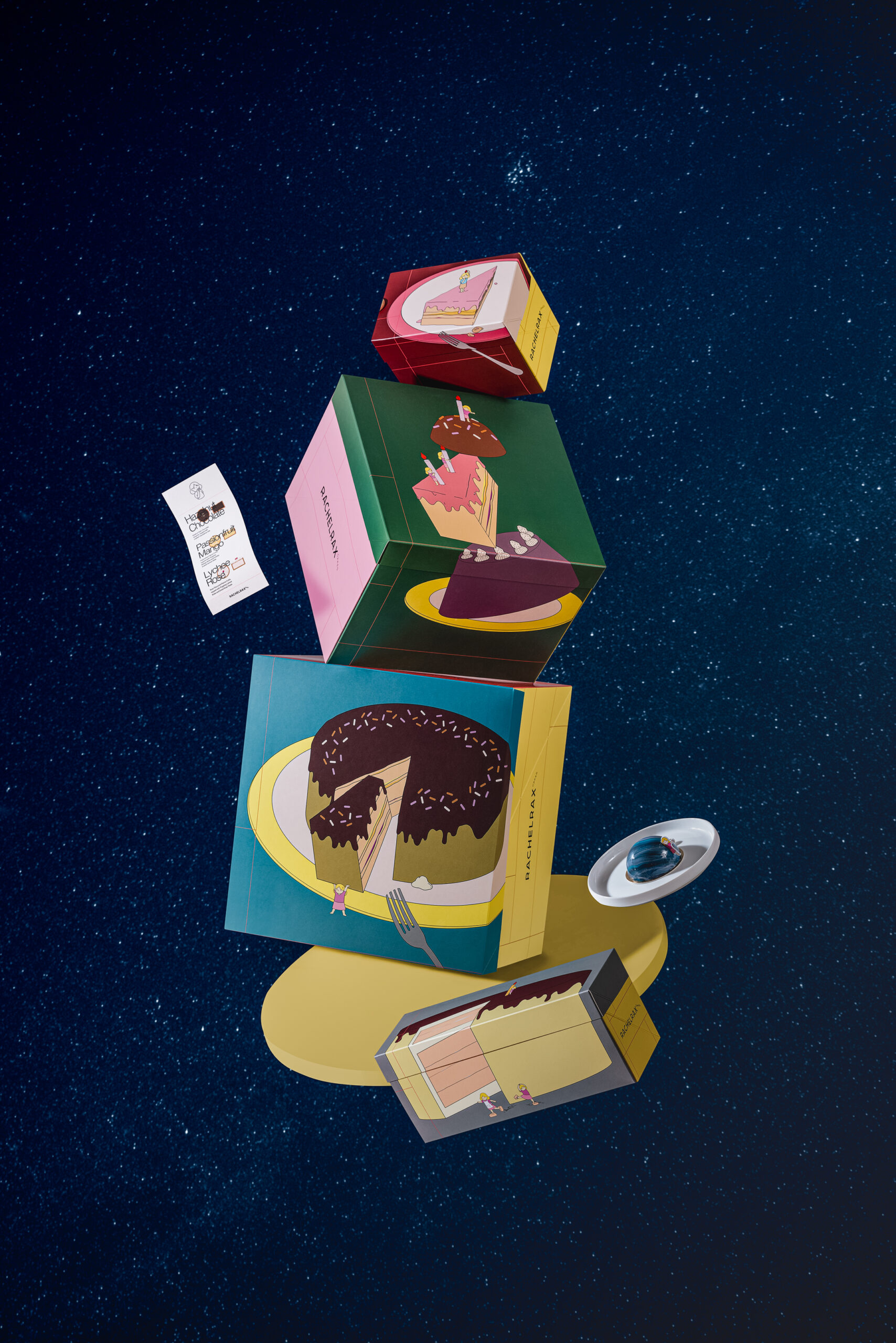
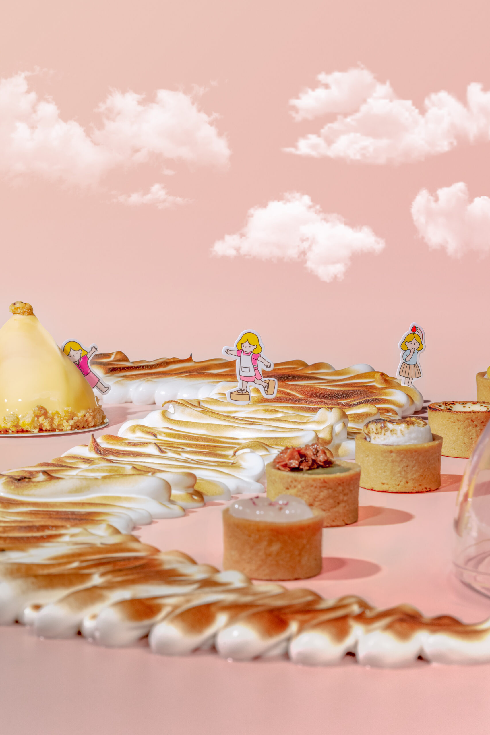
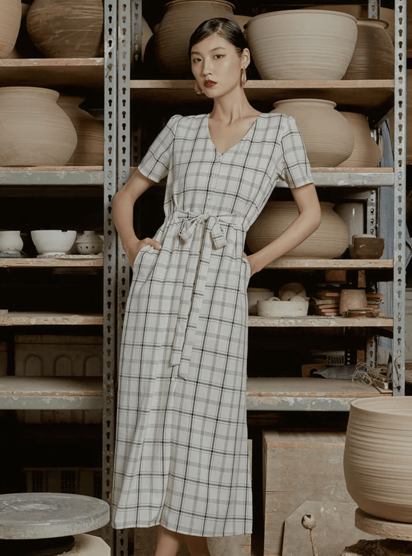
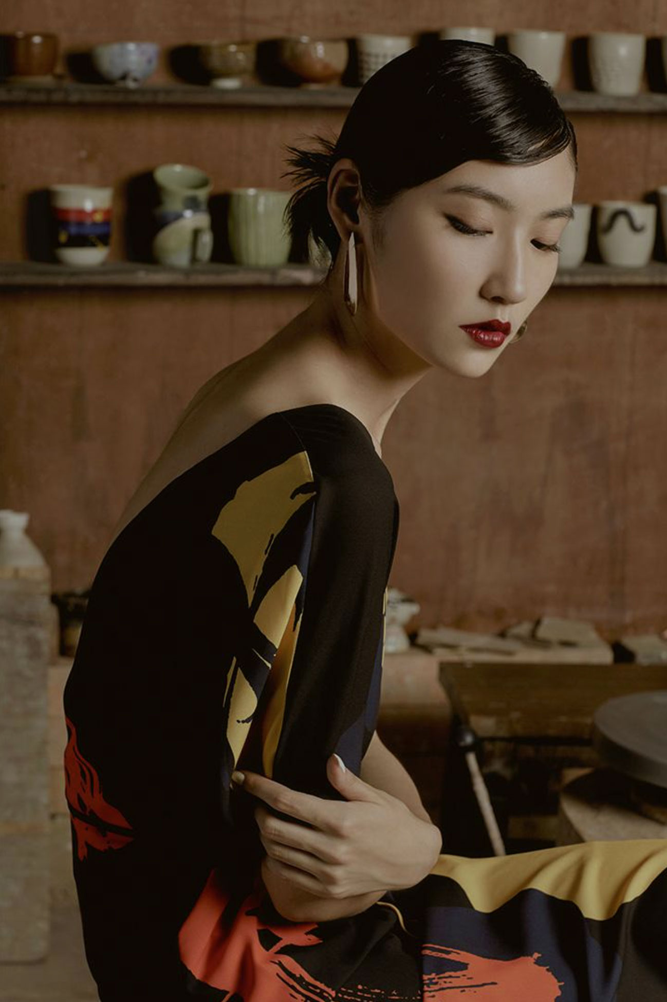
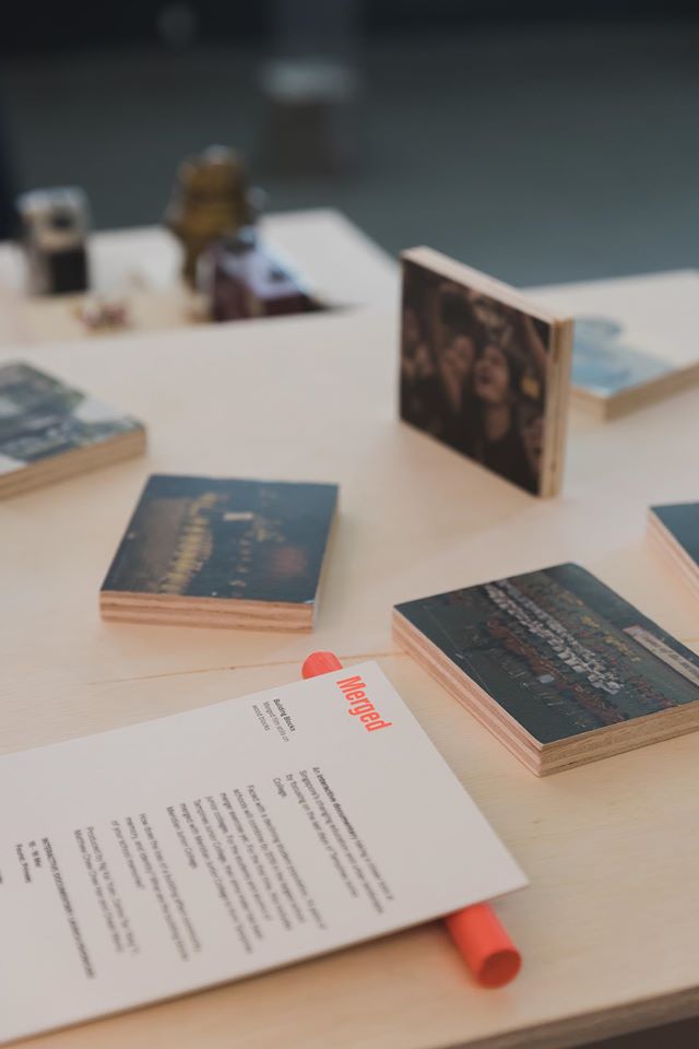
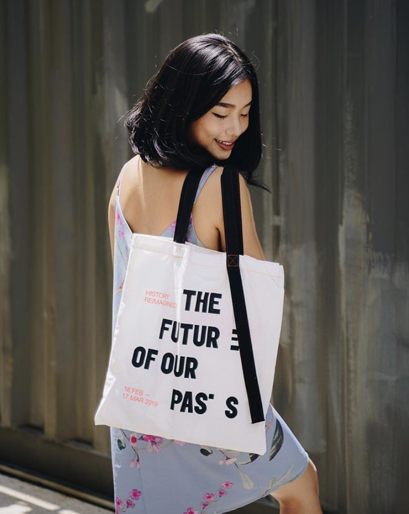
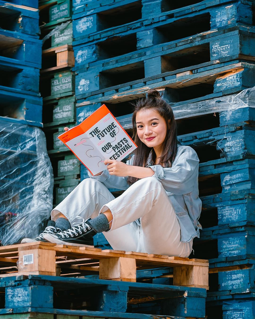
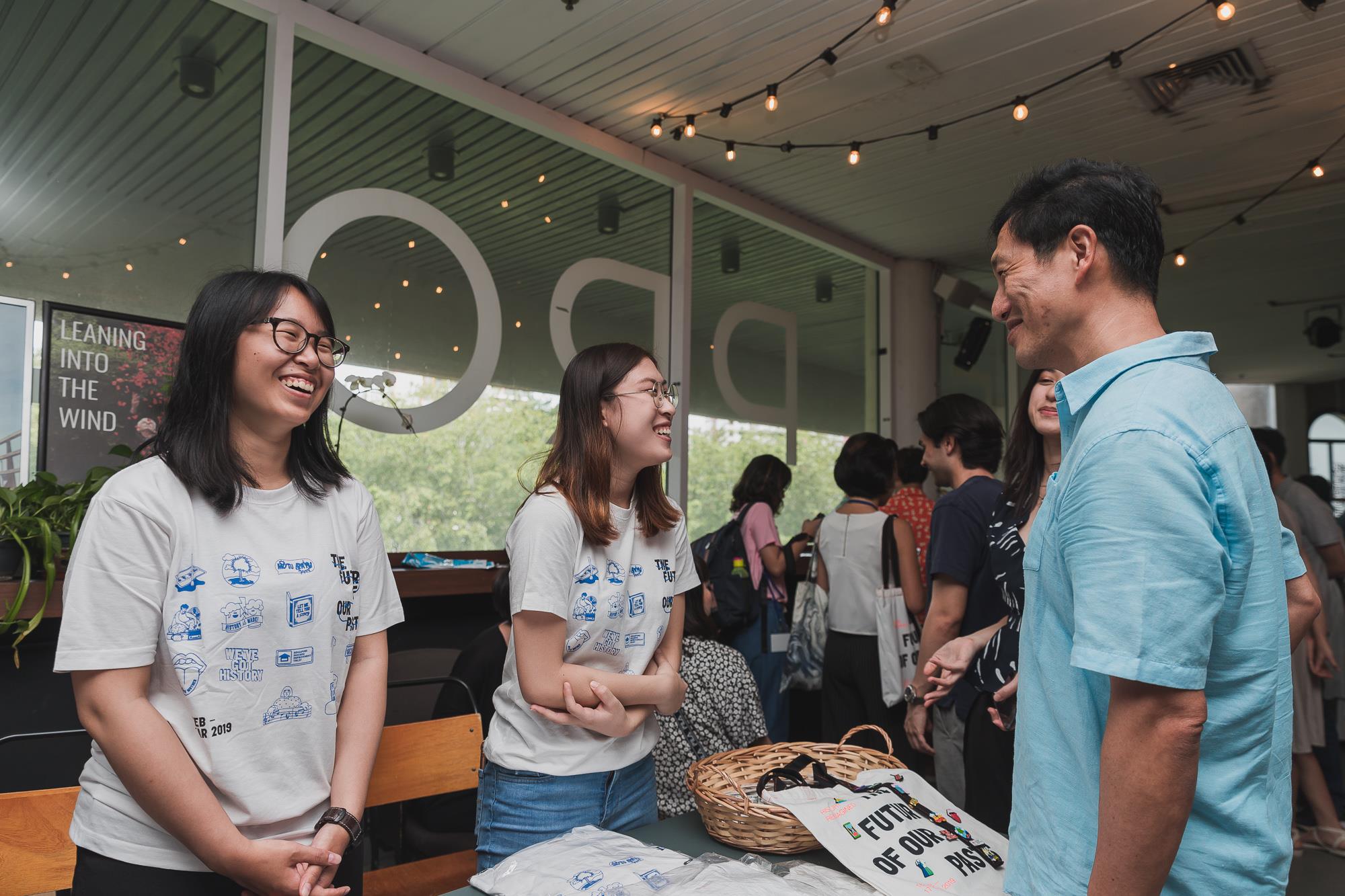
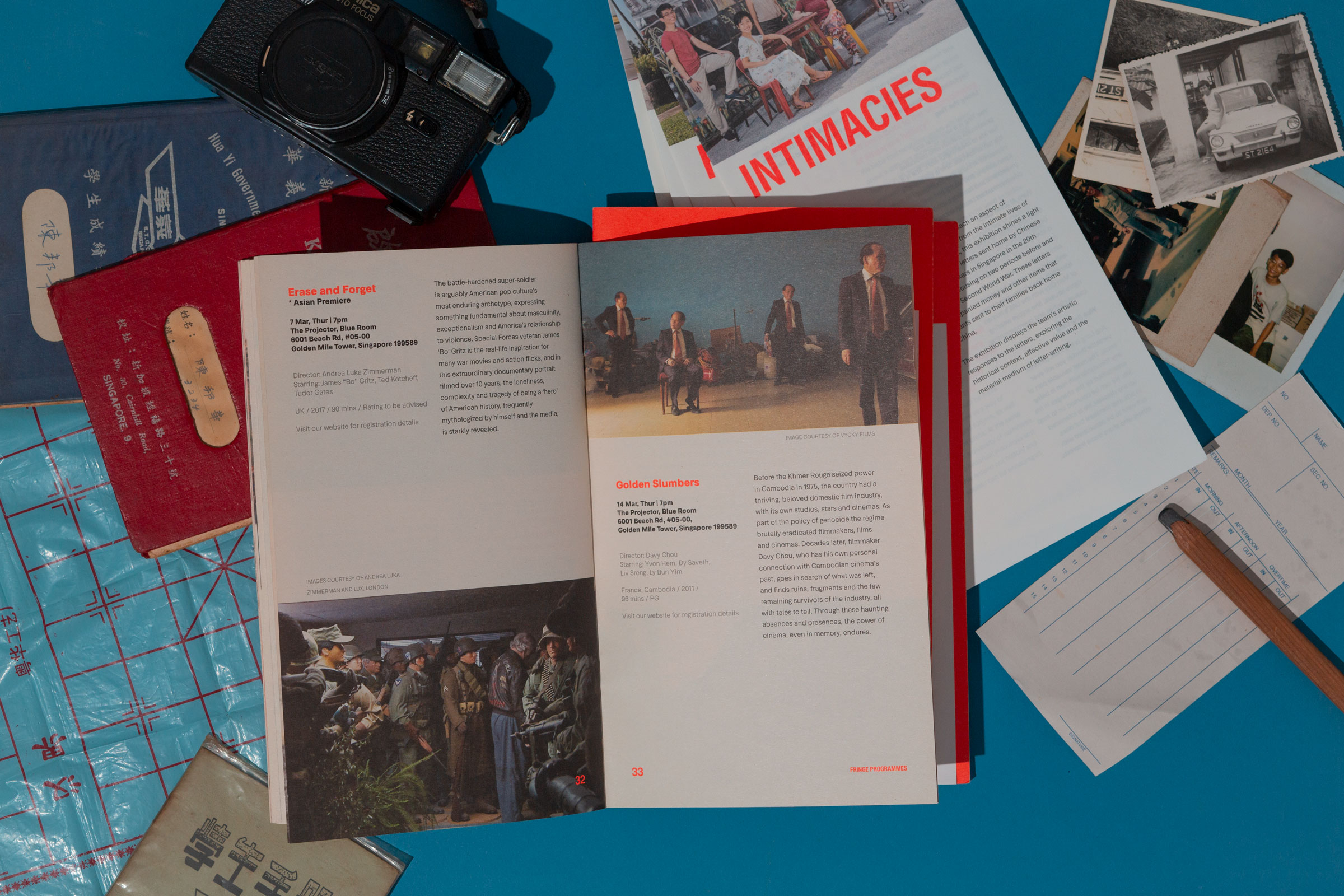
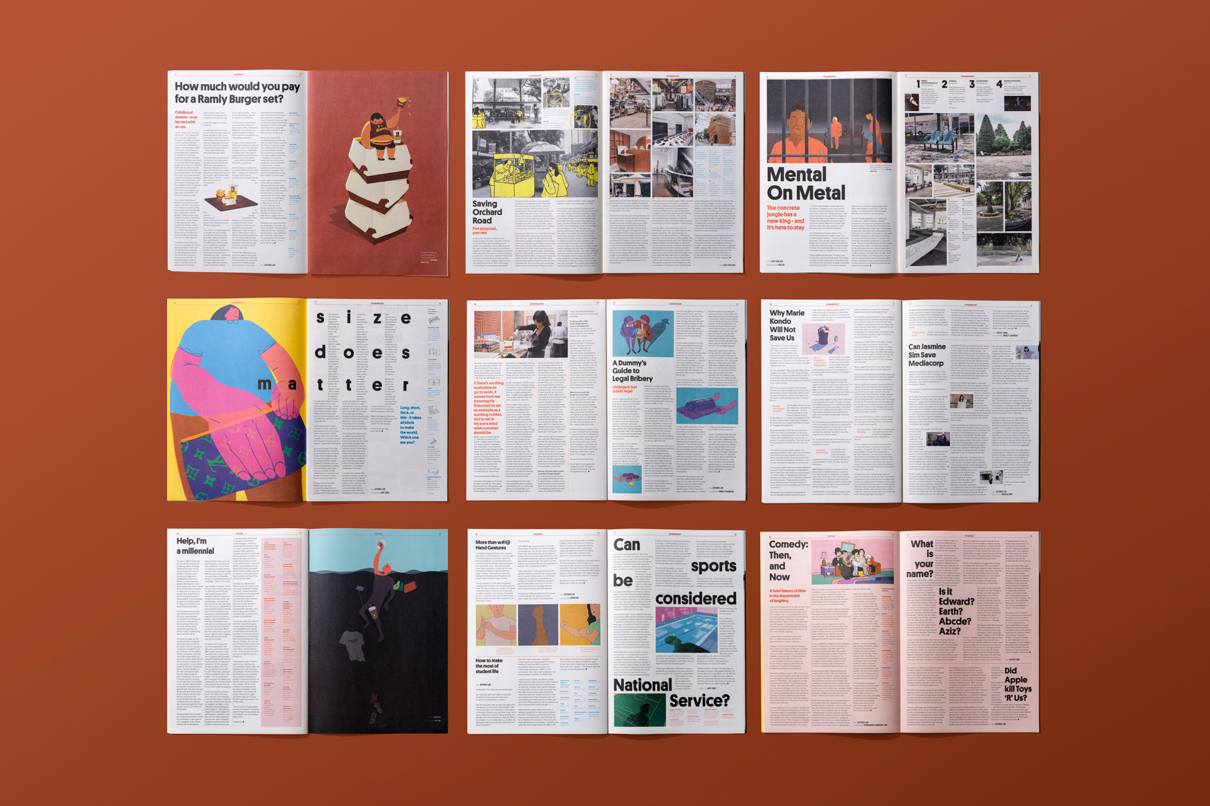
Dear is a media company steeped in culture and grounded in locality. Curated for the ever-curious, it comprises of printed magazine, online, broadsheet with a mix of commentary, op-eds, interviews and photo essays as well as research documentaries and city guides.

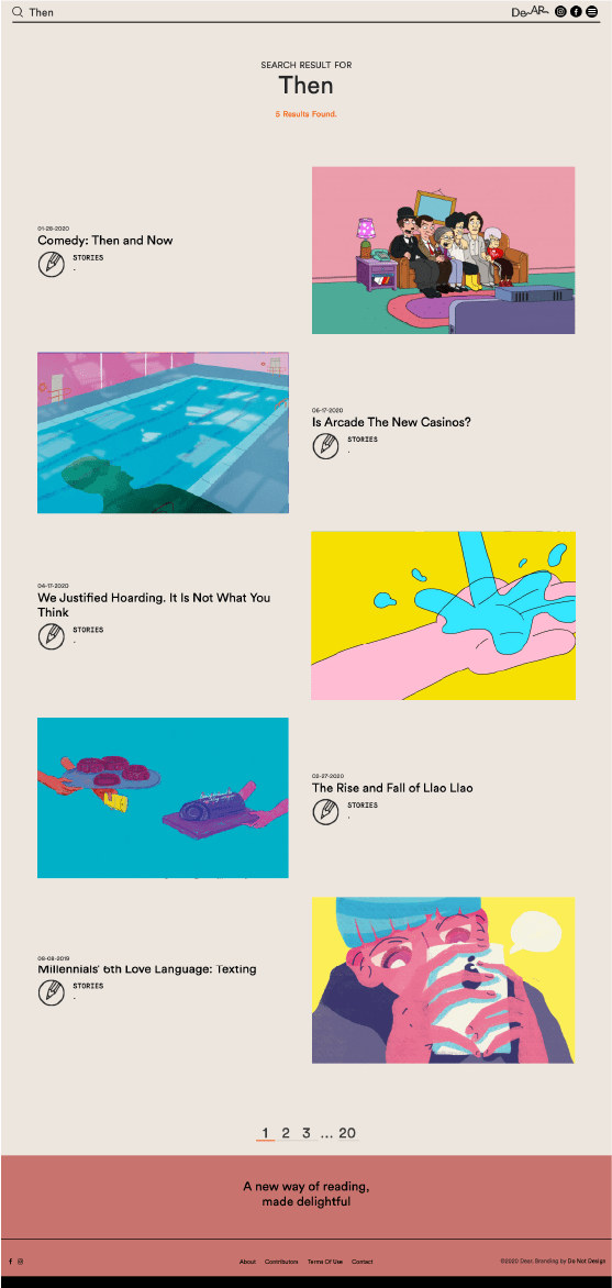
At its core, DEAR is a storyteller. Every read is a journey. Every last word and image elevates the reading experience to one that is immersive and engaging. How much would you pay for a Ramly burger set? How do we save Orchard Road? What if objects had feelings? Our stories are cheeky yet contemplative, with a penchant for the non-conventional. They are written by and for the everyday man, in a celebration of never-ending curiosity.
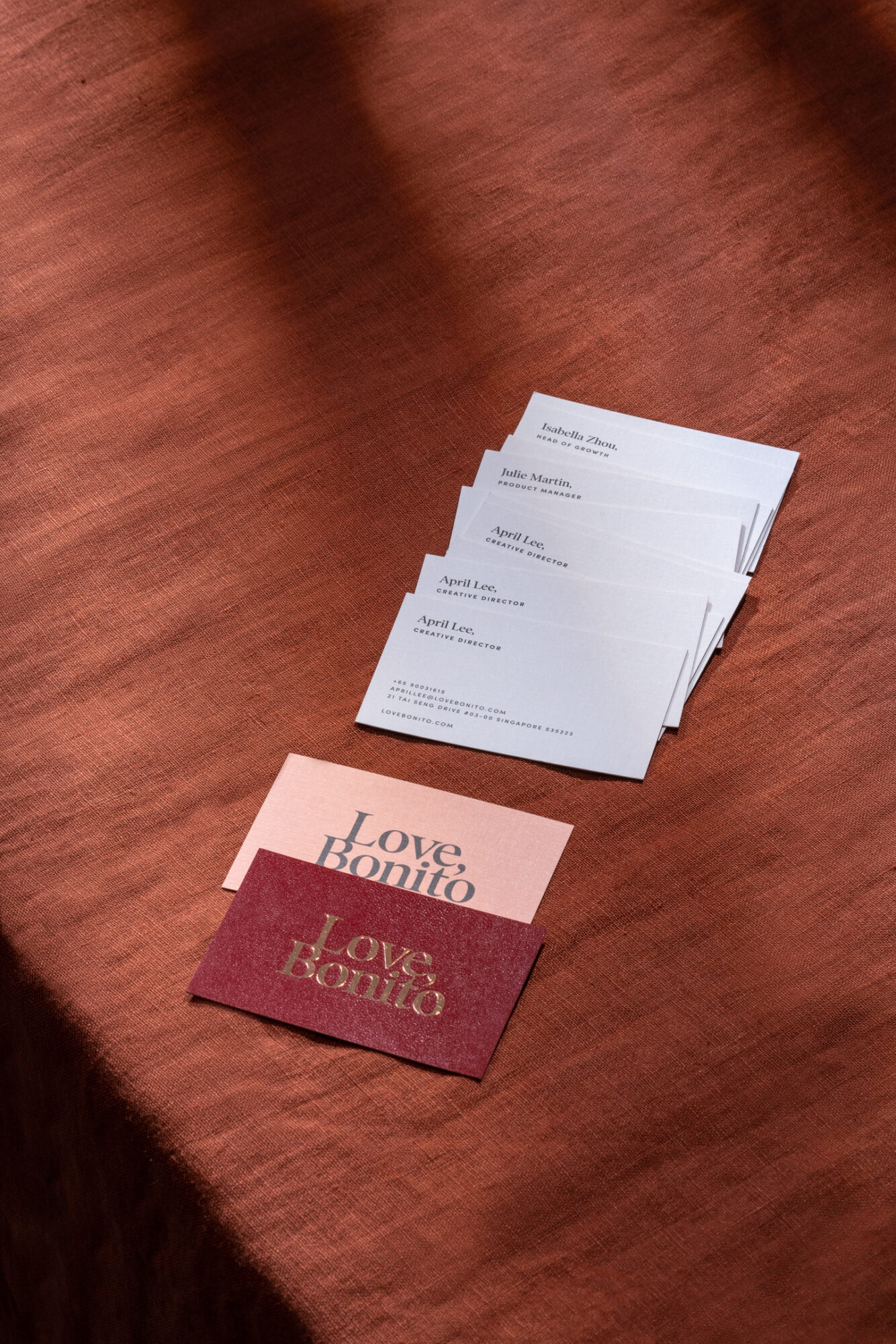
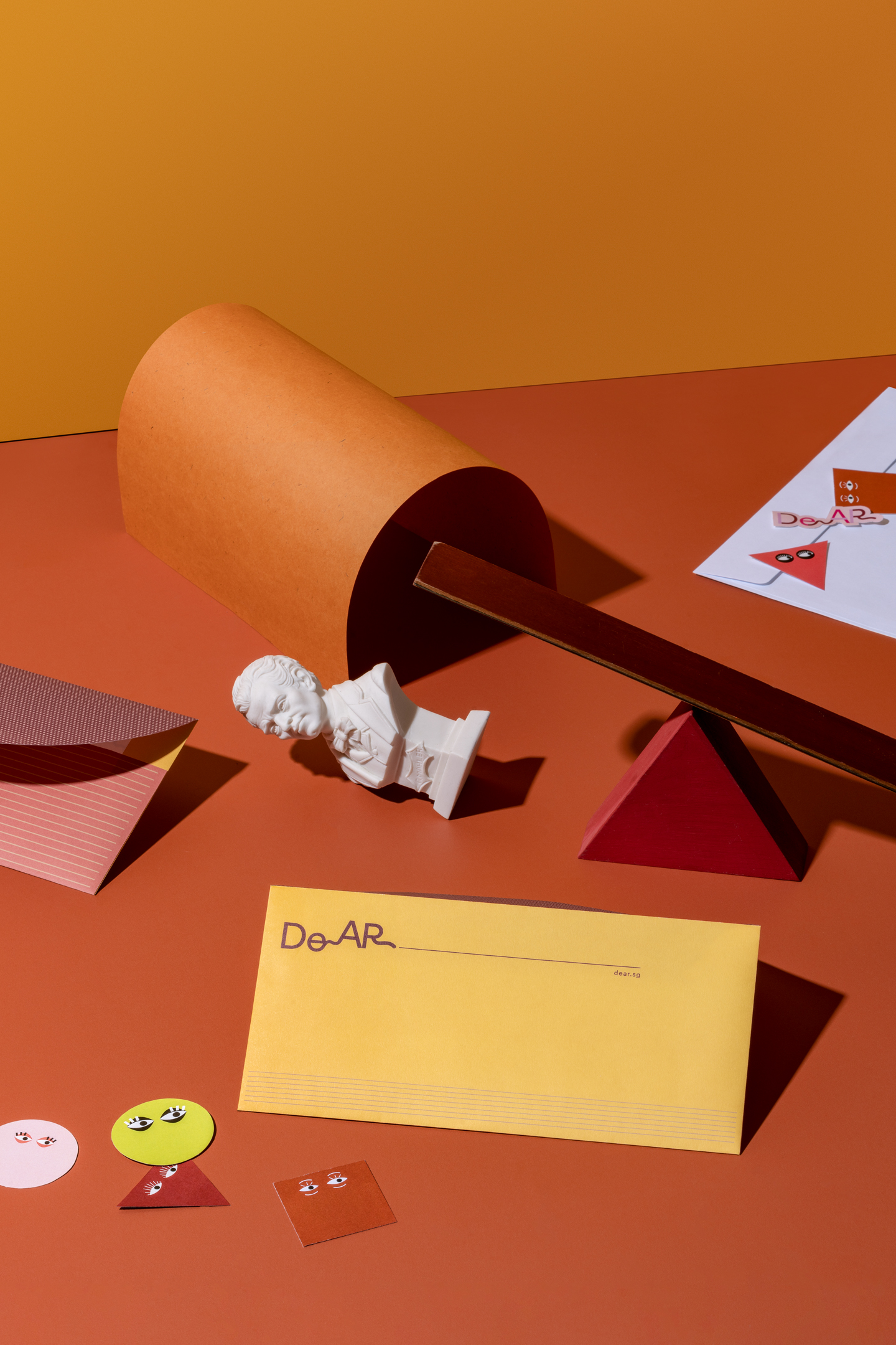

Identity—

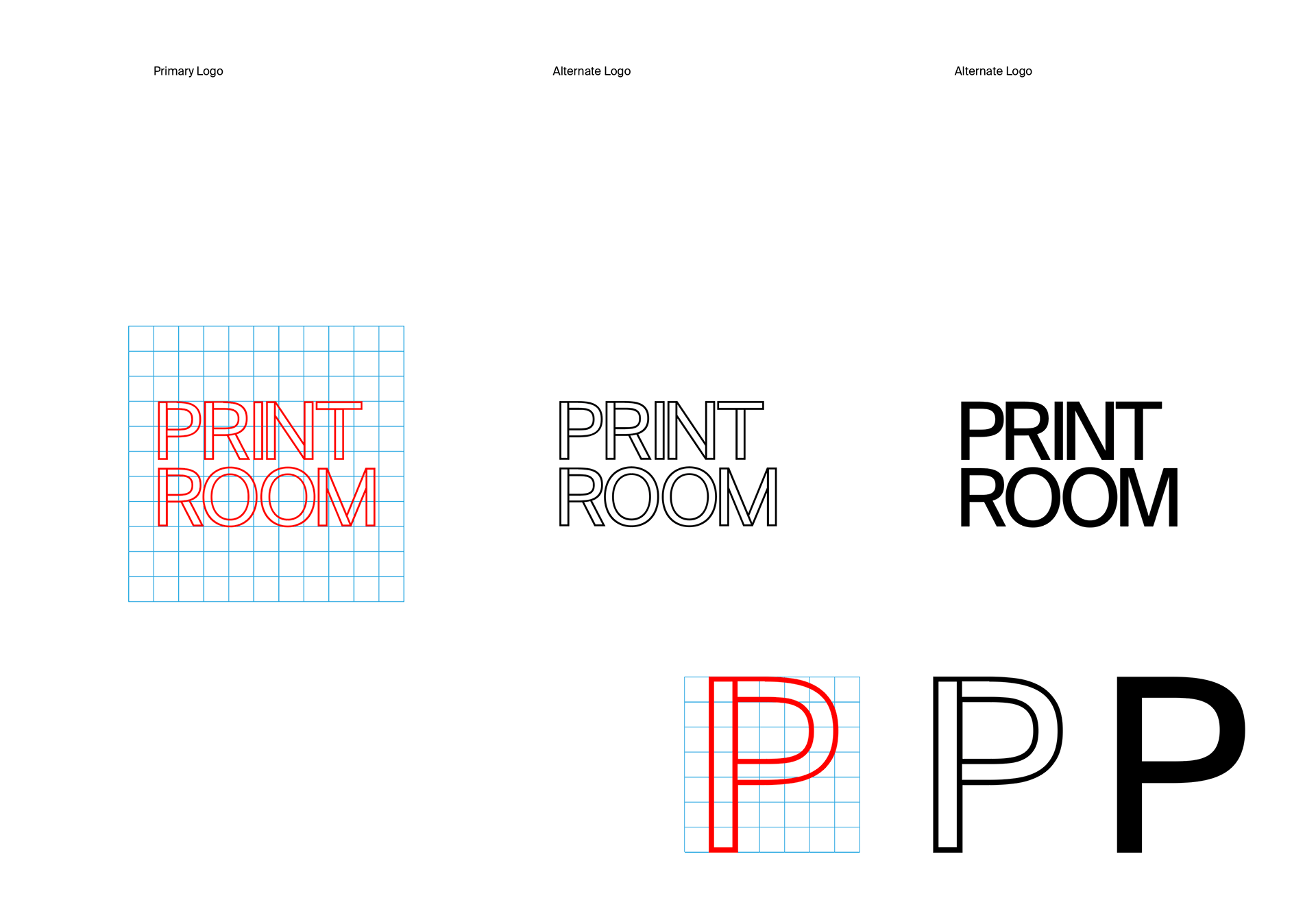
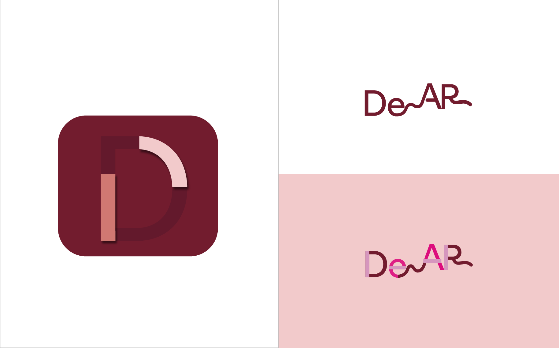
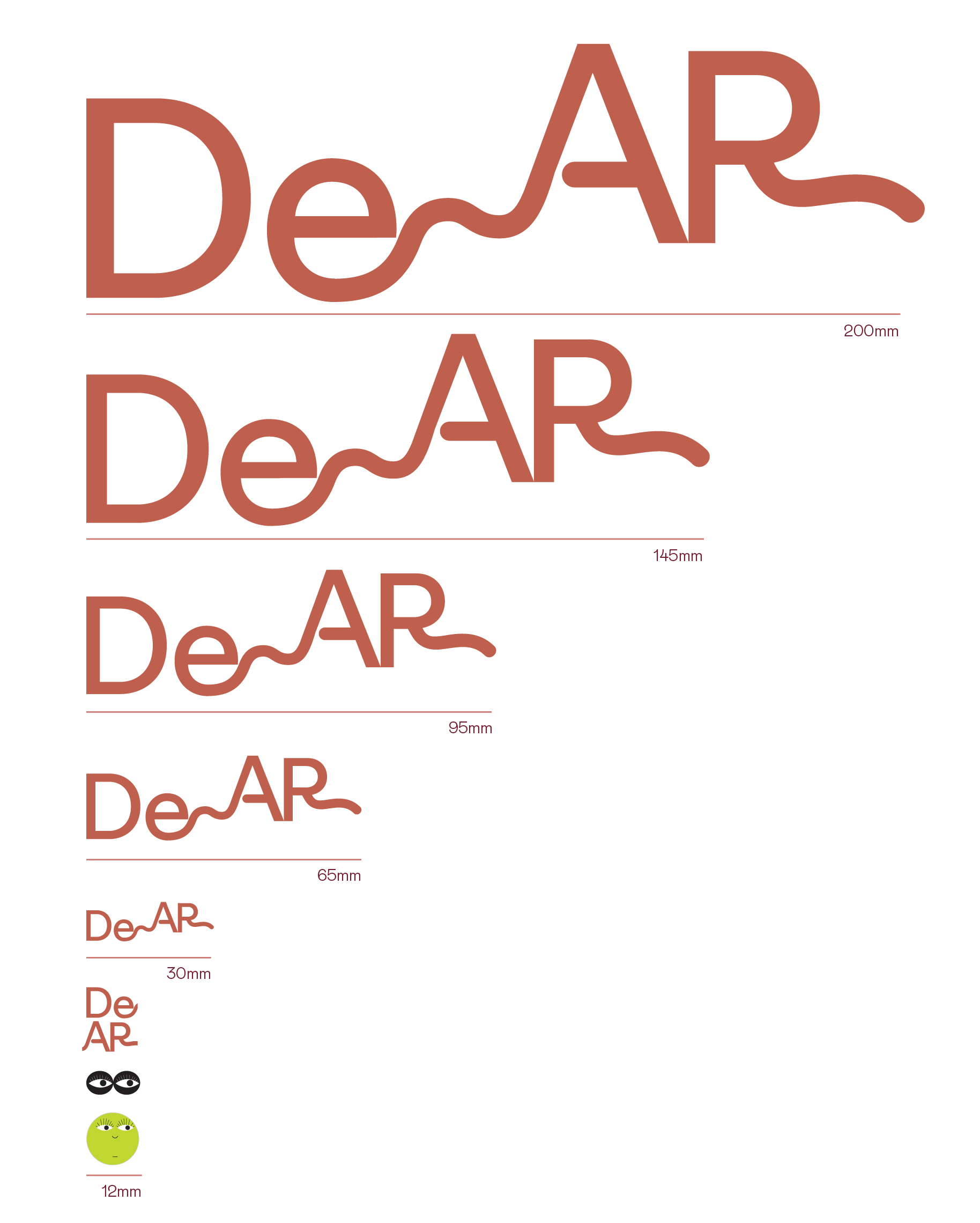
Dear is personal yet distant, a double entendre that entails both fondness and formality at the same time. Termed with a sense of endearment, it characterises affection from our dearest; Termed as a form of salutation, it delineates a standard greeting in our emails.

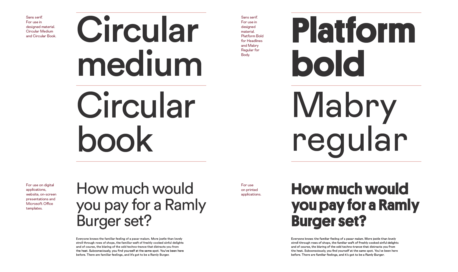
Preserving the personal touch of DEAR, our logo’s word mark uses a handwritten, organic line that symbolises the channel of connection that we stand for. It is designed for all contexts from digital to print, in which legibility plays a paramount role throughout.

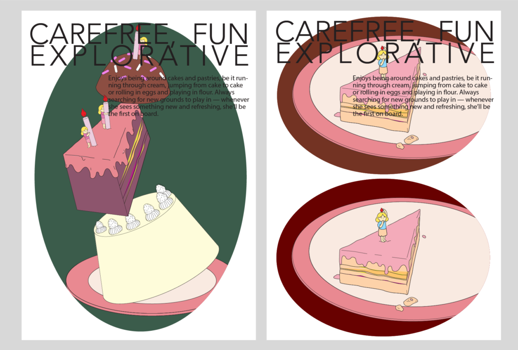
With a healthy pinch of humour and a trifle of seriousness, we want to shake things up and connect communities through insightful and thoughtful narratives. From casual conversations to visual essays, our stories are here to question, paint a picture, and speak to you. DEAR is about uncovering the little oddities in everyday life, getting you the stories you never knew you wanted.

UIUX

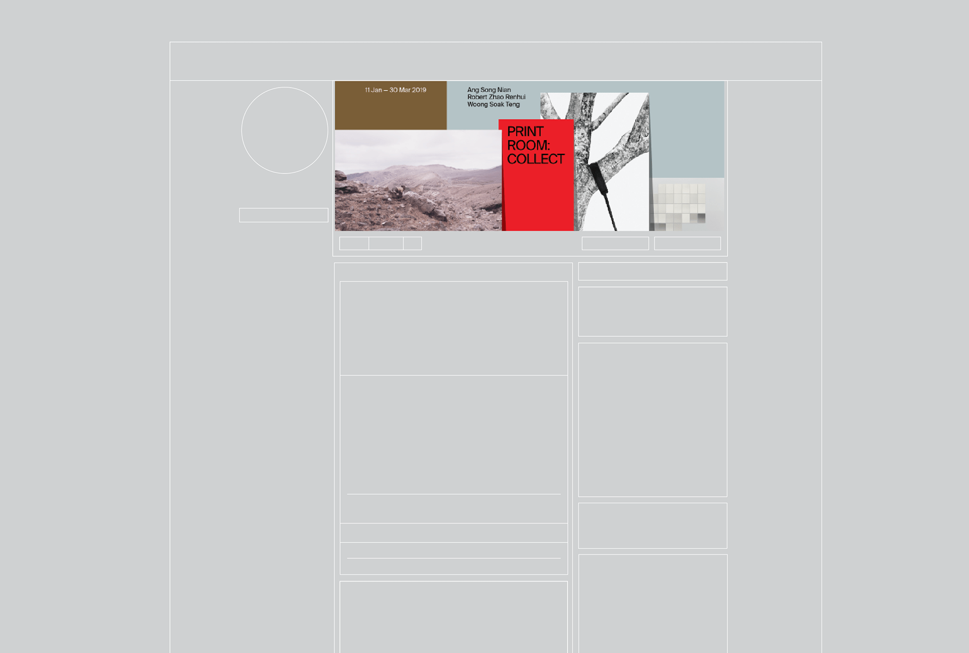
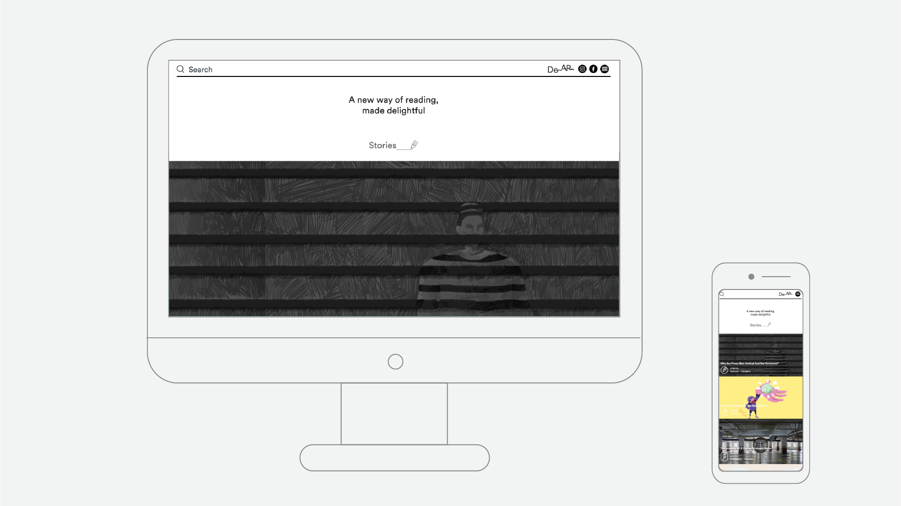
Our website is designed to be modular for all screens. Small or big, we ensure that your reading experience is fuss-free and plain sailing. Apart from eye-catching visuals, subtle design elements complement the experience that assures spellbound attention from you. 


Experience and Story

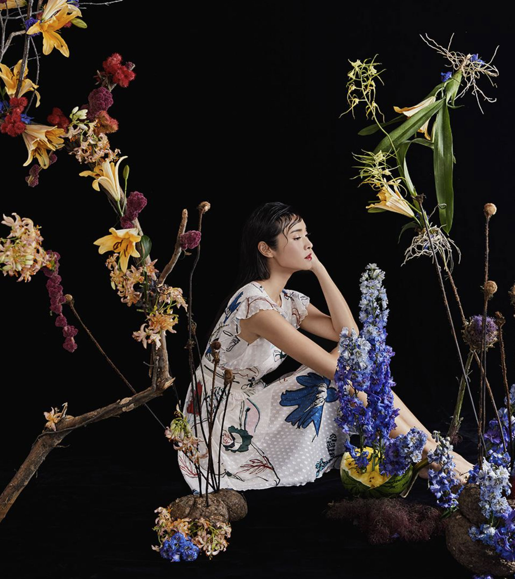
Divulge the delights of reading. That’s what we want to do. Each and every story is stripped to its core, researched to its demise with no stones unturned. The long and short of it- we have it all covered. With our visuals taking centre stage, our stories shy no less of its limelight through its subtle yet canny voice which offers alternative angles to ordinary (or not so) affairs.


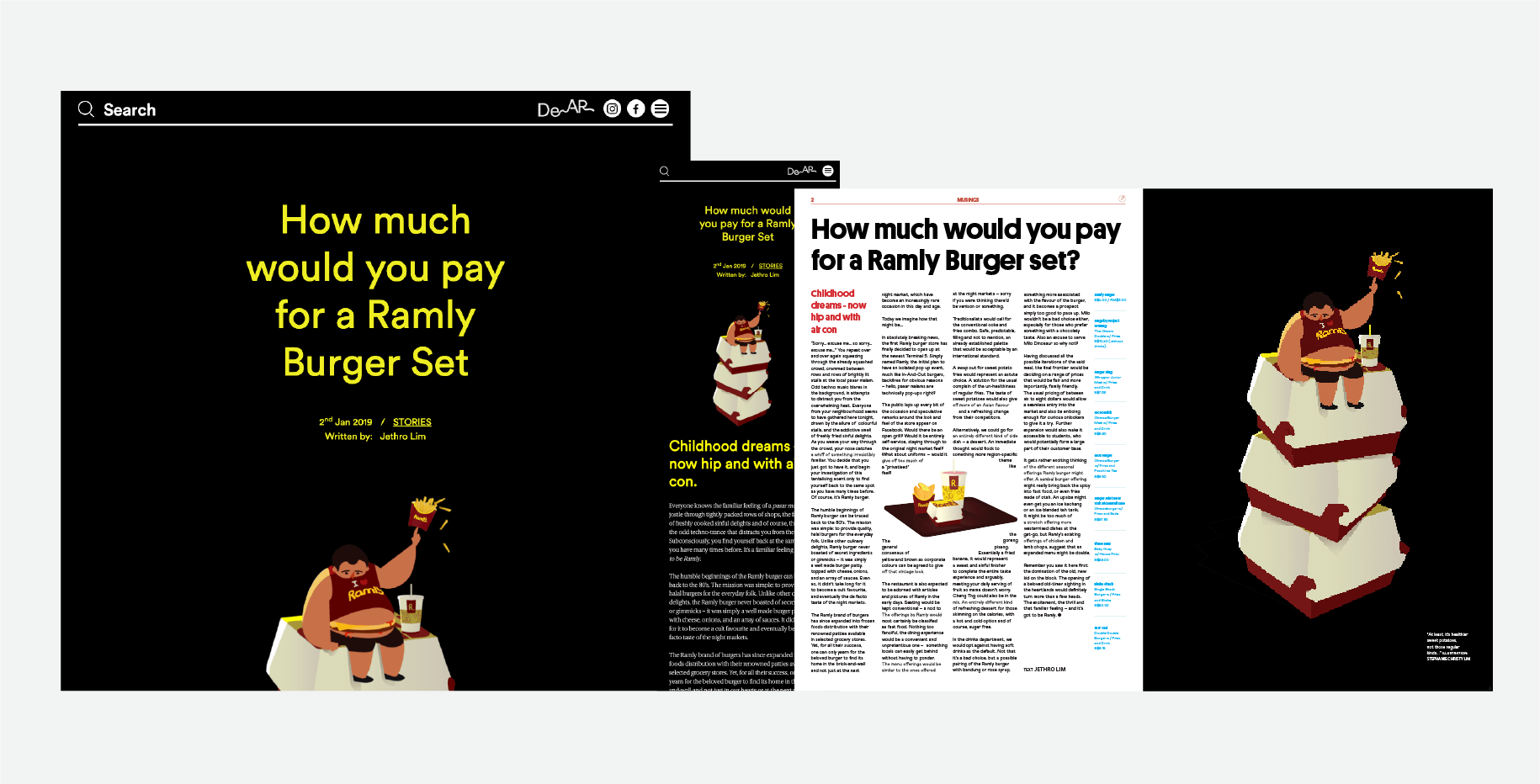
A combination of illustration, art direction, design and writing come together to breathe new life into storytelling, making reading that much more robust, immersive and exciting. Where words come to life and imagery elevates everyday reading experiences, DEAR is about capturing the essence of what makes a story— the little oddities in everyday life, and a sense of never-ending curiosity of the world. From casual conversations to visual essays, our stories embody the joy of reading across various mediums.

Our stories are a combination of illustration, art direction and design, paired with writing to breathe new life into experiential storytelling, making reading that much more robust and exciting. Where words and imagery come to life to elevate ordinary reading experiences, DEAR is about capturing the essence of what makes a story— the little oddities in everyday life, and a sense of never-ending curiosity of the world. From casual conversations to visual essays, our stories embody the joy of reading across various mediums.

Our stories are a combination of illustration, art direction and design, paired with writing to breathe new life into experiential storytelling, making reading that much more robust and exciting. Where words and imagery come to life to elevate ordinary reading experiences, DEAR is about capturing the essence of what makes a story— the little oddities in everyday life, and a sense of never-ending curiosity of the world. From casual conversations to visual essays, our stories embody the joy of reading across various mediums.


Do Not Design 

Work with us — write to we@donotdesign.com

©2009—2021

Do Not Design for Save Hair - rallying the world towards the importance of haircare.

Save Hair

Services

Market Research & Analysis

Brand Identity

Communication Strategy

Creative Direction

Design Direction

User Experience

Interactive Design

Front-end Development

Back-end Development

Payment Processing

Content Strategy

Creative direction

Yanda


Design & Art direction

Yanda / Elizabeth Zhang


Illustration

Elizabeth Zhang


Copywriting / Editorial & Socials

Joylene Chai / Faith Ng


Photography / Styling

Hosanna Swee


Printing

A&K / Prestige Labels / Pixeltech


Collateral Photography

Anton Tang


Haircare should be just as important as hair style, dyeing of hair, eating, fashion and every other daily affair we deem crucial.


To portray the weight of its importance, we did something rather unheard of— we integrated the dining experience into haircare. An emphasis on the indulgence on our haircare is an investment in feeling and looking good. 

We set some ambitious goals. Save Hair's new identity needed to reflect the knowledge of scientific hair care that went into creating the brand, without appearing oriental and old school. Despite its rookie status, Save Hair needed to go beyond holding its ground in the international market to set thoughtful, innovative hair care on the global stage. How would we achieve that?


Do Not Design was commissioned to create a packaging design system for Save Hair. From product, packaging, website and social media management to stationery and in-store elements, our designs centered on these keywords: modern; sincere; healthy; comfort; confident.


To create Save Hair’s packaging, we put careful thought into the little details— material and colorway. Along with an earthy colour palette, our approach focused on clean visuals with modern sensuality, paired with dainty illustrations of products on a dining plate. A simple representation of the value of haircare.


We maintained a simple, type-based label to ensure visual consistency while openly displaying the ingredients list to create a sense of transparency and reliability for the brand,

Save Hair is designed not just to sell itself, but to look good in your bathroom. Through deftly crafted details in its packaging, we created a contemporary packaging that exudes charm and elegance.

We worked with Hosanna Swee on a lighthearted photoshoot that would bring out the raw, honest beauty of Save Hair.

Classy and organic, even Save Hair's name cards encapsulate the quiet, understated confidence of the brand.

Down to its email collaterals, we wanted to create a unique visual identity that remained cohesive with the rest of the brand.

Save Hair’s product line speaks sufficiently for itself. By incorporating hang tags on the bottles, we provided information about the brand and its mission, while sharing a self-explanatory instructional guide that negates the presence of a salesperson.

By replacing the use of shopping bags with a tote bag, this is our push for saving the environment, one bag at a time.


Do Not Design 

Work with us — write to we@donotdesign.com

©2009—2022

Do Not Design for Paladino - a purveyor of exquisite fabric for the modern gentleman

Officine Paladino

Services

Research & Analysis

Brand Positioning

Brand Identity

Communication Strategy

Creative Direction

Design Direction

User Interface

Website


Creative direction

Yanda


Design & Art direction

Yanda / Preston Tham


Photography

Munkong


Styling

Marie Lee / April Lee


Collaterals Photography

The Gentle Studio / Anton Tang


Crafted with the finest Merino wool woven exclusively in the best mills in Italy, a curation of trendy designs, colours and timeless essentials.


Art direction, branding and identity, publication design, digital marketing and responsive website design– these are a few of our favourite things! (and also what we constructed for Paladino) in order to introduce the brand to the market, while driving sales and building a customer loyalty base.

More than just a cosmetic development of the brand, our research went deep into understanding the suits market in order to drive the logic and reason behind every touchpoint of Paladino, while ensuring relevance for modern day consumers. We realised that brands like Paladino rely mostly on their representatives and tailors to build a reputation with consumers. The question was now about how we could take control of the narrative in order to increase our brand visibility. How could we transform our relationship with consumers? How would we create an interactive and impactful tailoring experience?


It came down to research. Conducting surveys. Analysing the traditional tailoring process. Speaking to those on the ground, finding out what people truly need. How do consumers even decide what they want in a suit? Do they follow trends? A budget? How are suits even made? How do consumers decide what and which fabric to be used?

What we came to realise is that the process of purchasing a suit always involves a middle man. Which meant that the opportunity for users to experience a brand was no longer a luxury. Competitors swatch books were also corporate and serious. Who said that had to be the case? 

We took it upon ourselves to reshape the perception of swatchbooks, transforming into something reminiscent of a magazine, something anyone would want to pick up and really start flipping 


The design system revolved around a defining straight line representing a woven thread that adds tone and balance to the overall identity; while establishing a distinction across the different collaterals.


Conventional colors for men include black, brown, dark red and green. Instead of using colors that were overused, stereotypically male and basic, we wanted to stand out from the crowd, right from the start. 


This meant opting for a dye fabric color that is offbeat yet subtly luxurious— Orange. Sourced from across the globe in Belgium, orange would be distinctive and lush, a color that was most definitely not forgettable. Orange (Think Hermes, Louis Vuitton and even Holland and Sherry’s female range) also harmonized well with blue as a secondary color, which we ended up choosing.


Celebrating the spirit of craftsmanship, clarity and personal touches, the swatch book showcases fabric swatches in the best possible way against a stark white background. Handwritten text was paired with a timeless sans serif font to create a novel typographic language. 

A set of custom icons are designed and set in a clear, friendly and easy to understand tone. Each layout spread portrays style in a relatable and engaging manner with its easy-to-reference format. The striking orange cover also reflects a forward-thinking mindset in revitalising the fabric market. 

Paladino wasn’t a small, unassuming startup. It became a contender, a brand that was comfortable in the market, right from the start. With its good design, Paladino continued to take off and expand, seeking opportunities in the Southeast Asian market. From Japan, to Singapore, Thailand, Cambodia, Vietnam, Malaysia, Indonesia and Philippines. And then, it came time to look for greater pastures within the US market.


Reinventing the online experience of a fabric merchant for consumers: For the uninitiated, fabrics can be unnecessarily complicated and difficult to comprehend. Paladino was created to change that. The website is designed in a way that consumers can learn about Paladino's story and the origin of the fabrics, browse collections, create a look based on the fabrics offered, all in one site. From small to big screen, Paladino’s website is designed to look great everywhere. One of the main challenges was to translate the experience of touch into a digital format. To do so, we developed a tool that allowed visitors to view products in 3D, which showcased the depth and texture of each fabric and how it would reflect light or flow to fit the shape of each body.


Do Not Design 

Work with us — write to we@donotdesign.com

©2009—2022

Do Not Design for Alchemist— an everyday affair meets sophistication for a growing coffee chain

Alchemist

Services

Research & Analysis

Brand Positioning

Brand Identity

Communication Strategy

Creative Direction

Design Direction

Wayfinding & Signage

Creative direction

Yanda


Design & Art direction

Yanda / Nicole Then / Tan Yie Xuan / Wee Yen 


Illustration

Tan Yie Xuan / Wee Yen

A project by Do Not Design   


Alchemist is a coffee chain that fuses the magic of coffee craft and science to create an authentic experience for its customers. 


In rebranding Alchemist, we sought to position the brand such that it could comfortably expand into new product categories and markets, while retaining its modern and distinctive touch.


As part of our strategy, we developed a distinctive visual language that exemplifies the precision and simplicity of Alchemist’s coffee. The designs are a harmony of classic and modern, evoking a sense of peace and calm that lets customers truly experience the magic behind thoughtfully brewed coffee.

Branching from the elements of alchemy, an ancient branch of natural philosophy related to magic, mythology and chemistry, Alchemist’s logo stems from a flask with a slanted opening (which is reminiscent of a potion bottle).

Alchemist’s colour palette consists of black and blue, with the occasional yellow hue that punctuates fun and personality where needed. More importantly, the signature blue shade that wraps the coffee chain’s walls and packaging was carefully selected to— you guessed it:  instil a sense of tranquility and calm while enjoying coffee.

Alchemist’s visual language is consistent throughout its distinctive metal countertop in all 6 outlets of café, coffee roastery and take-away kiosk. The design cohesion has also been translated through its coffee bean bag, business stationeries and retail menus to coffee drop bag boxes. 


With an extra flap around its opening to keep coffee staying fresh for longer, every little detail was taken into consideration during the design process.


Because mailer bags can serve as more than just a pocket for paper, we designed them too. Alchemist’s envelopes show off the store’s signature interior of metal countertops and minimalist furnishings. Who said envelopes can’t be a marketing tool!

A quick search of the hashtag 'Alchemist' would speak for itself, revealing a substantial increase in the number of people gramming the brand. Here's more: When Alchemist's canned coffee first launched, over 1300 orders were placed for the coveted coffees.

Visual merchandising involves being constantly being aware of how your store and displays appear to your customers, which affects sales! 

We standardised the layout of our curated shelves for the interiors of each store. Delicate items are generally placed on the top shelves while bigger, bulky items should be kept at the bottom to create a cleaner visual.


Do Not Design 

Work with us — write to we@donotdesign.com

©2009—2021

Do Not Design for Rachelrax Cakes - celebrating the fun and flavour in baking with an iconic mascot

Rachelrax Cakes

Services

Research & Analysis

Brand Positioning

Brand Identity

Communication Strategy

Creative Direction

Design Direction

Wayfinding & Signage

Creative direction

Yanda


Logo Design

Preston Tham / Jesslyn Sutisna


Design & Art direction

Yanda / Preston Tham / Delaphy Ng


Illustration

Jesslyn Sutisna / Delaphy Ng


Collaterals Photography

The Gentle Studio


Printing

KS Packaging / Pixel Tech

A project by Do Not Design   


Rachelrax is a carefree, fun and explorative brand selling pastries and cakes. In rebranding Rachelrax, the goal was to create a feast for the tastebuds and eyes through its experiential packaging and whimsical style. 


The new identity for Rachelrax took inspiration from the comic world of Tin Tin and Tim Walker’s whimsical photography to create a visual and packaging that reflects Rachel’s experimental and free-spirited nature. A combination of fun and freedom in both baking and serving, Rachelrax is truly a reflection of it’s founder. In bringing the brand to life, a visual surrealistic world; art direction system, typography, environmental graphics, tone of voice and creative guidelines were all considered. We created a flexible suite of elements fronted by Helvetica and staggered letterings. This served as a further identifier for the brand that can be combined in multiple ways to keep the brand’s image feeling fresh while maintaining a strong sense of consistency for brand recognition.

Rachelrax’s mascot is an embodiment of the bright and energetic, who are eager to change the world while having fun doing it. Alongside the main mascot are a collection of different postures and scenarios that add a touch of playfulness, quirkiness, and edge to the brand. We delivered over 10 scenarios that are expressive and joyful, from hugging candles, playing with oversized cakes and plates, to straight up chillin’ by a candle’s fire. 

Photography by The Gentle Studio

For the purpose of collecting and marketing, we created a wide range of branded materials— from cake toppers, tasting notes, thank you and gifting cards to collapsible boxes and paper bags. All in the name of designing an unforgettable experience for customers.

Additional strategic and creative support was provided in the form of interim product campaigns from Mooncakes to Bubble Tea, retail activation and customer defining strategies. 

To maintain a sense of comfort and functionality while serving the kitchen and front counter, the Rachelrax uniform was designed as a light T shirt and apron.

Additional strategic and creative support was provided in the form of interim product campaigns from Mooncakes to Bubble Tea, retail activation and customer defining strategies. 

Rachelrax's  front view is already famous, so want to make the back famous too. Playful and unique, the bottle shows off our mascot’s back view while utilising its clear walls/body to reveal the mascot’s front as one sips from the bottle. Talk about how her front view is already famous, so want to make the back famous tooPlayful and unique, the bottle shows off our mascot’s back view while utilising it.

Some say Rachelrax’s retail collaterals are considered collectible— but you didn’t hear that from us! With customers returning for their cakes only to keep the packaging, you wouldn’t be surprised to find that a quick search for #Rachelrax on Instagram would land you in a world of colours, cakes and fun.

With its instagrammable identity, Rachelrax also saw its numbers rise drastically. Since rebranding, @Rachelrax, has gained a 3750% increase in followers, rising from its humble beginnings of 400 to 15200.


Reviews from customers:


‘Taking mooncakes to another level, such a unique box!’
‘Super cute tart and messaging’
‘Everything about it is so whimsical’
‘Paper bag goals’


Social media posts and Instagram stories follow Rachelrax’s whimsical style. Whether it’s about shooting bubble tea pearls through your straw, taking a bite out of a literal moon cake, or galaxy glazed chocolate cakes, each post brings out the lively, carefree identity of the brand.

Rachelrax Cakes Social Media


Do Not Design 

Work with us — write to we@donotdesign.com

©2009—2022

Do Not Design for Love, Bonito— elevating a brand for the modern day woman with a bold & confident visual language

Love, Bonito

Services

Market sizing & research

Brand position building

Creative Direction

Design Direction

Packaging & Prototyping

User Interface

Creative direction

Yanda


Design & Art direction

Elizabeth Zhang


Illustration

Elizabeth Zhang


Collaterals Photography / Styling

The Gentle Studio


Printing

A&K / KS Packaging


Love, Bonito is the largest vertically integrated, omni-channel women's fashion label in the region.


Renowned for its mastery of the Asian fit, Love, Bonito takes a thoughtful, innovative and data-centric approach in creating the right experiences, products, community and content for Asian women all around the world. Cue, us! We were commissioned to refresh the brand’s corporate stationery in a way that would emanate the confidence and boldness of a modern, womenswear label. 


We asked ourselves, how can we engage and make loyal customers out of the next generation of fashion consumers? With the demands of a new decade, Love, Bonito needed to evolve. 


Since its birth in 2005, Love, Bonito has expanded its status as a rookie blog shop named Bonito Chico and needed an identity to reflect their growth and confident spirit. Since acquiring 13 million worth of funding, we saw the need to bridge the gap between its identity and its potential to expand to the regional market. Because iconic companies are built on their understanding of their customers and the strength of design, we wanted to merge thoughtful design with strategy to help Love, Bonito continuously stay relevant while standing out amidst large, global competitors like Zara.

Brand Audit. The new identity is a far cry from the usual, arbitrary graphics that trademark its competitors and smaller blogshops. Instead, an iconic, refined approach that reflects Love, Bonito's mission to empower women across the globe. Timed to coincide with the opening of their flagship store in Funan, Singapore, the new brand experience delivers an ambitious push on omni-channel services, combined with a renewed emphasis on brand storytelling.


Although eliminating packaging waste is quite impossible, we hoped to create packaging that would feel special enough for customers to keep. The envelopes are designed with fine lines, a small detail that makes it reminiscent of a clutch. 

In creating the packaging for Love, Bonito, we wanted to create an identity that customers would remember and come to associate with the brand. This would position Love, Bonito as a polished, home grown brand. Its Gift Card packaging consists of a set of patterns and visuals synonymous to the bold language that Love, Bonito embodies.

In line with the rest of the brand’s visual language, the photoshoot for Love, Bonito is polished and classy, drawing attention to the brand’s corporate stationery.

We wanted to avoid the abstract graphics that are commonly seen amongst blogshops. Instead, we drew reference from Love Bonito’s store, which features details like terrazzo tiles, staircases and arcs. As a whole, their corporate stationery is iconic yet refined, reflecting their mission to empower women across the globe. Much like its principles— unabashed, uninhibited and undeniably you, we utilised organic forms and geometric shapes to reflect the energy and diversity that Love, Bonito yearns to inspire in women.

Photography by The Gentle Studio

We wanted to avoid the abstract graphics that are commonly seen amongst blogshops. Instead, we drew reference from Love Bonito’s store, which features details like terrazzo tiles, staircases and arcs. As a whole, their corporate stationery is iconic yet refined, reflecting their mission to empower women across the globe.

An all-access community and rewards experience, created to allow shoppers to join a membership programme, accumulate credits from shopping at Love, Bonito and unlock premium tiers for exciting perks.

Looking good is only the baseline. We take it one step further with our bold ideas, and create irresistible brands, each with a distinct personality that captivates and engages with its customers across the customer journey.


Do Not Design 

Work with us — write to we@donotdesign.com

©2009—2022

Do Not Design for Space To Imagine, A Room for Everyone - a brand building emphasis on the importance we should on haircare

Singapore Pavilion

Services

Exhibition Identity

Creative Direction

Design Direction

User Interface

Website

Creative direction

Yanda


Design & Art direction

Preston Tham


Exhibition Photography

Rebekah Lee


Printing

Allegro Print


A project by Do Not Design   

The key identity explores speech bubbles as a touchpoint to contemplations on the purpose of architecture and people’s connections to places. 

The speech bubbles are adapted through various collaterals to invite spontaneous responses from the visitors. The exhibition catalogue is designed such that it unfolds to become the publicity poster. As such the overall identity echoes the theme of Space to Imagine, Room for Everyone: remaining honest and transparent while also being people-centric, reusable, and functional.


Do Not Design 

Work with us — write to we@donotdesign.com

©2009—2022

Do Not Design for The Future of Our Pasts - reintegrating Singapore's storied past into the future

The Future of Our Pasts

for Yale-NUS

Services

Festival Identity

Creative Direction

Design Direction

User Interface

Website

Spatial/Exhibition Design

Creative direction

Yanda


Design & Art direction

Edward Harland / Elizabeth Zhang / Evangelyn Ong


Illustration

Elizabeth Zhang


Printing

Allegro Print


Construction

2ideas

A project by Do Not Design   

The Future of Our Pasts (TFOOP) is a month-long festival exploring lesser-known stories of the past and present— reimagined through artistic mediums. 


Organised by Yale-NUS in support of the Singapore Bicentennial, TFOOP Fest ran from 16 February to 17 March 2019 at various locations around the city. TFOOPFest is a festival organised by Yale-NUS College, in support of the Singapore Bicentennial. Taking place for the first time in 2019, the festival featured 11 projects that reimagined lesser-known stories of communities and places of Singapore’s past through creative mediums. History is often perceived as static, monolithic and boring. In Singapore, what comes to mind when one thinks of history is common narratives and images. But what about some of the smaller, micro-narratives that might have slipped through the canals of history?

Do Not Design was commissioned to develop the festival’s identity and branding, spanning across digital, print and spatial mediums. Inspired by the connectivity of the future and the past, the festival’s identity is an interpretation of a string as a symbol of a progressive entity running through the times–– from past to present. Set in Elephant (designed by Gareth Hague), the logotype is a sans serif font inspired by classic woodtype grotesques with nuances of geometric shapes. A string intertwining through the title also emanates a perception of depth running throughout.

Exhibition Launch

Noteworthy tactile elements were infused into the spatial solutions as part of the festival’s launch party, further immersing visitors into a holistic experience.

The brilliance and vibrancy of the future is represented by an unmistakable, fluorescent orange which perfectly juxtaposes with the festival’s historical imagery and references.

Consistency throughout all touchpoints creates opportunity for free promotion. The striking fluorescent orange on the tote bag makes it outstanding amongst the overwrought public spaces, acting as a walking billboard to garner more attention for TFOOP.

Straying from the orthodoxy of event guides, unique editorial techniques were incorporated into the typical brochure format. While minute, these subtle details transform the conventional into something engaging, a visual arrest that demands attention from visitors.


Do Not Design 
Work with us — write to we@donotdesign.com

©2009—2022

Do Not Design for N-Tyler— honouring design while breathing new life into menswear classics

N-Tyler

Services

Creative Direction

Design Direction

Art Direction

User Interface

Website


Creative direction

Yanda (in collaboration with Uniform)


Design & Art direction

Yanda / Sherylene Chew / Cherie Chong


Printing

AlsoDominie

A project by Do Not Design / Uniform   


N Tyler combines traditional tailoring and classic British sensibilities with a modern flourish to create a look that is perfect for the urban genteel.


In collaboration with Uniform, Do Not Design was commissioned to work on the art direction and design from the campaign, lookbook to website and marketing assets.

Titled ‘The Importance of Being’, the entire campaign photographed by Joel Low muses over the unique sartorial beat of gentlemen—the Genteel Patriarch, Self-Made Man and Heroic Artisan. These are the apostles from the fashion bible our fashion evangelists fervently worship.

The advertising campaign mimics the idea that it is a page torn off from the fashion bible


LOOKBOOK

To encourage more pick-ups and also to use the look book as a marketing tool on its own, we proposed to make the book more desirable and instagramable. We drew inspiration from the book of all books‚ the Bible—leather bound cover paper is sourced from Belgium and finished with pearl foil stamping; Lightweight textured paper for the inserts and cream coating paper for the whole book were used to mimic the aesthetic of the Bible. Large text ensures easy to read. Corners of the look book adopts a rounded-cut to prevent dog-ears. Each colour and piece of merchandise was also named so that they can be marketed individually when needed.
 
'                                    
From backdrop of the photoshoot where we hand-dyed and stain ourselves with coffee, to the styling and art direction. everything has been taken care of—rolled-up pants, matching socks, hats, pocket squares, ties, bow-ties, shoes to props to bring out the character of each look.
    DIGITAL MARKETING To appear as if a fashion evangelist had taken the inserts from a fashion bible to create this catalogue, a torn effect was used for the website and the digital marketing assets.

RESULTS There was a distinct increase in the number of pick-ups, interests and praises on the new book as opposed to the previous years where they were just another glossy paper printed material. The whole rebrand made the label exciting and refreshing again and we were able to reach out to an even new audience in stylists. Free media was earned when the campaign were featured in fashion websites and design coffee table books.


Do Not Design 
Work with us — write to we@donotdesign.com

©2009—2022

Do Not Design for Print Room - reshaping the perceptions of a photography bookstore while enriching the customer experience

Print Room by DECK

Services

Brand Positioning

Creative Direction

Design Direction

Creative direction

Yanda


Design & Art direction

Edward Harland


A project by Do Not Design   


DECK is an independent art space that champions for photography enthusiasts in Singapore and Southeast Asia.

  Within DECK is Print Room. A space dedicated to an assemblage of works from new and established Southeast Asian photographers. Each quarterly showcase is curated based on theme and distinctive artistic creation. (The first of the quarterly showcases, COLLECT, features Hanging Heavy On My Eyes by Ang Song Nian, With Nature and a Camera by Robert Zhao Renhui, and Ways To Tie Trees by Woong Soak Teng.) The modular gallery space functions as a repository for art institutions, offering a platform for both professional and amateur photographers to come together, mingle and be inspired in a celebratory fashion.
The outlined strokes depicts the building blocks of each letterform, a resemblance of a framework to preserve the true form of Print Room. This rings synonymous to Print Room’s value of preserving the authenticity of photographic prints. The genesis of Print Room’s identity is a modular grid which is applied across all digital and printed platforms.
Print Room Display. To distinguish the year-long programme from DECK’s existing branding, a bespoke typeface, Print Room Display was conceived to set itself apart as an independent and exclusive space.

The previously steel beams in the gallery spaces are replaced with wood for a more cohesive and congruous interior blend between the bookshop and gallery. Introducing a wood cladding also exudes a warmer ambience, creating a holistic and welcoming environment for visitors to patronise and experience.

To distinguish the year-long programme from DECK’s existing branding, a bespoke typeface, Print Room Display was conceived to set itself apart as an independent and exclusive space.

Based on our analysis, observations have shown that a significant amount of visitors are unaware of ongoing exhibitions held at DECK leading to patronising visits. As such, a wooden signage was implemented to ease visitor navigation by pinning ongoing exhibitions/ events.


The previously steel beams in the gallery spaces are replaced with wood for a more cohesive and congruous interior blend between the bookshop and gallery. Introducing a wood cladding also exudes a warmer ambience, creating a holistic and welcoming environment for visitors to patronise and experience.


Do Not Design 
Work with us — write to we@donotdesign.com

©2009—2022