Do Not Design for National University of Singapore, Department of Architecture - a brand building emphasis on the importance we should on haircare
Save Hair
Services
Research & Analysis
Brand Identity
Communication Strategy
Creative Direction
Design Direction
Creative direction
Yanda
Design & Art direction
Preston Tham
A project by Do Not Design
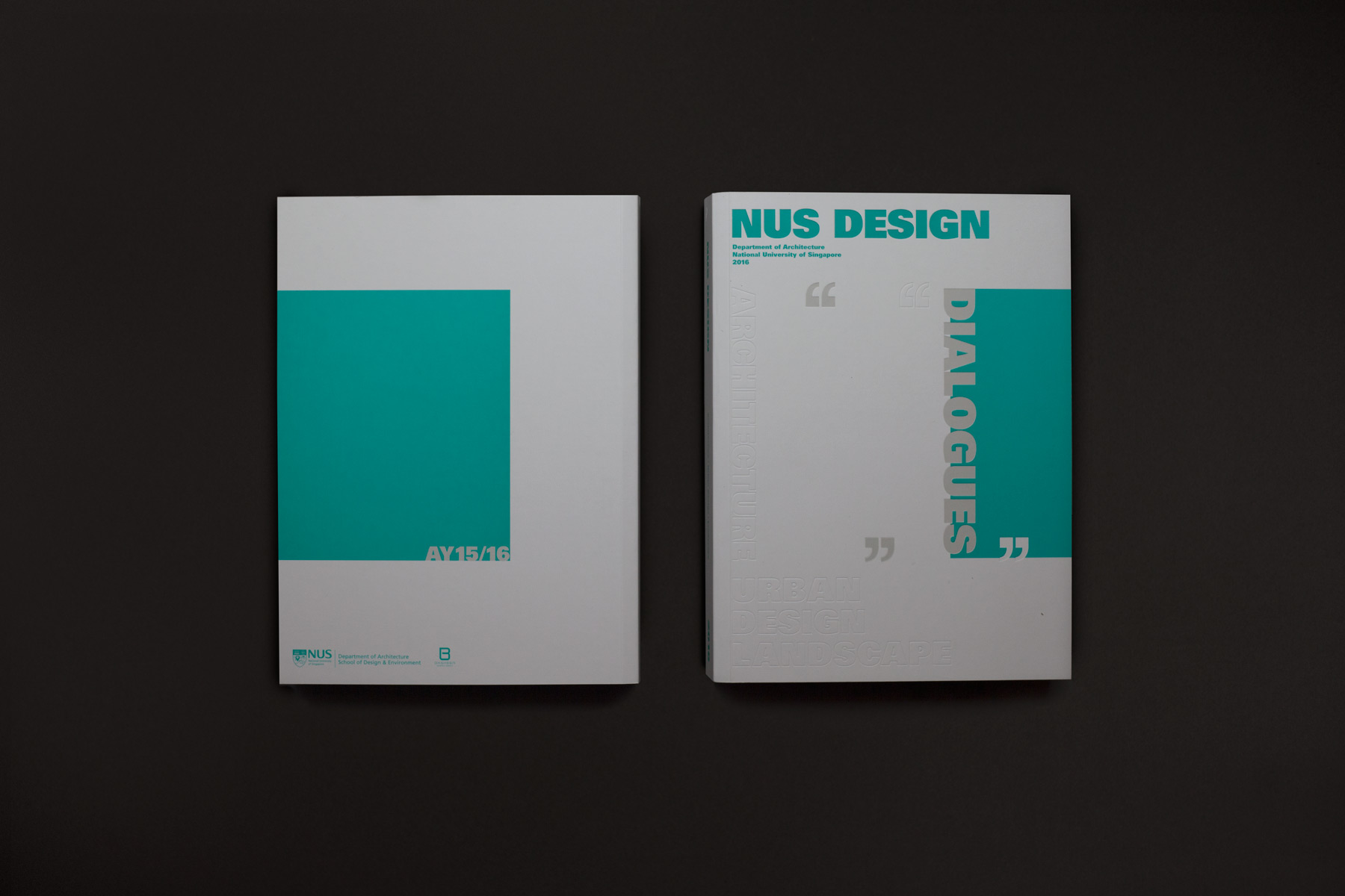
Repositioning Singapore's oldest architecture school
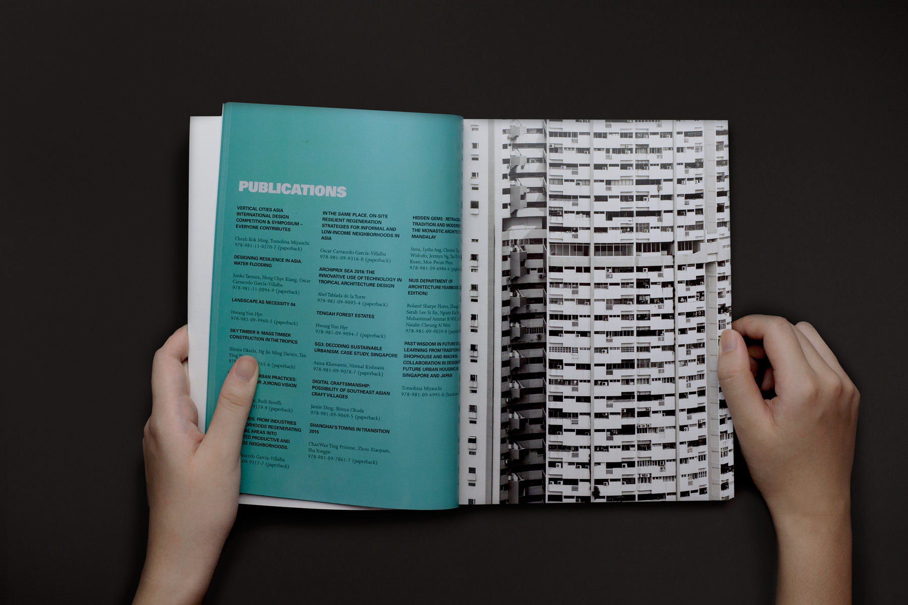
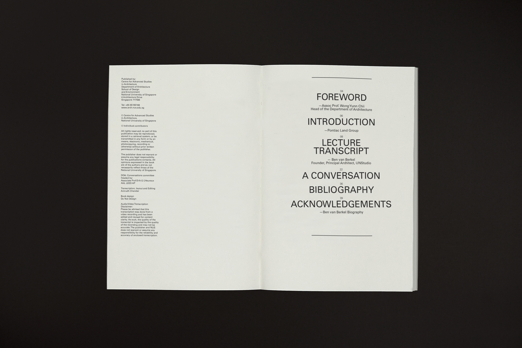
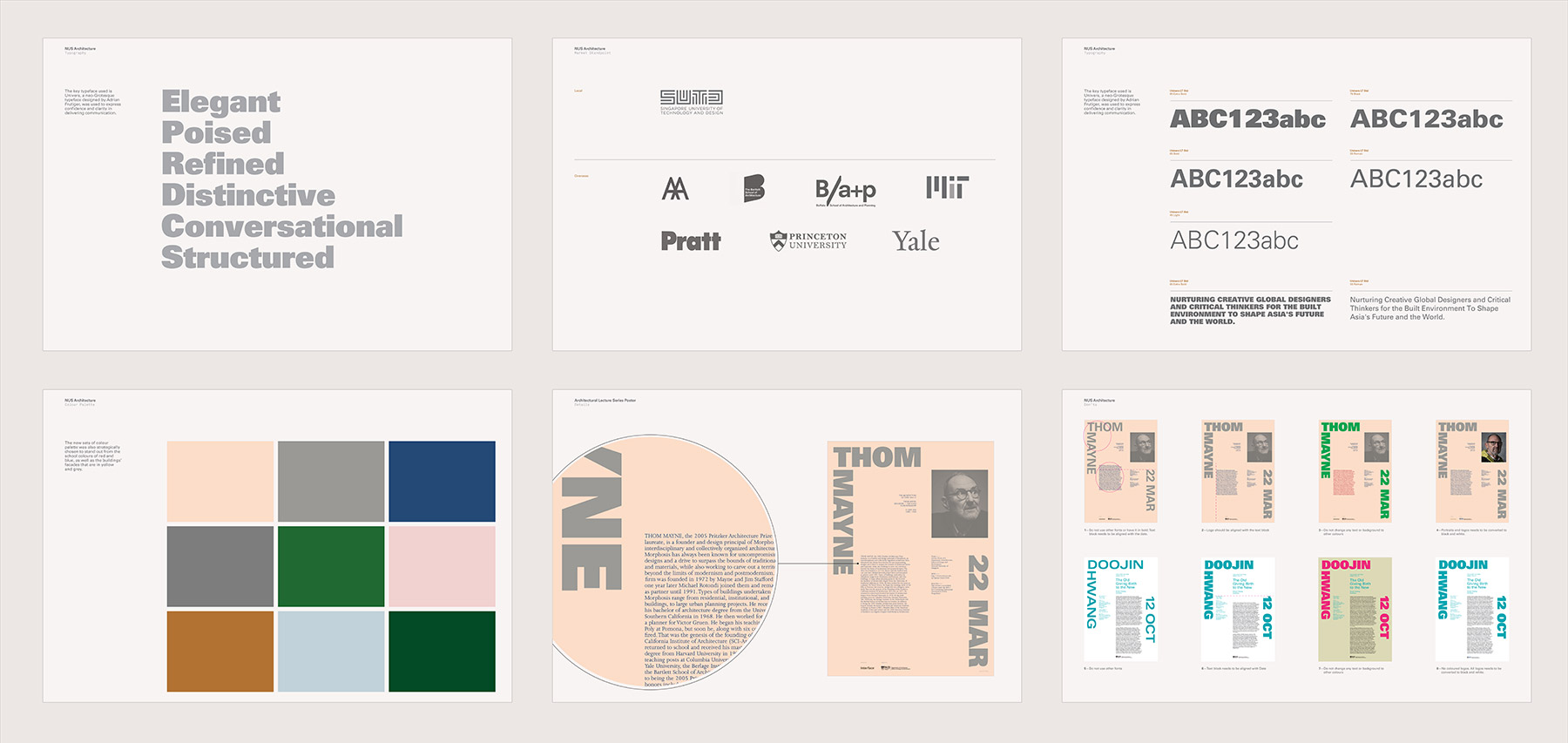
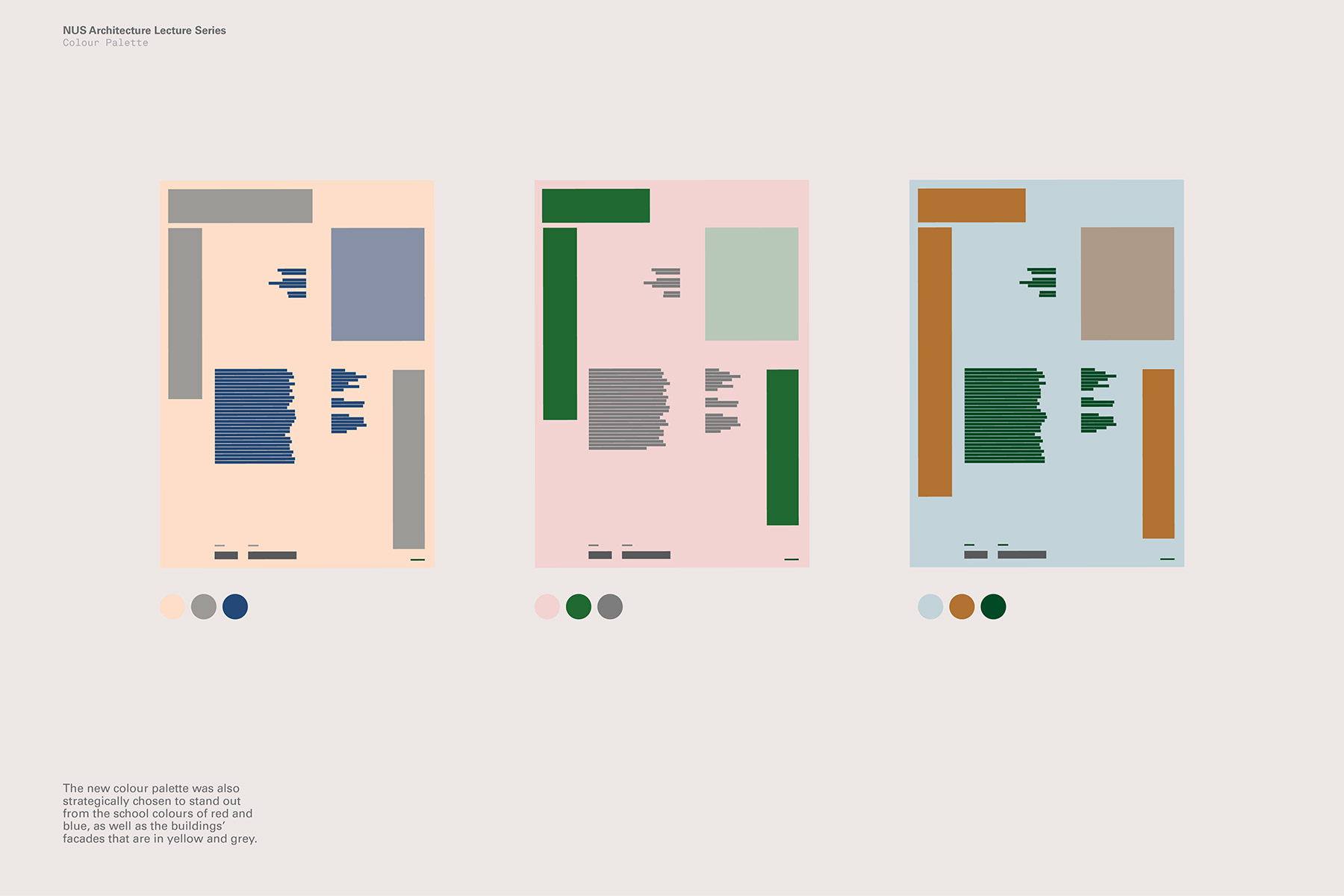
Do Not Design was commissioned by National University of Singapore, Department of Architecture to design a new graphic identity to redefine a unified voice and look, reposition and reflect the research-intensive school’s creativity and modular organisation, enthusiasm as well as its mission of ‘Nurturing creative global designers and critical thinkers for the built environment to shape Asia’s future and the world.’
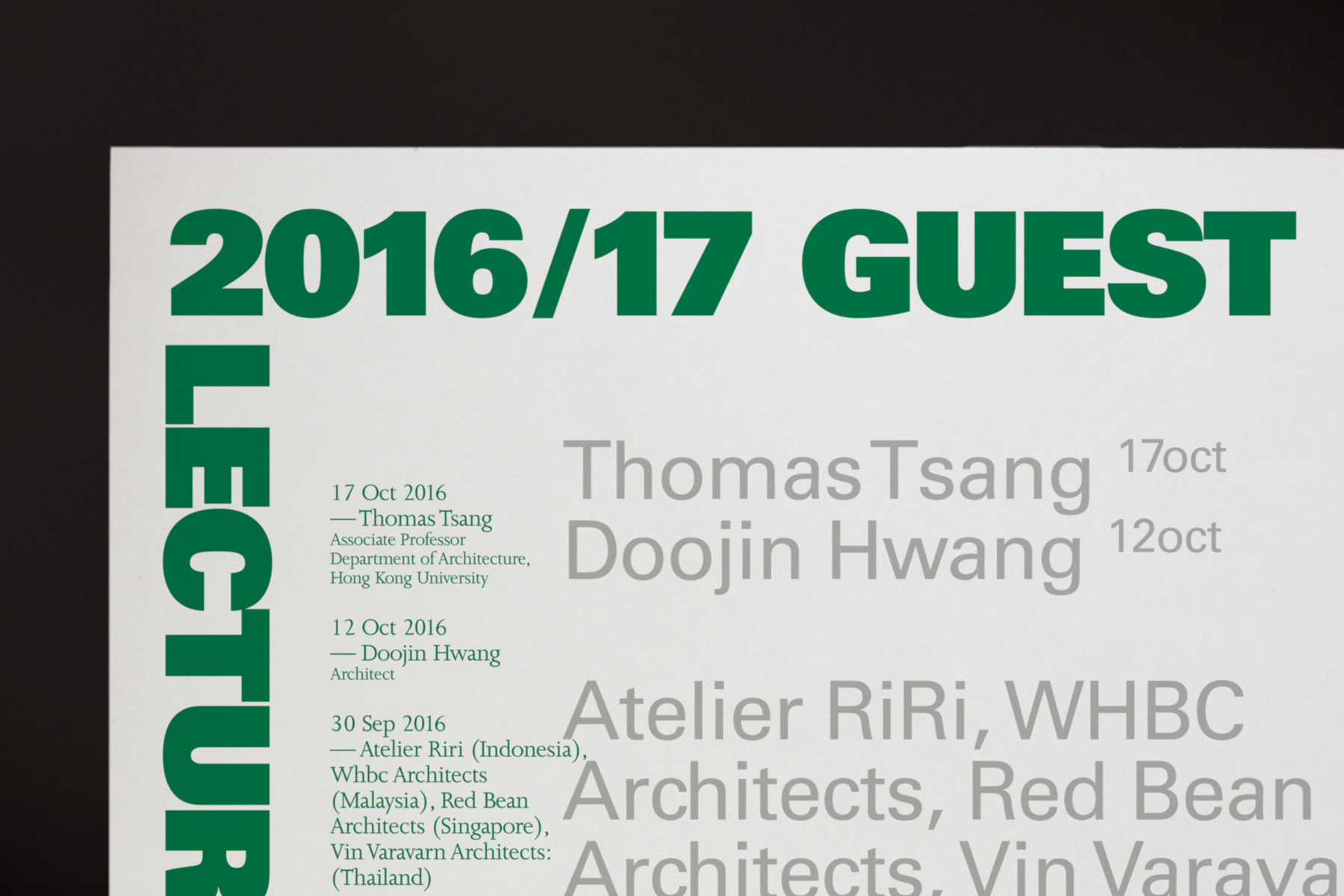
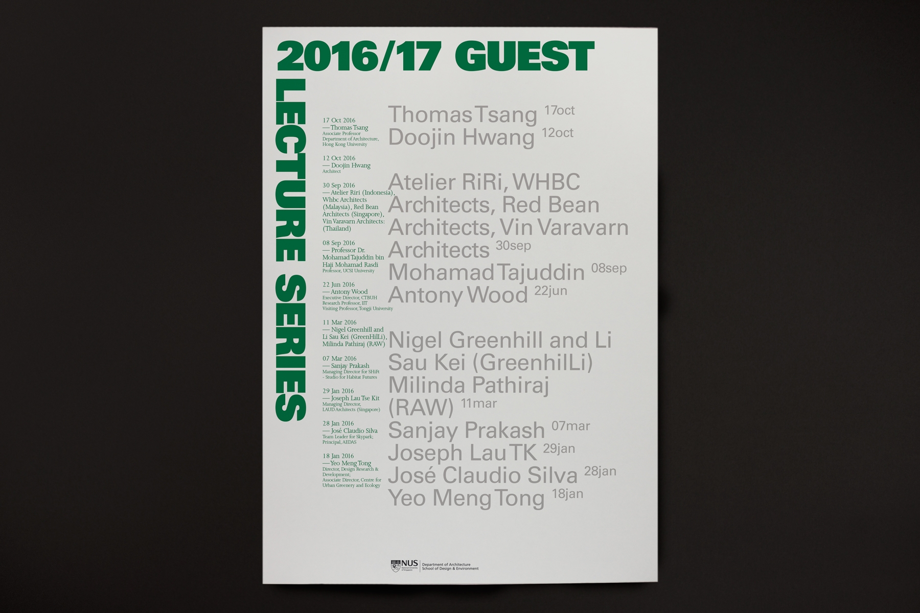
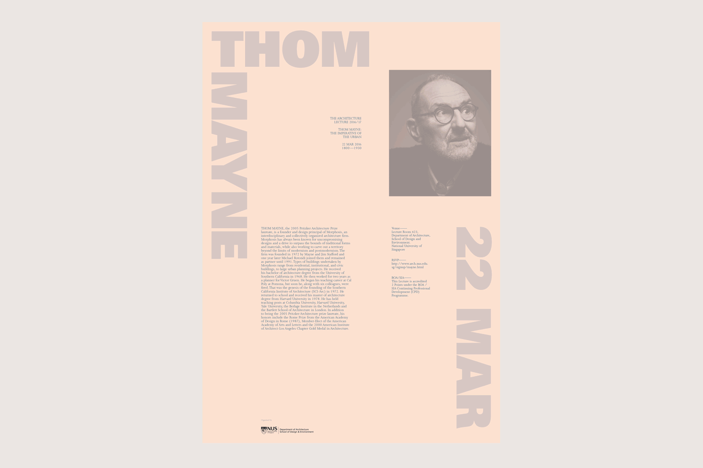
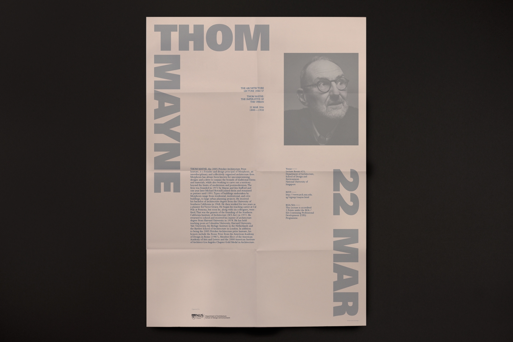
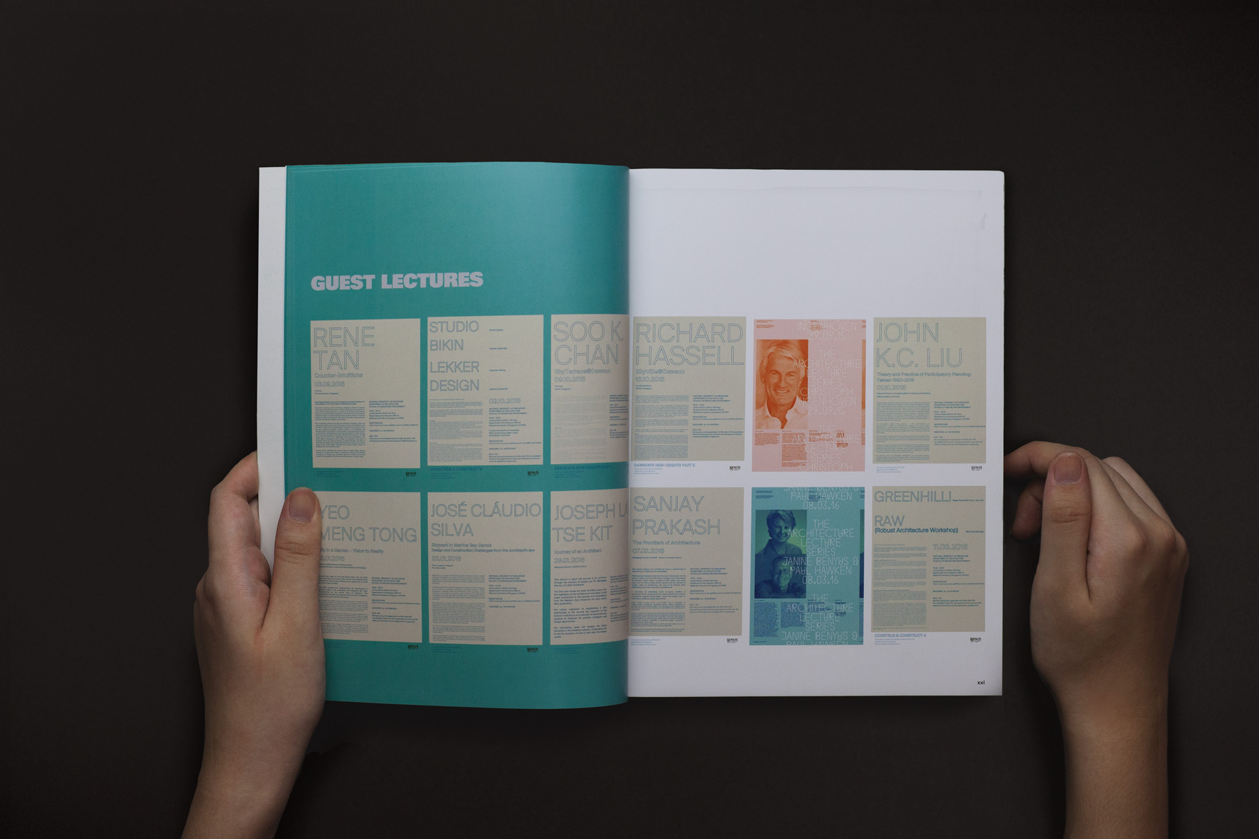
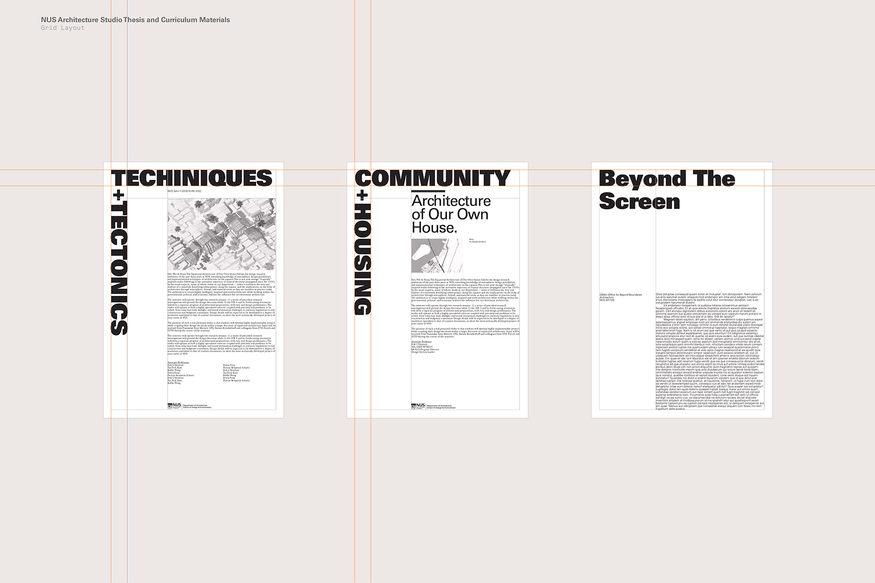
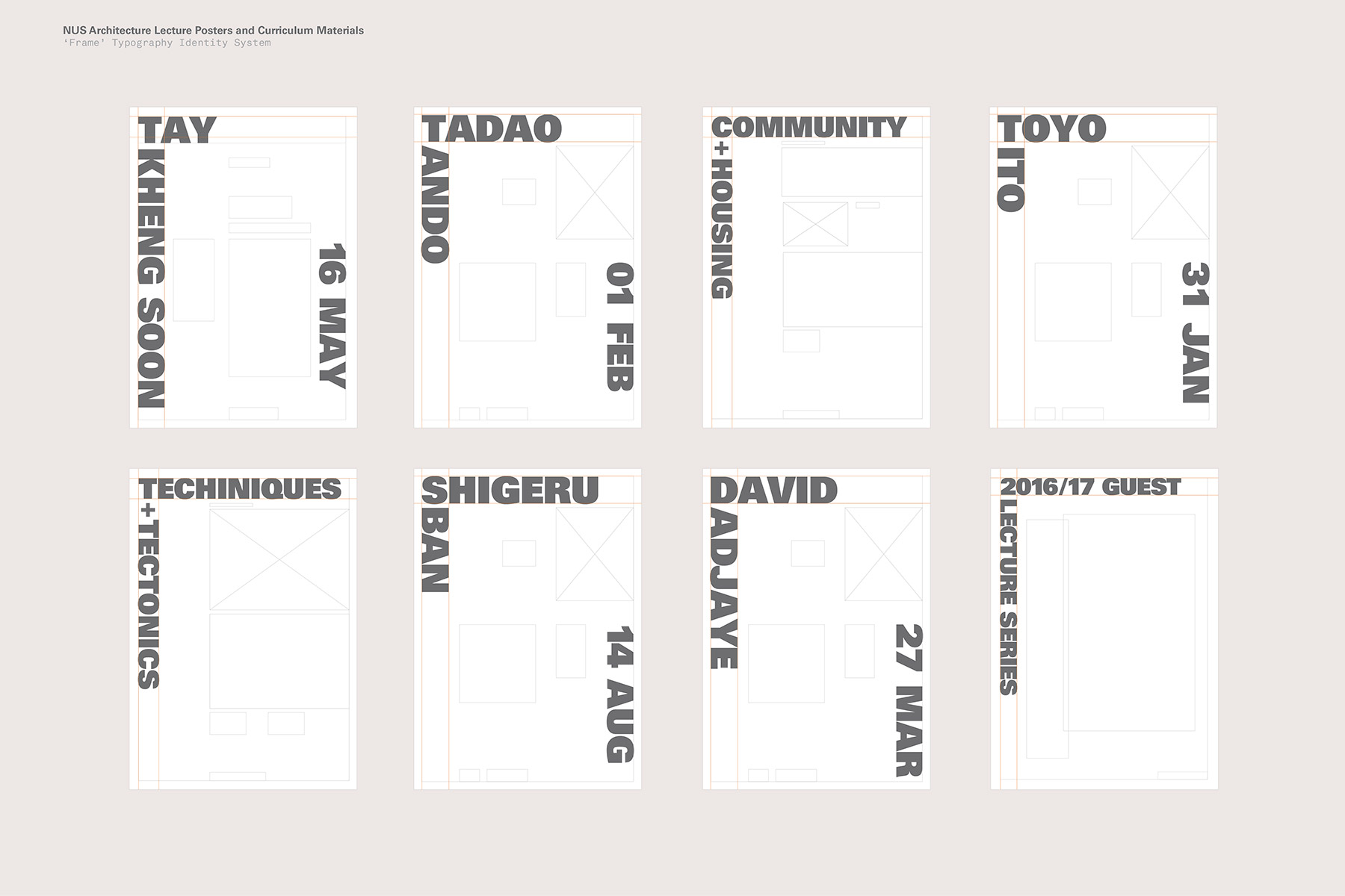
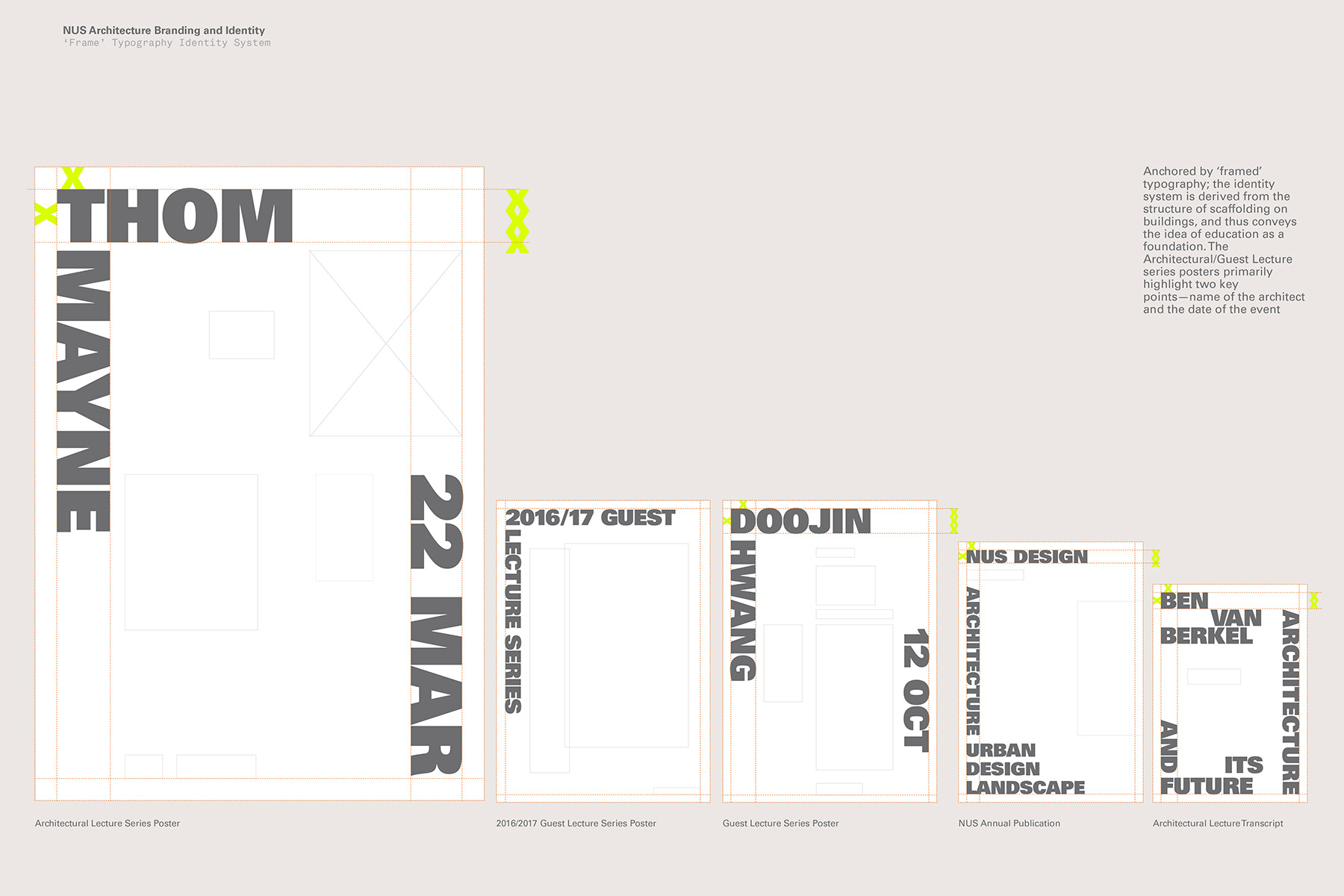
Anchored by ‘framed’ typography; the identity system is derived from the structure of scaffolding on buildings, and thus conveys the idea of education as a foundation. The Architectural/Guest Lecture series posters primarily highlight two key points—name of the architect and the date of the event.
To have a better understanding, of the how the rebranding of NUS Architecture was faring, we went down to simulate being a student at the school. Based on the rule of eye-tracking, we realised several things— getting people to look twice at our posters was a challenge, considering the visual overload of information in an institution. Because no one would really stop to read our posters, the headers were designed to be intentionally oversized, allowing viewers to capture the essence of each poster at a glance.
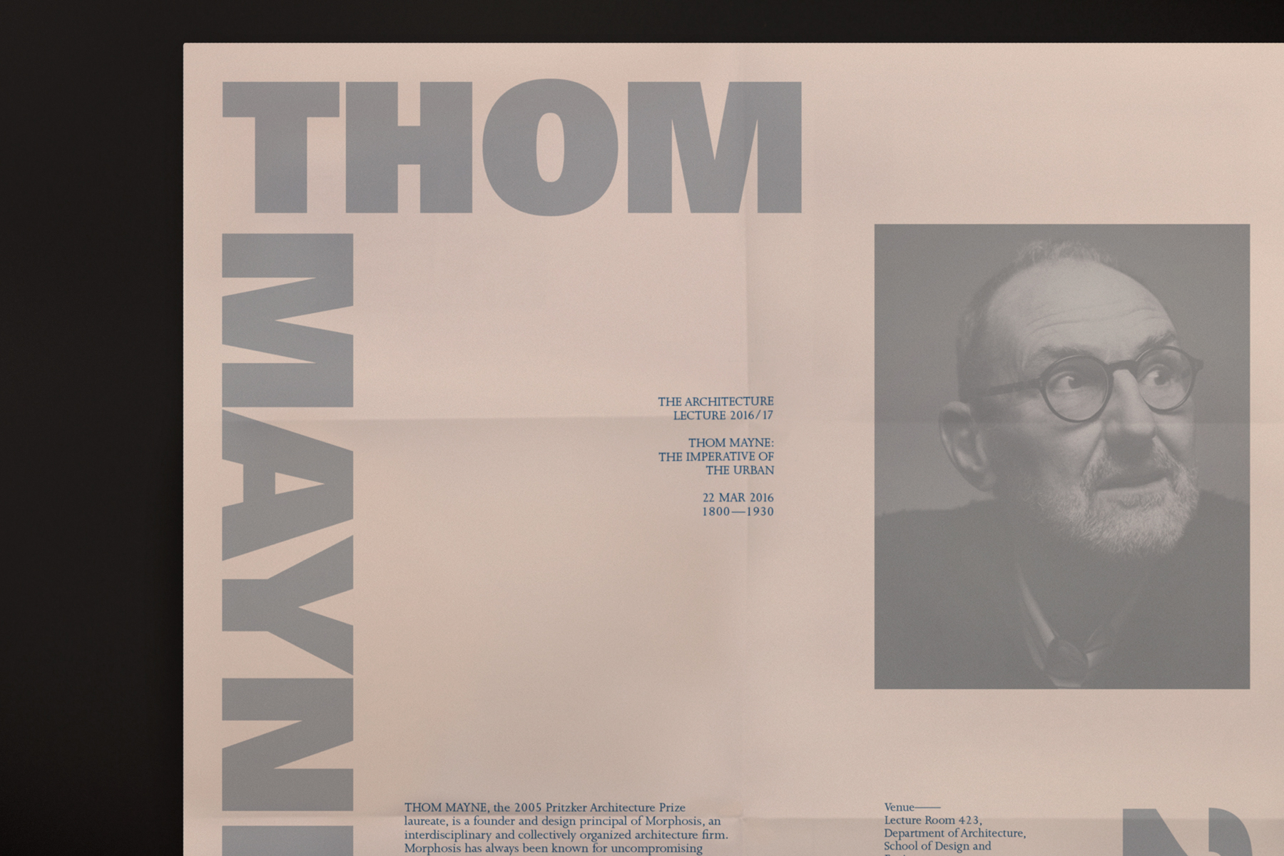
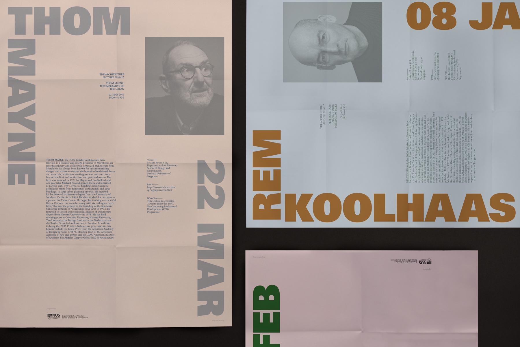
Anchored by ‘framed’ typography; the identity system is derived from the structure of scaffolding on buildings, and thus conveys the idea of education as a foundation. The Architectural/Guest Lecture series posters primarily highlight two key points—name of the architect and the date of the event.
Do Not Design
Work with us — write to we@donotdesign.com
©2009—2022


