Do Not Design for Revlon— redefining the world's most desirable beauty brand for the festive season, launching it into the Southeast Asian market

Revlon (South East Asia)

Services

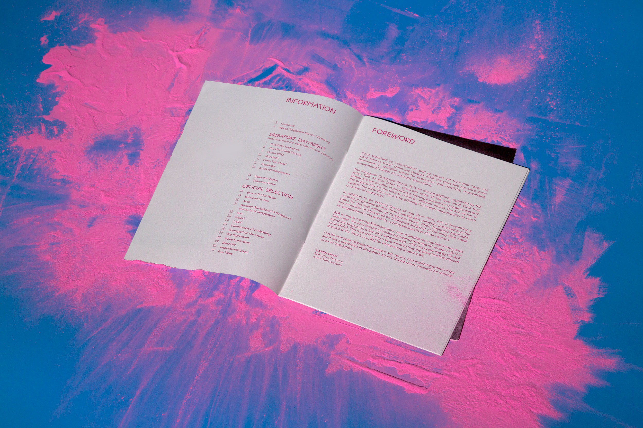
Social Media Strategy

Creative Direction

Design Direction

Photography

Creative direction

Yanda


Design & Art direction

Elizabeth Zhang


Illustration

Elizabeth Zhang


Photography / Styling

Hosanna Swee

A project by Do Not Design   


A long established, global cosmetic powerhouse in need of a revamp. 


In creating Revlon’s festive season campaign in 2019, we wanted to disrupt the beauty landscape while repositioning Revlon at the forefront of womens’ minds. Our job was simple. Reign in the festive season with a series of social media posts, a popup store and photoshoot for its launch in Southeast Asia.

Revlon’s christmas festive identity needed to reinforce the brand’s core proposition to provide glamour, excitement and innovation. This looked like a lavish indigo unboxing experience and a series of blown-up red lip installments to showcase Revlon’s festive lippies.

Typography is the art and technique of arranging type to make written language legible, readable and appealing when displayed. The arrangement of type involves selecting typefaces, point size, 


Do Not Design 
Work with us — write to we@donotdesign.com

©2009—2022

Do Not Design for 1 KM: Jalan Besar - a curation and exhibition of the work of like-minded creatives for curious eyes

1 KM: Jalan Besar

Services

Curation

Communication Strategy

Creative Direction

Design Direction

User Experience

User Interface

Website

Social Media

Creative direction

Yanda


Design & Art direction

Preston Tham


Illustration

Jesslyn Sutisna


Copywriting

Joyce Yang


Photography

Damien Chong


Printing

Allegro Print

A project by Do Not Design   


Pioneered in the spirit of curation and experience, 1KM is an exclusive discovery of creatives who live and work within the one-kilometre radius in the same neighbourhood. 

   
Like-minded entrepreneurs in art, design, architecture, retail and F&B are putting together ‘satellite events’ for curious eyes and potential collaborations with some of Asia’s most imaginative minds.
The letterform in the logo can be adapted to the width or height of different layouts suggesting how creatives are reachable within close proximity. The visual language is flexible and it provides a sense of movement moving across fields of applications.      
The campaign visual takes directions from the neighbourhood's vernacular typography and visually reference the unique architecture of the area here. Key words related to 1KM are condensed into different typographical objects like buildings and roads in creating the campaign visual. Crimson orange is considered for the identity as it's used to grab visitors' attention in this vibrant neighbourhood.
GUIDE BOOK A content driven brochure does not only cover the usual information but also focuses on telling Jalan Besar’s history, interviews with collaborators as well as yummy food recommendations.
      We designed and collaborated with the neighbourhood’s seamstress to conceive the 1KM tote bag. Materials were sourced from the shop that produced old-school tool bags.      
The red wayfinding signages can be spotted easily at the allocated spots from afar. Maps of the particular areas are drawn specially for visitors to understand the participating creatives better.     


Do Not Design 
Work with us — write to we@donotdesign.com

©2009—2022

Do Not Design for Concrete Cocktail— reimagining the cocktail experience, with accessibility and authenticity in mind

Concrete Cocktail Co.

Services

Research & Analysis

Brand Identity

Communication Strategy

Creative Direction

Design Direction

User Experience

User Interface

Website

Creative direction

Yanda


Design & Art direction

Yanda / Nora James Yee

Collaterals Photography

Anton Tang


Illustration

Ng Si Qi

A project by Do Not Design   


A balance of fresh goodness and sublime quality, Concrete Cocktail promises an authentic, distinct experience. No more pretentious, scam-ey cocktails— they mix, you pour. 


Cocktails are more than just a drink but rather, a start to a great night with friends, or alone (if that’s what you prefer). We crafted a bold, approachable identity for Concrete Cocktail. In a relatively small and niche marketplace, we needed to deliver a distinctive brand experience that would evolve their identity for the next era of growth. This translated even throughout the rebranding process, from its logo to the packaging of each bottle. Like its name, the new identity of Concrete Cocktail takes inspiration from, you guessed it— concrete!

To reflect a sense of flexibility and inclusivity, we created a logo that wasn’t strictly defined. Depending on the occasion (or not) the hand gripping the bottle can be replaced with one of many variations of hands. In the same spirit of ambiguity, the logotype consists of variations of scribbled-inspired typefaces, which is reminiscent of the name scribbles on an unfinished glass of drink at a bar.

Looking good is only the baseline. We take it one step further with our bold ideas.

Looking good is only the baseline. We take it one step further with our bold ideas, and create irresistible brands, each with a distinct personality that captivates and engages with its customers across the customer journey.
Wrapped in concrete. Just as its name suggests. Concrete Cocktail’s bottles reflect the brand at its essence: authentic and distinct with its concrete-inspired paper wrapping. Because design should never compromise function, we took the journey a bottle takes to its receiver into consideration. More than just its literal meaning of a ‘concrete cocktail’, the paper wrapping cushions the bottle giving users an unboxing experience that isn’t commonly known to cocktails.


Do Not Design 
Work with us — write to we@donotdesign.com

©2009—2022

Do Not Design for Singapore Shorts— Celebrating the best and upcoming talents in local short films

Singapore Shorts

Services

Creative Direction

Design Direction

Creative direction

Yanda


Design & Art direction

Yanda / Preston Tham


Printing

Dominie Press

A project by Do Not Design   


An annual celebration of local short films.


The Asian Film Archive (AFA) aspires to be a hub for the Asian film community, contributing to culture, scholarship and industry through organised screenings, educational and cultural programmes that open and enrich new intellectual, educational and creative spaces, to promote a wider critical appreciation of this art form. Founded in 2005 as a non-profit organisation to preserve the rich film heritage of Asian Cinema, the AFA is a charity based in Singapore and an Institution of Public Character. The AFA won the New Non-Profit Initiative Award at the 2007 National Volunteers and Philanthropy Awards (Singapore) for original, sustainable, impactful and best practices. In January 2014, the AFA became a subsidiary of the National Library Board.


The logotype is set in Elephant (designed by Gareth Hague), a sans serif inspired by classic woodtype grotesques combined with geometric shapes.

The identity centres around three distinctive stacked blocks which represents the diverse perspectives of filmmakers and audiences. The boldness of the blocks is informed by taking references from elements such as screens, stage and frames. The arrangement of these three blocks conveys the visual metaphor to draw audiences closer to the films, embodying the spirit of connecting the community to short films. To encapsulates the spirit of motion and anticipation and to bring about movement to the static logo, text is intentionally cropped within the blocks. 
To complete the experience, the brochure is built around the logo which boldly folded in an unusual manner; creating an illusion of viewing from different perspective mirroring how film is viewed from different angles.
At the heart of the campaign visual is the visual interpretation of anticipation and excitement when discovering a new film. It is bold, lively and inviting. The tube-like channels celebrate connections between films and audiences freely expressed across all communications. The blur effect adds depthness and perspective to the campaign visual.


Do Not Design 
Work with us — write to we@donotdesign.com

©2009—2022

Do Not Design for Seenthesis— instilling the importance of visual literacy for a future of educators, readers and photography lovers

Seenthesis

Services

Creative Direction

Design Direction

Creative direction

Yanda


Design & Art direction

Elizabeth Zhang / Edward Harland


Illustrator

Elizabeth Zhang


Printing

Allegro Print

A project by Do Not Design   


Seenthesis is an educational resource book created to impart, inspire and guide the future generations of aspiring photographers through a comprehensive guide of the art of photography.


A comprehensive resource book on photography. On one hand- an informative educational guide; On the other, it primes educators and the general public into productive discussion, insightful understanding and endearing appreciation for the art of photography. The essence of the book encompasses a fundamental overview as well as contemporary approaches on photography with over 100 works by 32 Singaporean/ Singapore-based photographers. Driven by the belief that photography is for all, it is a timely reminder that photography is apparent in our lives and exists beyond art shows/ museums. Not to mention, it is also a memento to our roots –– the film and dark room, journalism that documented our history and its diversity.


Crafted as an art resource to help educators and students. Genuine, personal and raw, Seenthesis explores a glossary of lessons, from documentaries and typologies to the art of Mise-en-scène through worksheets and personal case studies by local photographers. Breaking down complex themes, we designed Seenthesis as an educator's guide to lead a class in discussions while understanding and appreciating the art form.


Each chapter divider was designed to be sectioned with independent color tabs to reflect the diversity of the different categories while better appealing to its younger audience in a more comprehensible manner.

To engage and apply, while deepening one’s analytical reading of photographs. Seenthesis is a work published by DECK.

Even down to its cover, the book exudes art with its (faux) embossed cover that mimics real canvas, minus the cost. Art doesn’t have to exist solely in art exhibitions!


Do Not Design 

Work with us — write to we@donotdesign.com

©2009—2021

Do Not Design for The Figment Journal— a in-house guide celebrating local culture and heritage with a curation of native know-hows

The Figment Journal

Services

Creative Direction

Design Direction

Creative direction

Yanda


Writing & Design

Joylene Chai


Illustrations

Sweet Gamboa

A project by Do Not Design   


Distinguished and memorable, the Figment brand delivers authentic local experiences to its discerning expat demographic.

Founded locally in Singapore, Figment offers beautifully furnished and locally- inspired heritage homes to expats and corporates for extended stays. By providing a unique, consistent high-quality guest experience at a sharing economy price, Figment sets out to disrupt the extended stay hospitality industry to become the WeWork of residential real estate.

Our conclusive guide book was designed like an album, with snapshots of pictures dating way back to illustrate Singapore’s ever-evolving landscape and culture. From tales of the shophouse to exotic meats as a treat, we left no secret hidden.

Do Not Design was commissioned to create a multifaceted guidebook to Singapore’s local scene, spotlighting our rich culture and heritage alongside a series of need-to-knows and food recommendations. In simple terms: An expat’s guide to the sunny city.


Do Not Design 
Work with us — write to we@donotdesign.com

©2009—2022

Do Not Design for The Abeyant Nursery— weaving the world of an artist's traumatic past and present through a juxtaposition of mixed media

The Abeyant Nursery

Services

Creative Direction

Design Direction

Creative direction

Yanda


Design & Art direction

Yanda / Elizabeth Zhang


Printing

Dominie Press

A project by Do Not Design   


More than just a visual story. An honest artifact revealing the trauma and loss of personal identity of an artist as he transcends from childhood to adulthood.


An honest an relatable story that is reminiscent of childhood, offering a candid glimpse into the life of Quinn Lim. We were commissioned by The Book Show / DECK to craft a visual representation of Quinn’s story, which manifested through the careful placements of photographs, report card clipping, crumpled post-it notes and other small mementos.


Instead of revealing the answers to the metaphors posed in this book, we’ll pose a series of questions. Starting from the cover page.

What does this trapped object on the cover page represent? Is this intentionally not aligned and flattened? Why is there a mix of scribbles and printed text throughout the book? What do the blanked-out grades on report cards represent? Why is text printed outside the margins in an exercise book?
Oddity at its best— is the best way to describe this project, which proved to be more than just a book, more than just a photo album, and more than just a regular book cover.


Do Not Design 
Work with us — write to we@donotdesign.com

©2009—2022

Do Not Design for The Design Society— documenting, celebrating, promoting and educating

The Design Society Journals

Services

Creative Direction

Design Direction

Creative direction

Yanda / Jerry Goh


Design & Art direction

Yanda / Cleo Tsu / Lara Loi


Writers

Dawn Lim


Printing

AlsoDominie / Allegro Print


An evolution from graphic design journal to convergence for the creative, design and community at large.

Driven by four key editorial objectives—document and archive, celebrate and recognise, promote and educate, community and outreach—the Journal is managed by a core team that encourages and seeks participation and contribution from a community of writers, illustrators, artists, designers and photographers. For the current issue, ANEW, 60 local creative agencies were invited to customise the variant covers, all responding to the theme, which can prompt vastly different and unique perspectives.

For our tenth issue in your hands. It’s a good time to hit the pause between rewind and forward, to push-pin this point on a map and examine the roads done and dusted, and those still unchosen. Through the lens of EMERGENCE, we examine the process of design: seeing how, through interaction, collaboration, and productive tension, the new comes into being without losing the muscle memory of what has been cast off. We speak to Mindflyer about how his illustrations have taken flight; discover how illustrators-turned-tattoo artists Flee Circus and Victoria Woon are making their mark; catch up with the good people at PRODUCE; and wander through the eclectic East Coast Road home of father-and-son photographer pair Chua Soo Bin and Cher Him. We check in with creatives' parents to ask what they think their kids really do, and deliver letters home to Singapore written by creatives chasing the hustle overseas.

Issue 9 of The Design Society Journal seeks to explore ORDER as both a thesis and its own antithesis in the paradoxical phenomenon of creation and production. 

Featured in this issue: Hanson Ho (of H55) speaks about the economy of working solo; Ryosuke Uehara and Yoshie Watanabe (of KIGI) share with us their borrowed philosophy from the laws of nature; Clarence Wee and Joanne Lim (of Craft Varies and The Letter J Supply respectively) negotiates perfection and imperfection in the art of calligraphy; and lastly, artist-photographer Lavender Chang opens up about the intimate duality in both her identity and work process.

The launch of PAPER, a compendium which sparks the right impression and associations. The inaugural issue features design mogul Theseus Chan and nineteen years of works from WORK -- complimentary with this issue of The Design Society Journal only.

Do Not Design for Architecture and the architect— kindling nostalgia within readers amidst an ever-changing landscape of built environment

Architecture and the Architect: 

Image-making in Singapore

Services

Creative Direction

Design Direction

Creative direction

Yanda


Design & Art direction

Yanda / Lim Yu Shan


Editor / Writer

Dawn Lim

Photographer

Khoo Guo Jie / Darren Soh


Printing

AlsoDominie

A project by Do Not Design   


An intimate project, this publication arises out of an anxiety towards the fast-changing built landscape of Singapore.


Its objective is to look at place, memory and nostalgia through architecture, while attempting to understand the images of Singapore in the collective minds. How do we, as agents and recipients of the built environment, come together to decide the landscape that generations after our own would inherit?

We have gone about assembling individual memories of architects and users who are both, in their own ways, image-makers of the city.

The result is a collage of both the physical and the sensory coming together to inform something about a spirit of intersecting times. In its most celebrative tone, the images and anecdotes in this book recognize what we have. Yet, this is not meant as an evasion of criticality. Instead, we encourage readers to take an unprejudiced look at this city we call Singapore, before searching for their own meaning of place. We see this publication as a tribute, as well as a reminder of the choices we make to strengthen our national identity. 


The publication features fourty buildings in a diversity of styles that were built in different decades — shopping malls, offices, instituitional spaces, public housing and private residential developments. Theses featured buildings sit alongside two republished essays — by veteran architects, William Lim and Alfred Wong, respectively — and eight new interviews with architects and an architecture photographer based on their works in Singapore. Lastly, anecdotes on the ground from residents, tenants, shopkeepers and security officers have been inserted throughout the pages of the publication to complete this collective gathering of voices. This project is supported and partially funded by the iRememberSG Fund of the Singapore Memory Project.


Do Not Design 
Work with us — write to we@donotdesign.com

©2009—2021

Do Not Design for Singapore's Vanished Housing Estates— transforming reading experiences with precious memorabilia

Singapore's Vanished Housing Estate

Services

Creative Direction

Design Direction

Creative direction

Yanda


Design & Art direction

Yanda / Preston Tham


Writers

Eugene Ong


Printing

AlsoDominie

A project by Do Not Design   


Celebrating art, architecture and heritage in a photography publication.

Singapore’s Vanished Public Housing Estates is a black-and-white publication by independent photographers, KC Koh and Eugene Ong. The book features over 27 now-vanished early public estates and precincts by the Singapore Improvement Trust (SIT) and Housing Development Board (HDB) along with essays on the history of early housing in Singapore.


Chapter dividers that are repetitive and often too easy to ignore

Instead of having chapter dividers that are repetitive and often too easy to ignore, readers are forced to notice various forms of ephemeral such as collected postcards, HDB eviction notices, vintage maps and memorabilia related to each estate sandwiched within the book. These inserts serve as chapter dividers as well as a brief write up of each of its history encouraging readers to explore and read on.

                                     
Alongside the publication were media relations, Straits Times Newspaper articles and videos. Cumulatively, Singapore’s Vanished Public Housing managed to kickstart $18,000, selling out before it’s launch date with a 130% increase in funds raised.


Do Not Design 
Work with us — write to we@donotdesign.com

©2009—2022