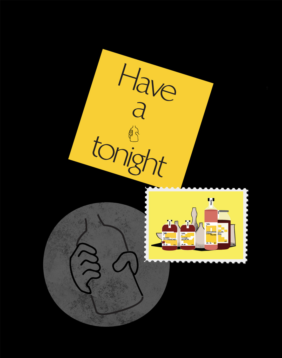
Do Not Design for Save Hair - rallying the world towards the importance of haircare.

Save Hair

Services

Market Research & Analysis

Brand Identity

Communication Strategy

Creative Direction

Design Direction

User Experience

Interactive Design

Front-end Development

Back-end Development

Payment Processing

Content Strategy

Creative direction

Yanda


Design & Art direction

Yanda / Elizabeth Zhang


Illustration

Elizabeth Zhang


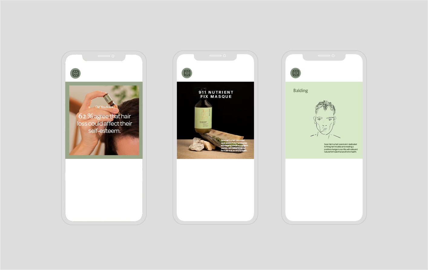
Copywriting / Editorial & Socials

Joylene Chai / Faith Ng


Photography / Styling

Hosanna Swee


Printing

A&K / Prestige Labels / Pixeltech


Collateral Photography

Anton Tang


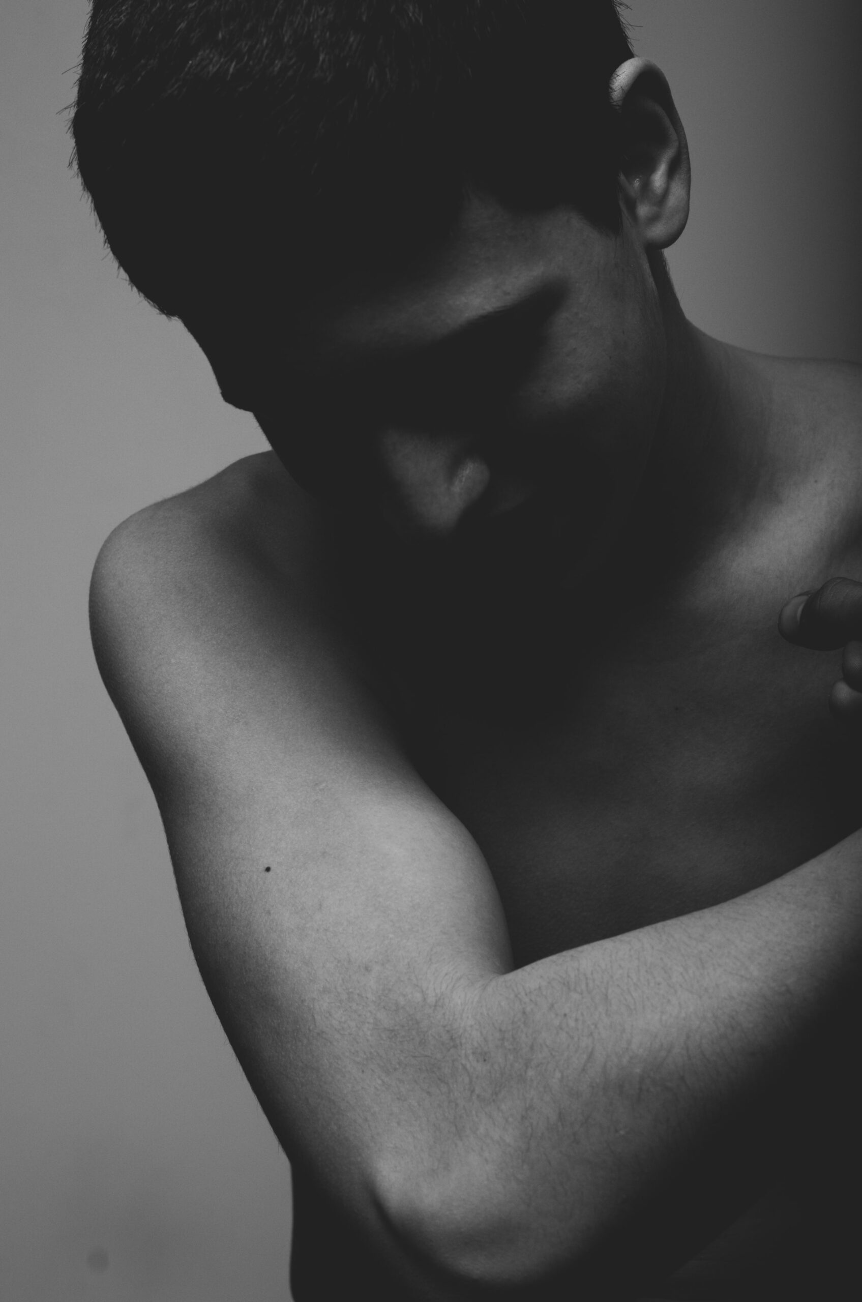
Haircare should be just as important as hair style, dyeing of hair, eating, fashion and every other daily affair we deem crucial.


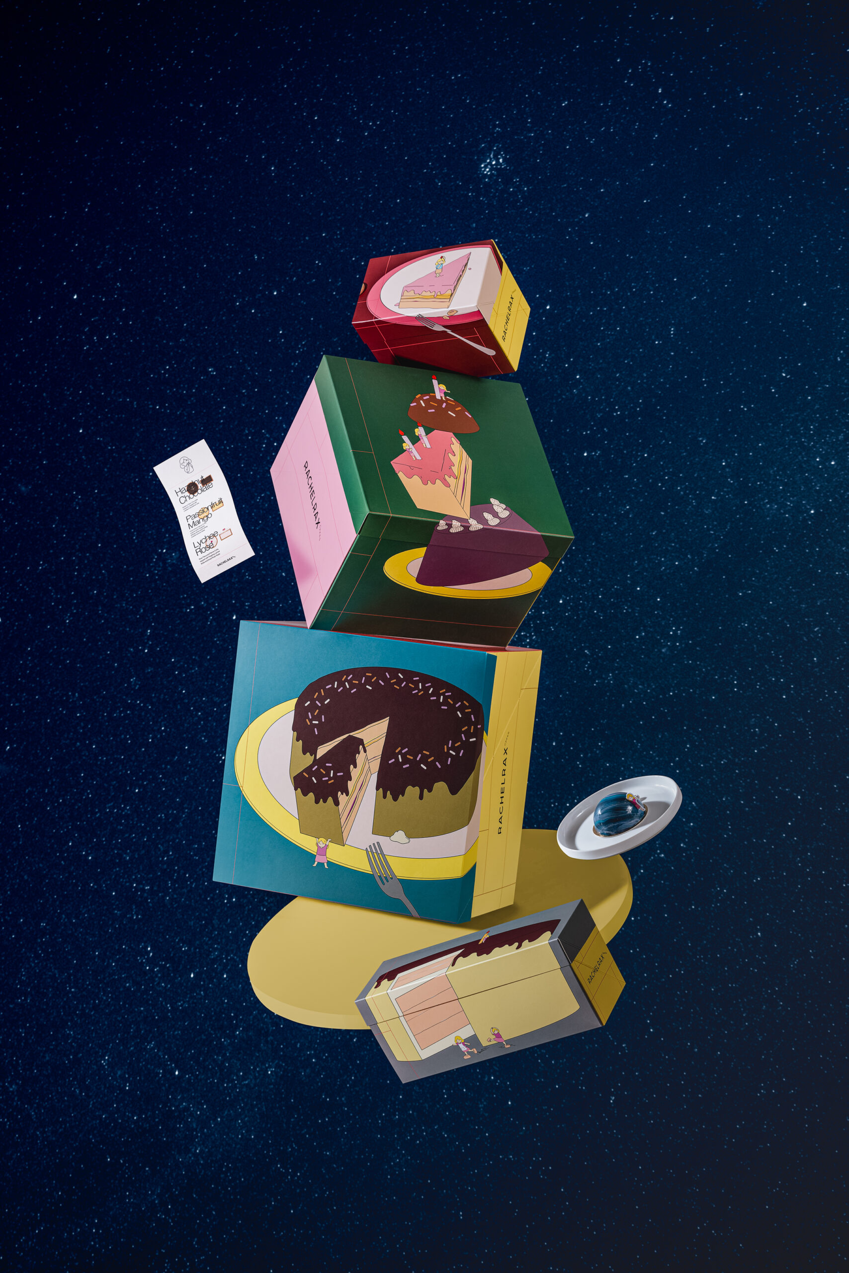
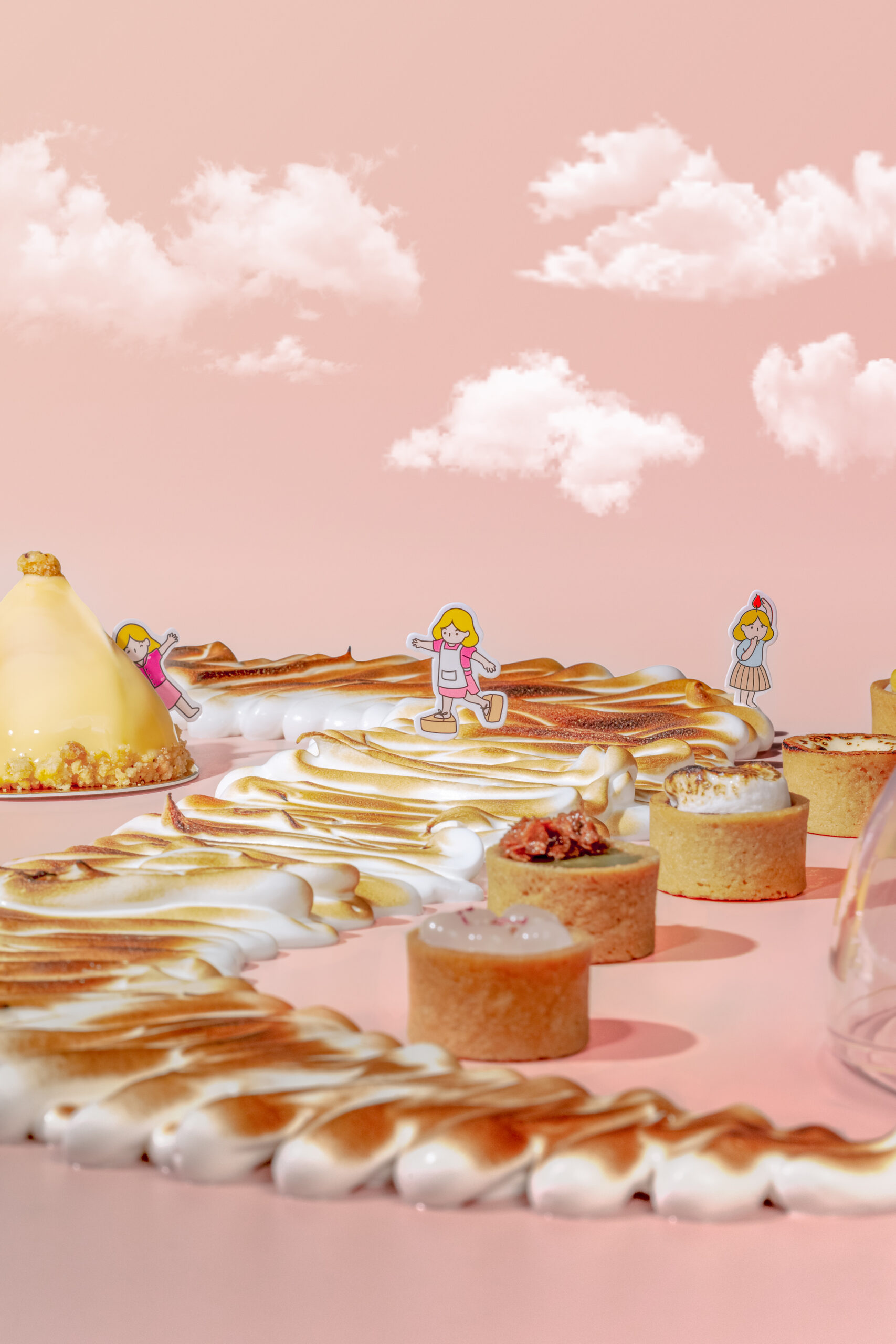
To portray the weight of its importance, we did something rather unheard of— we integrated the dining experience into haircare. An emphasis on the indulgence on our haircare is an investment in feeling and looking good. 

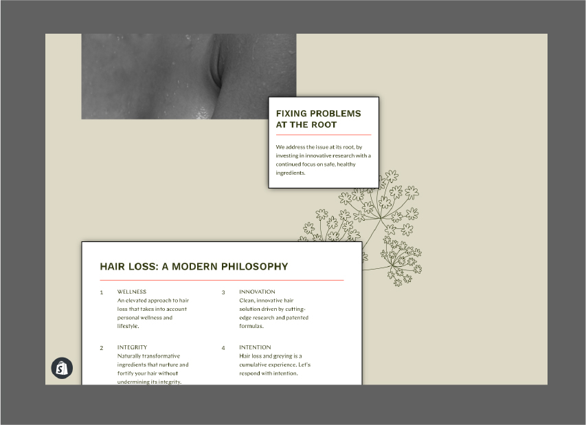
We set some ambitious goals. Save Hair's new identity needed to reflect the knowledge of scientific hair care that went into creating the brand, without appearing oriental and old school. Despite its rookie status, Save Hair needed to go beyond holding its ground in the international market to set thoughtful, innovative hair care on the global stage. How would we achieve that?


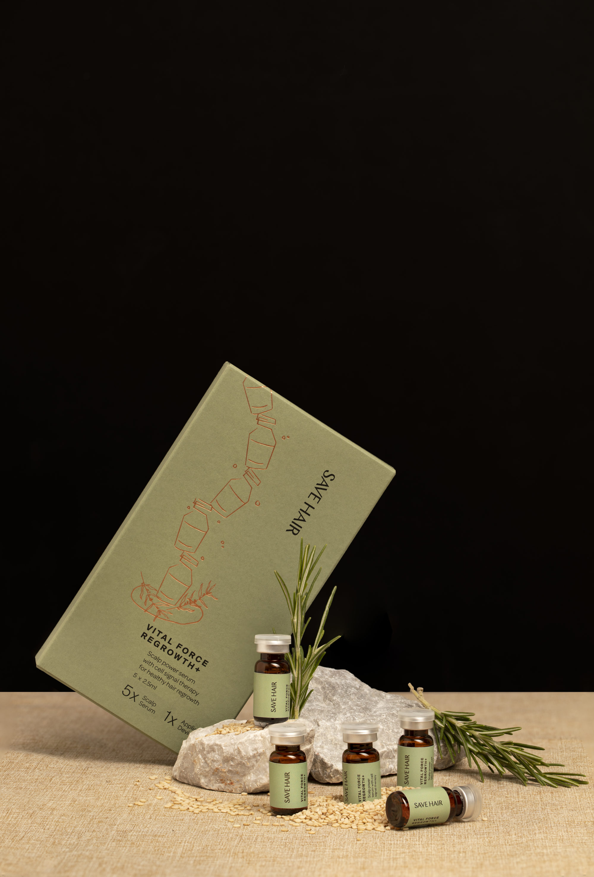
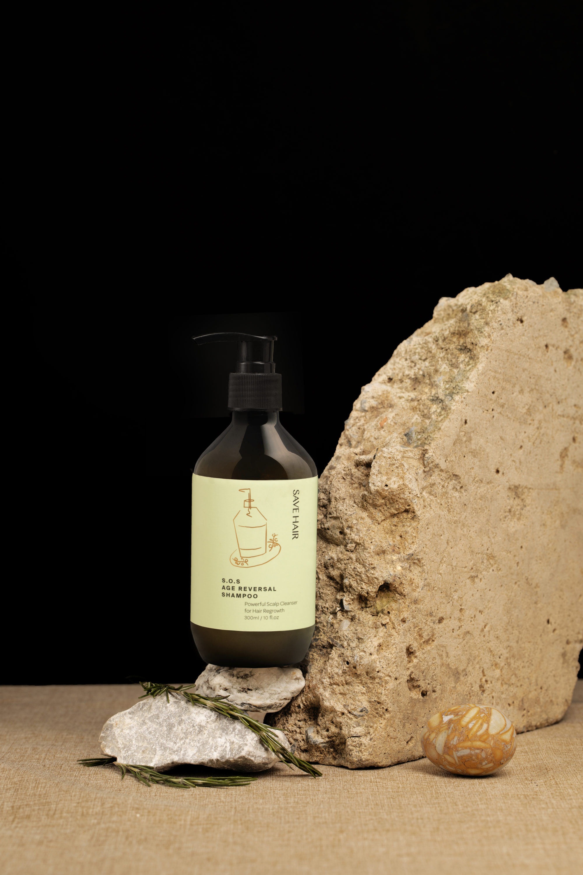
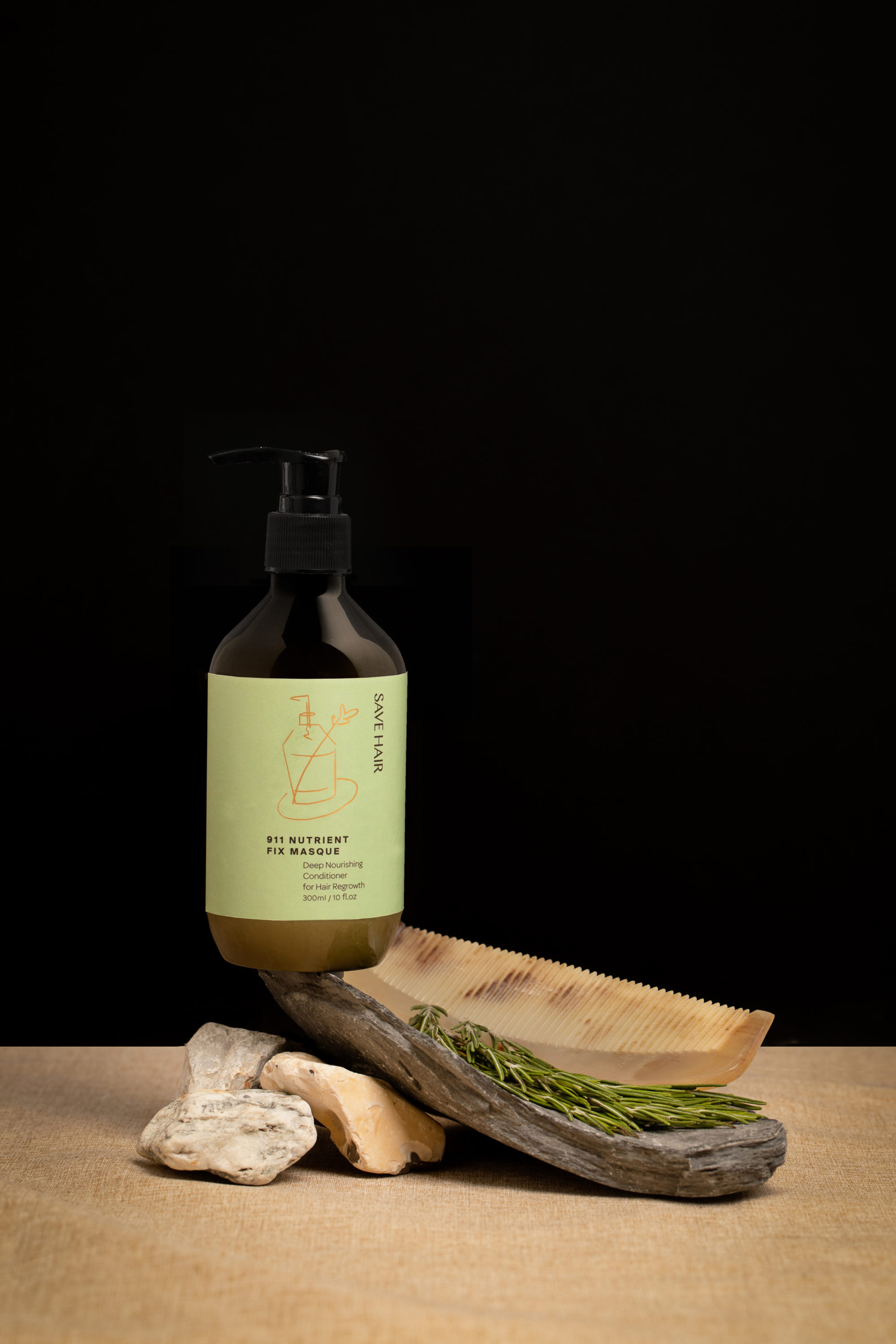
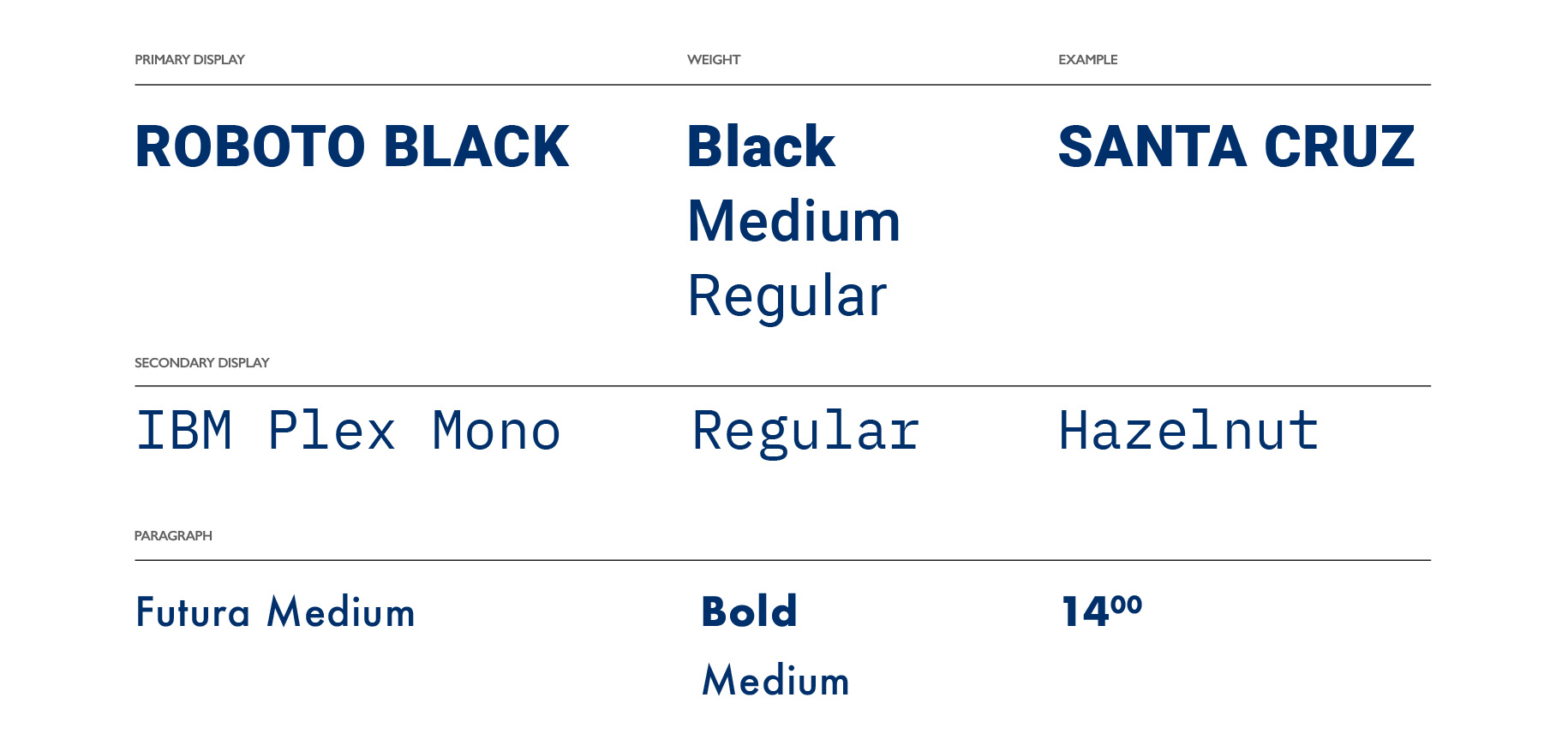
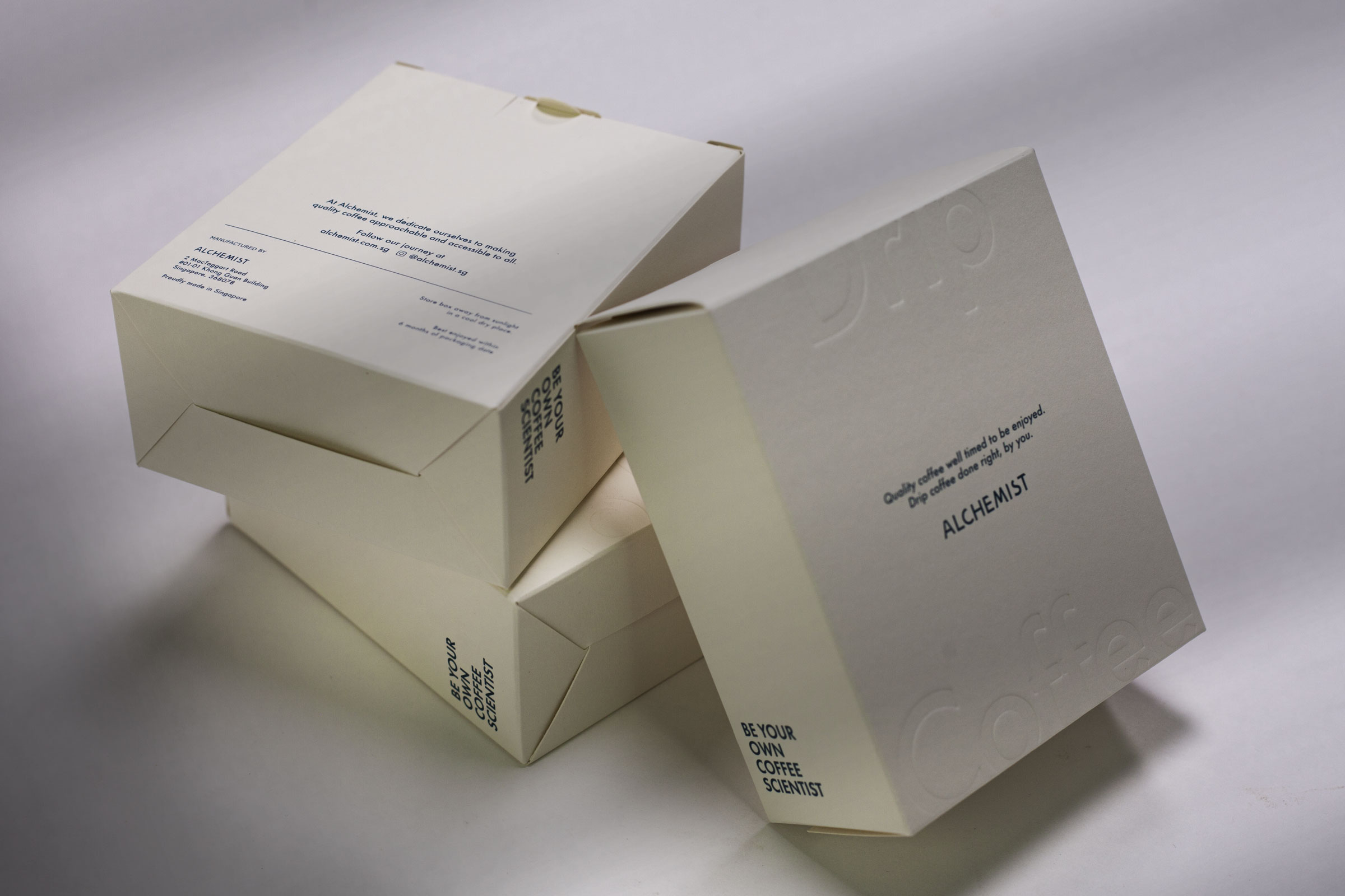
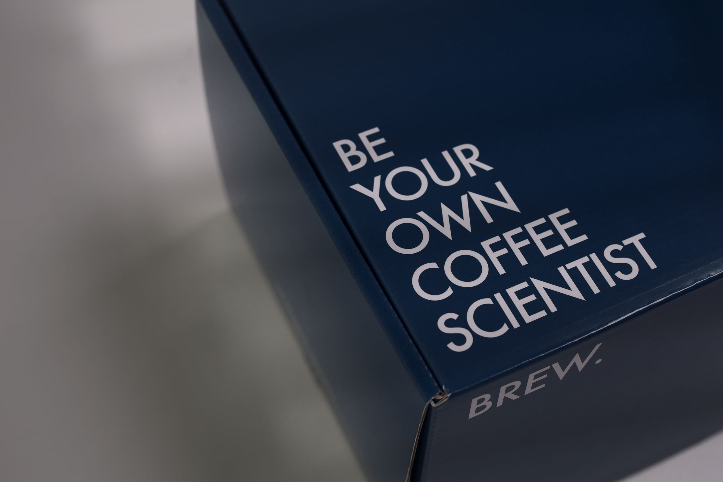
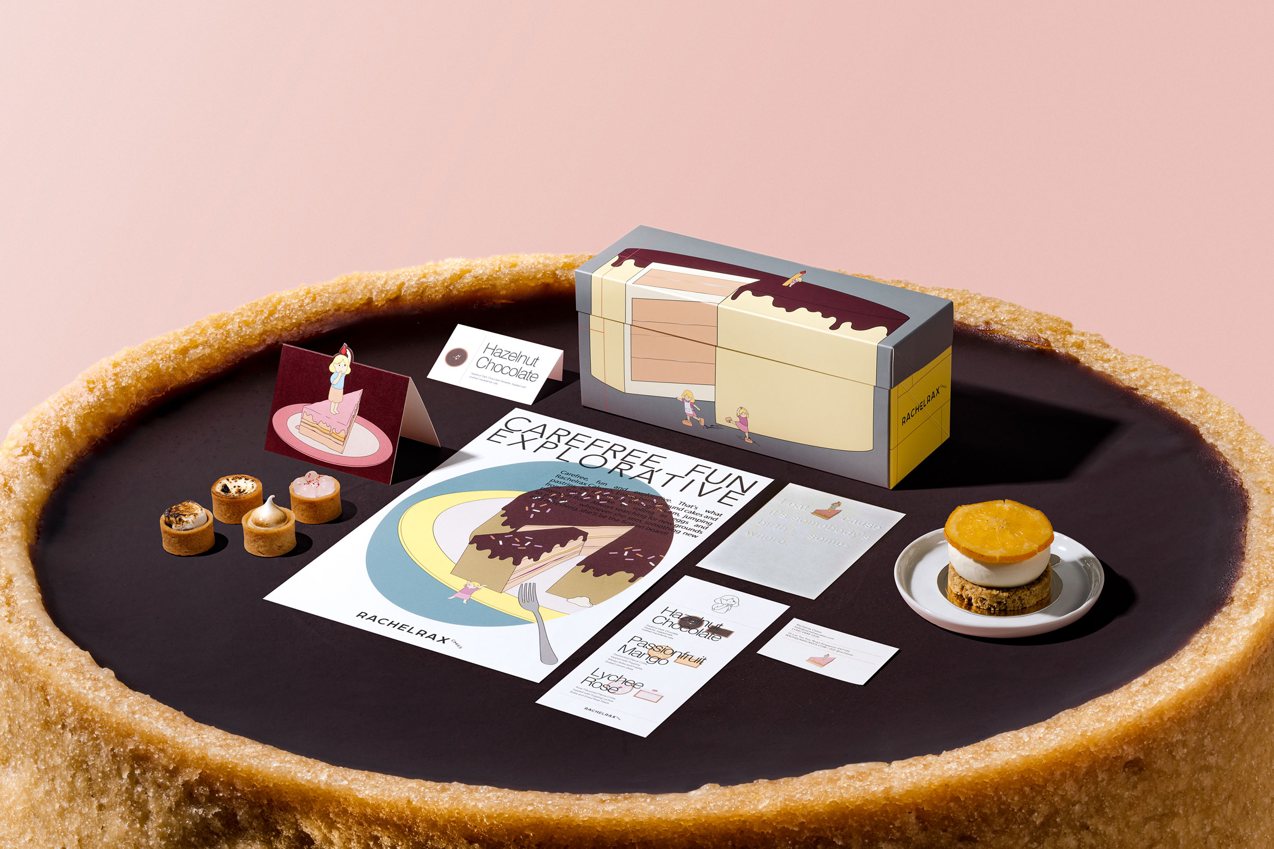
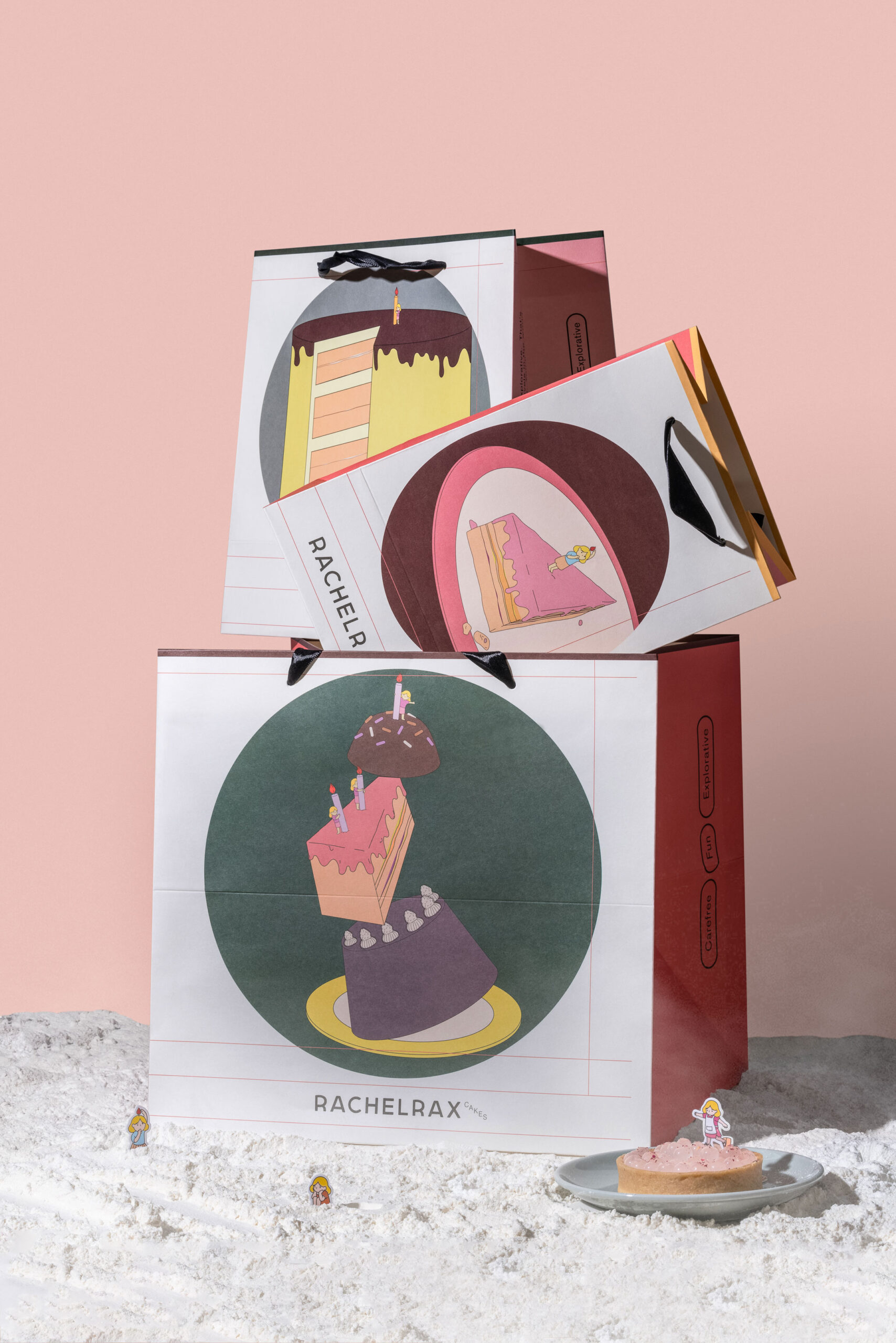
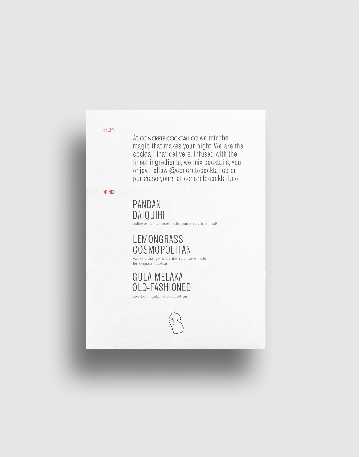
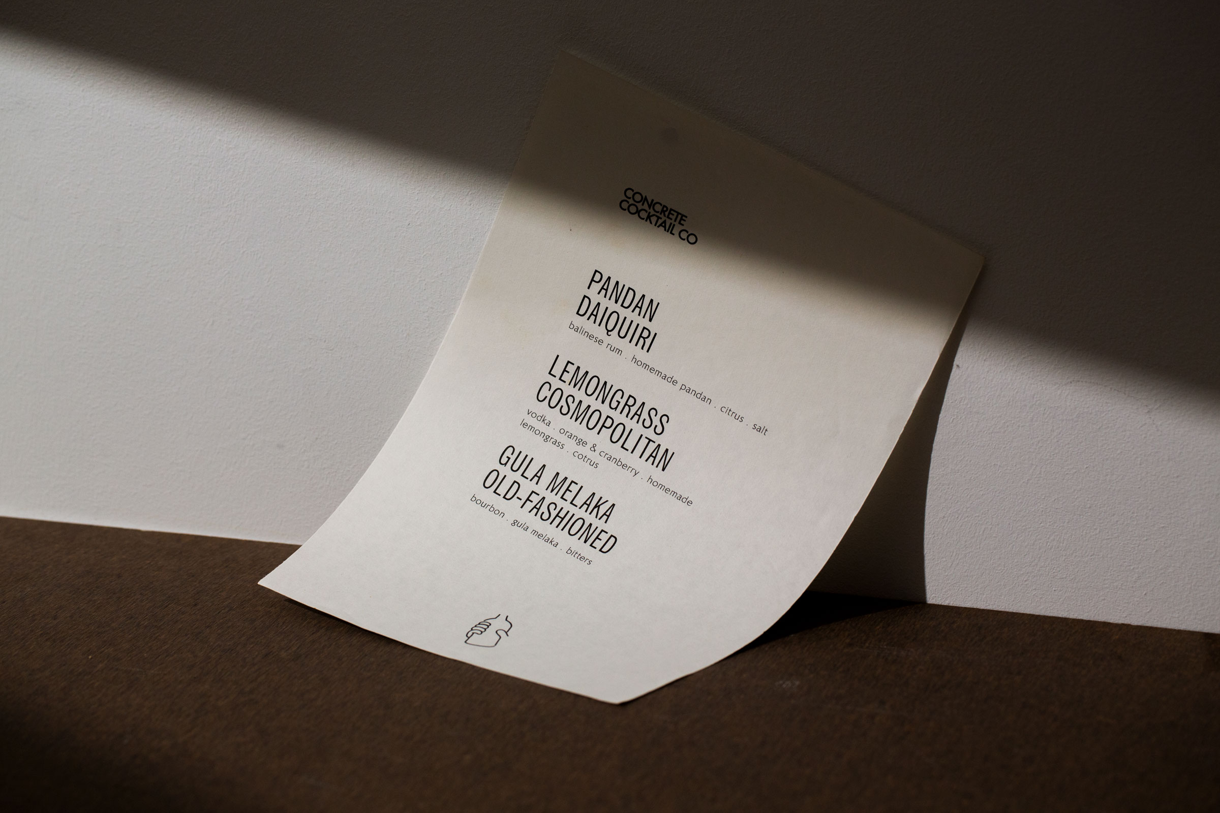
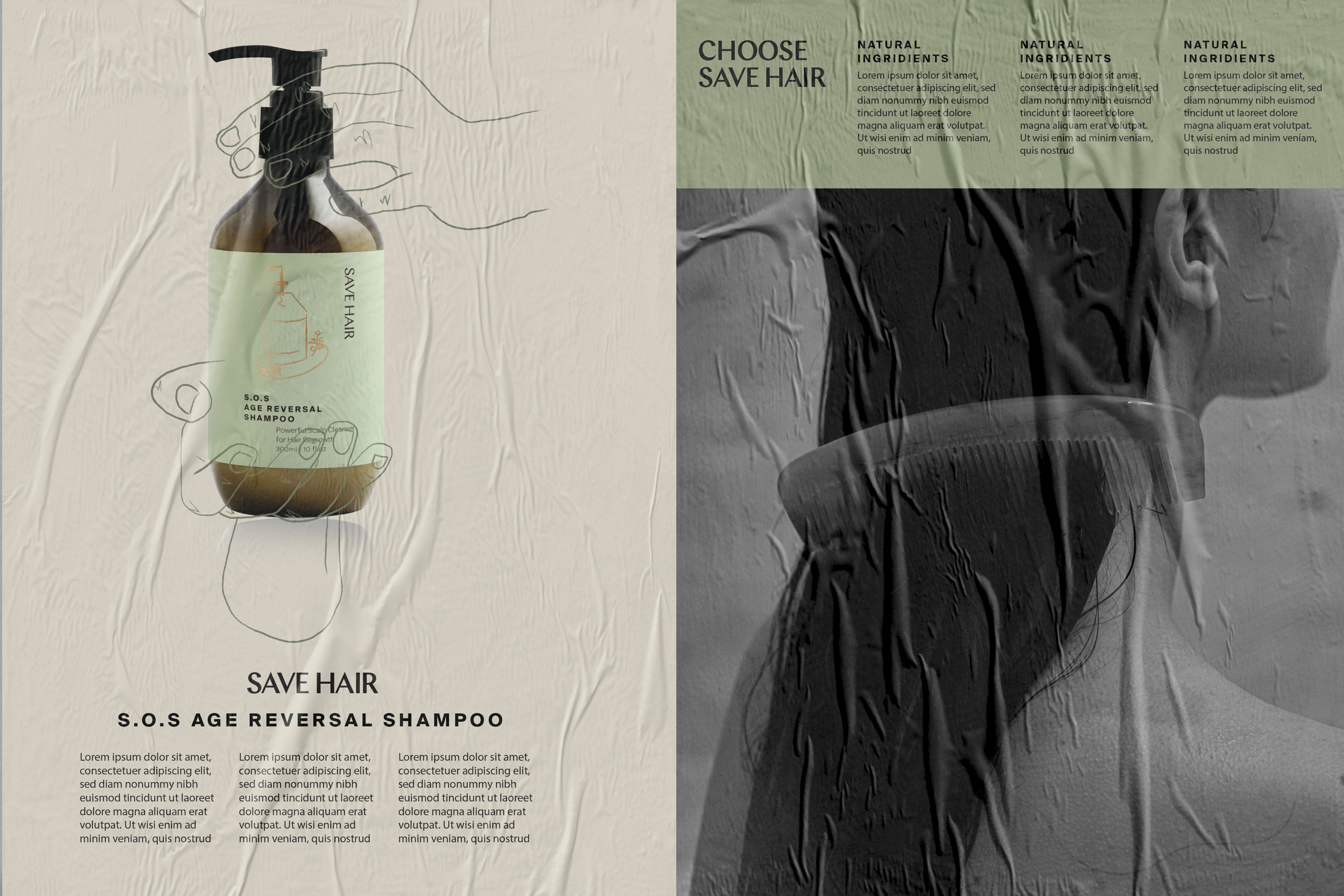
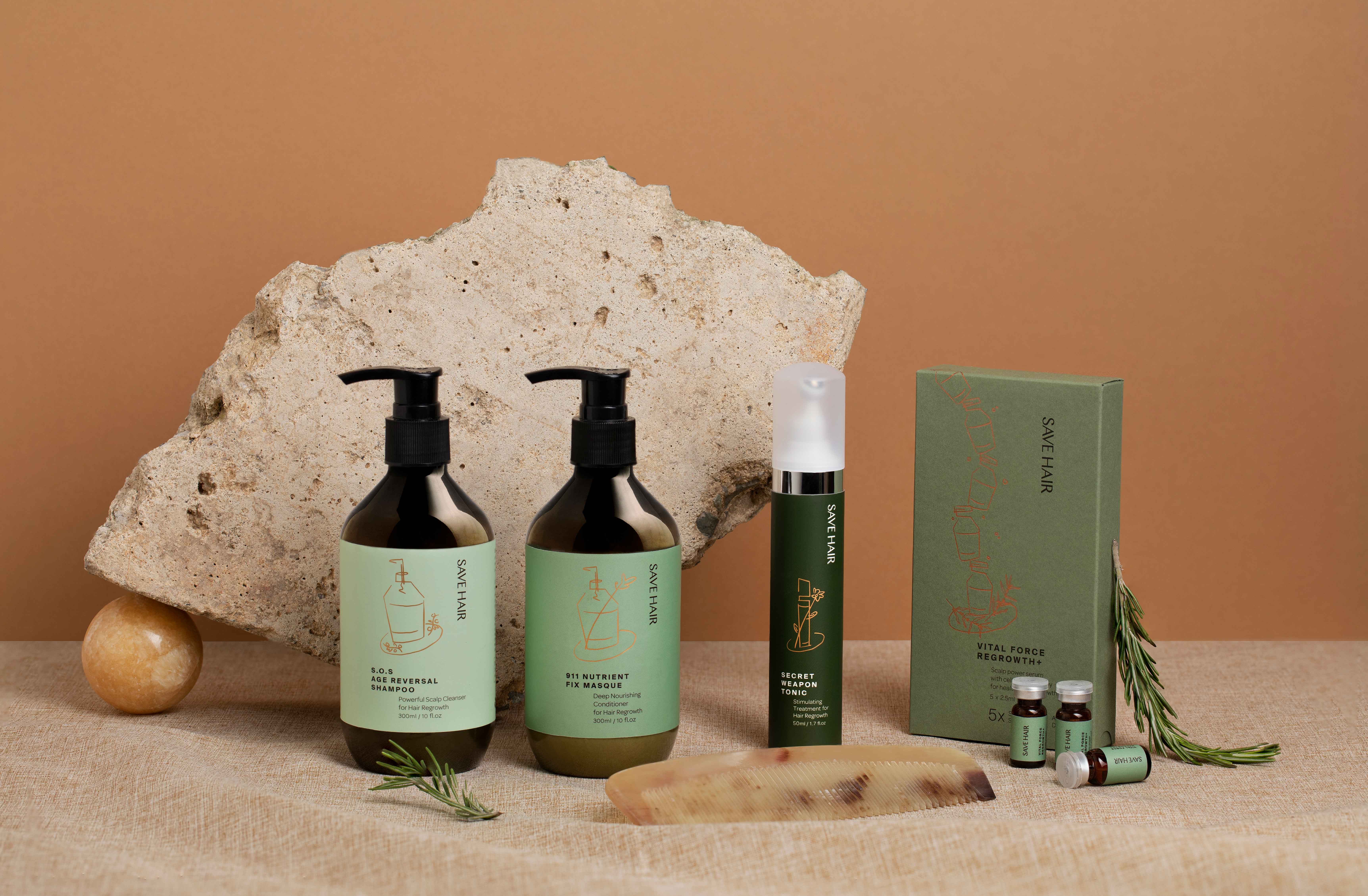
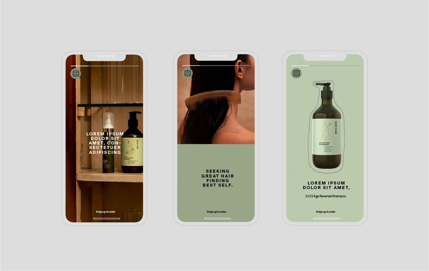
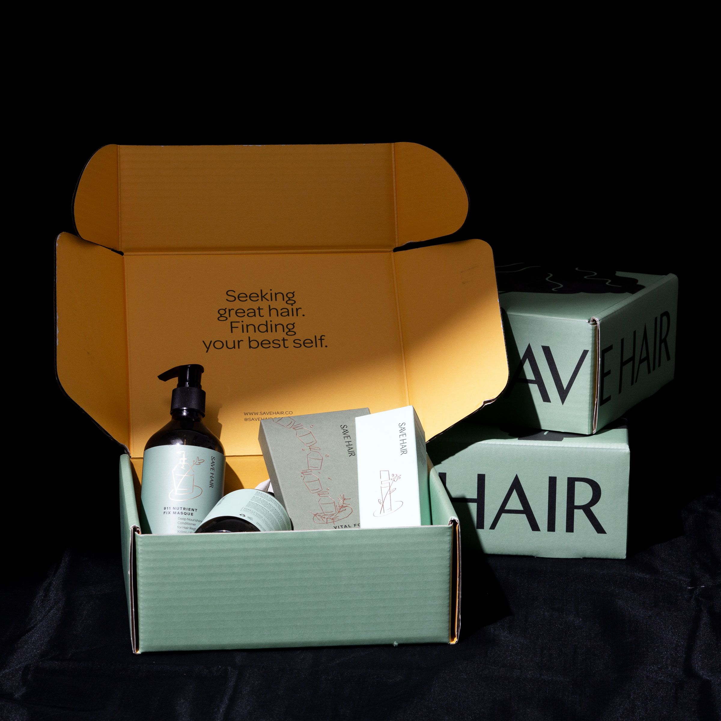
Do Not Design was commissioned to create a packaging design system for Save Hair. From product, packaging, website and social media management to stationery and in-store elements, our designs centered on these keywords: modern; sincere; healthy; comfort; confident.


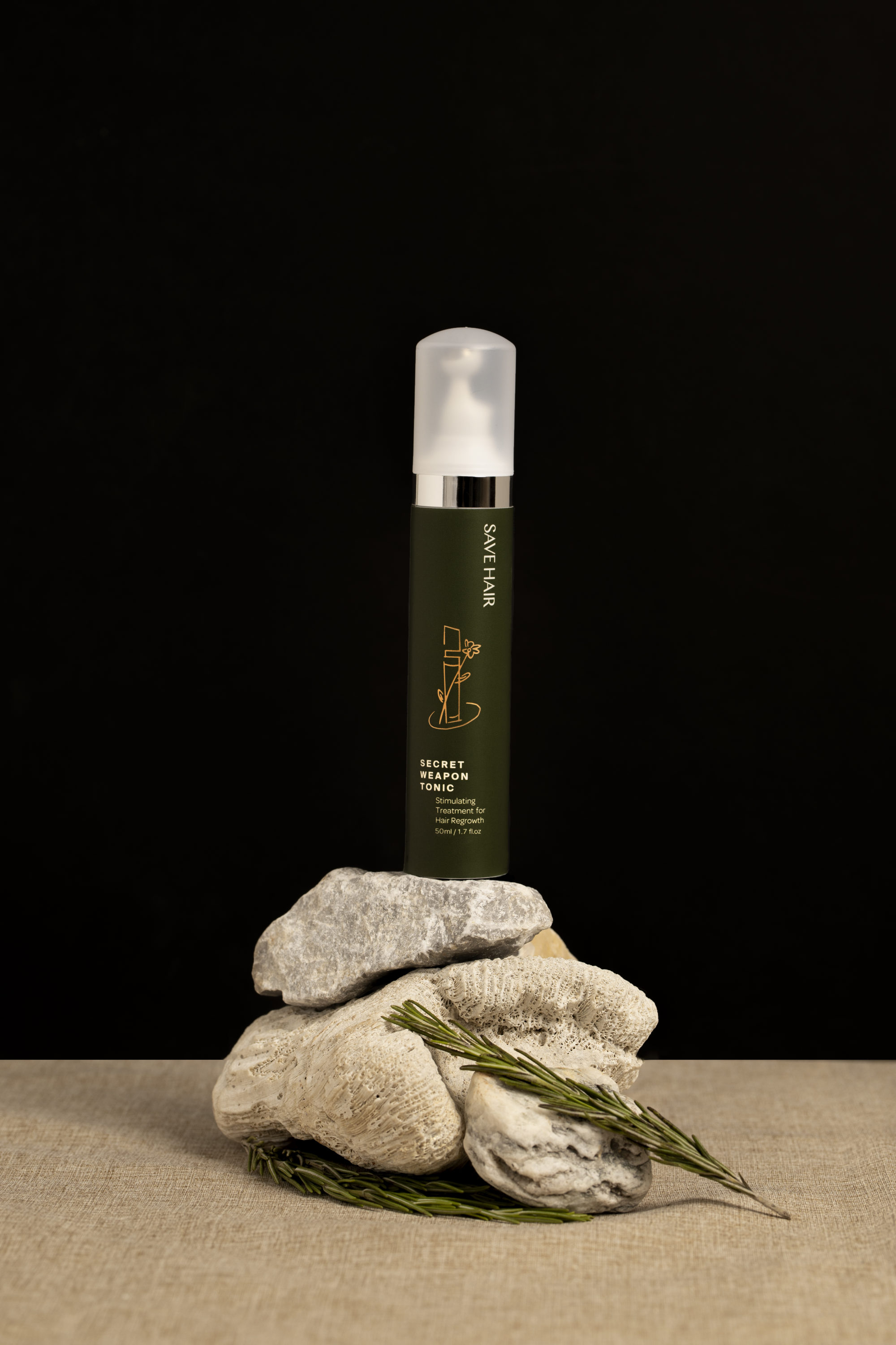
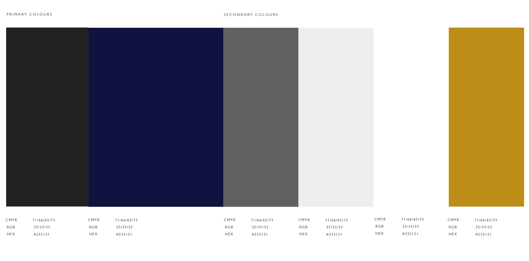
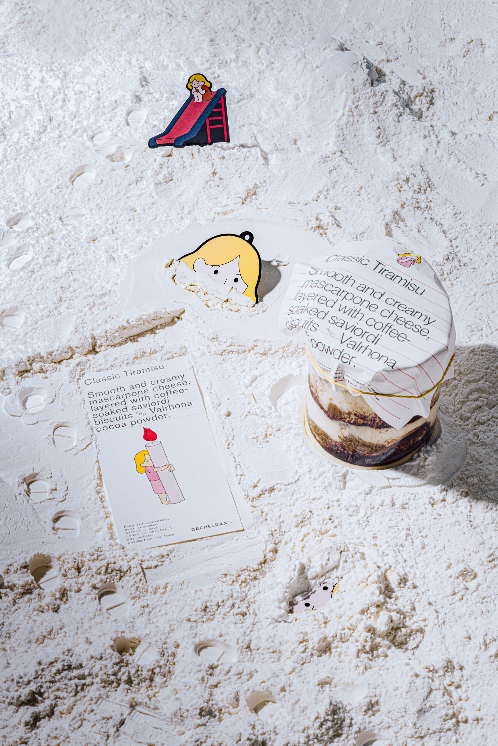
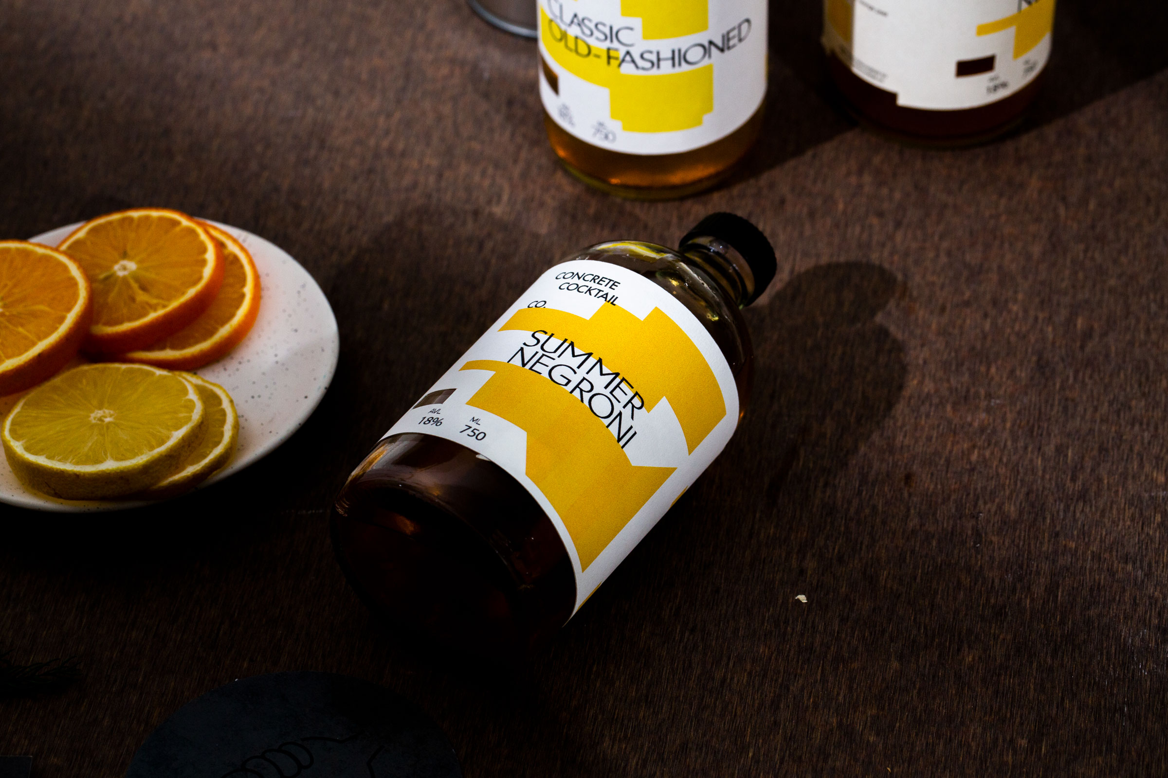
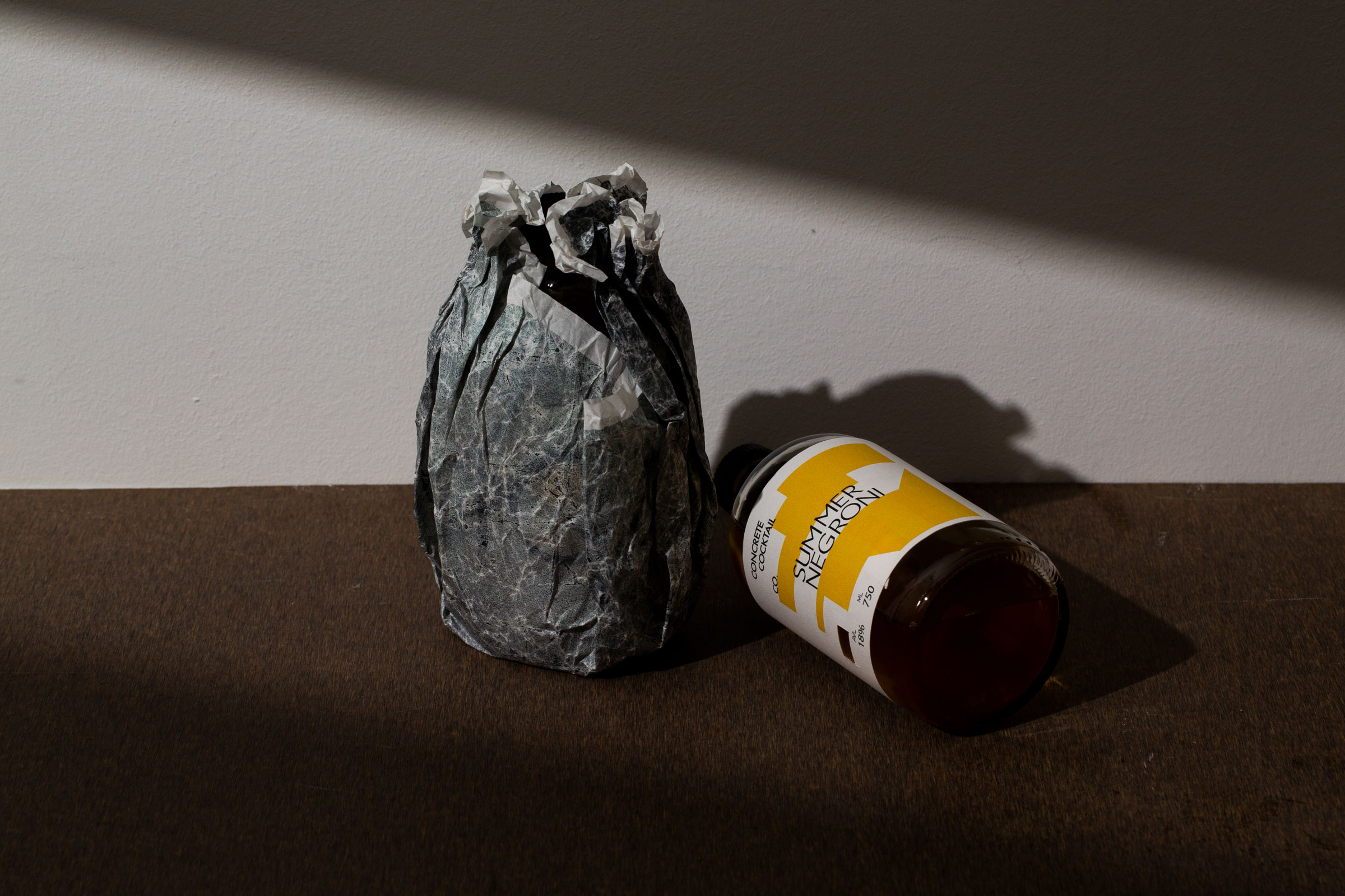
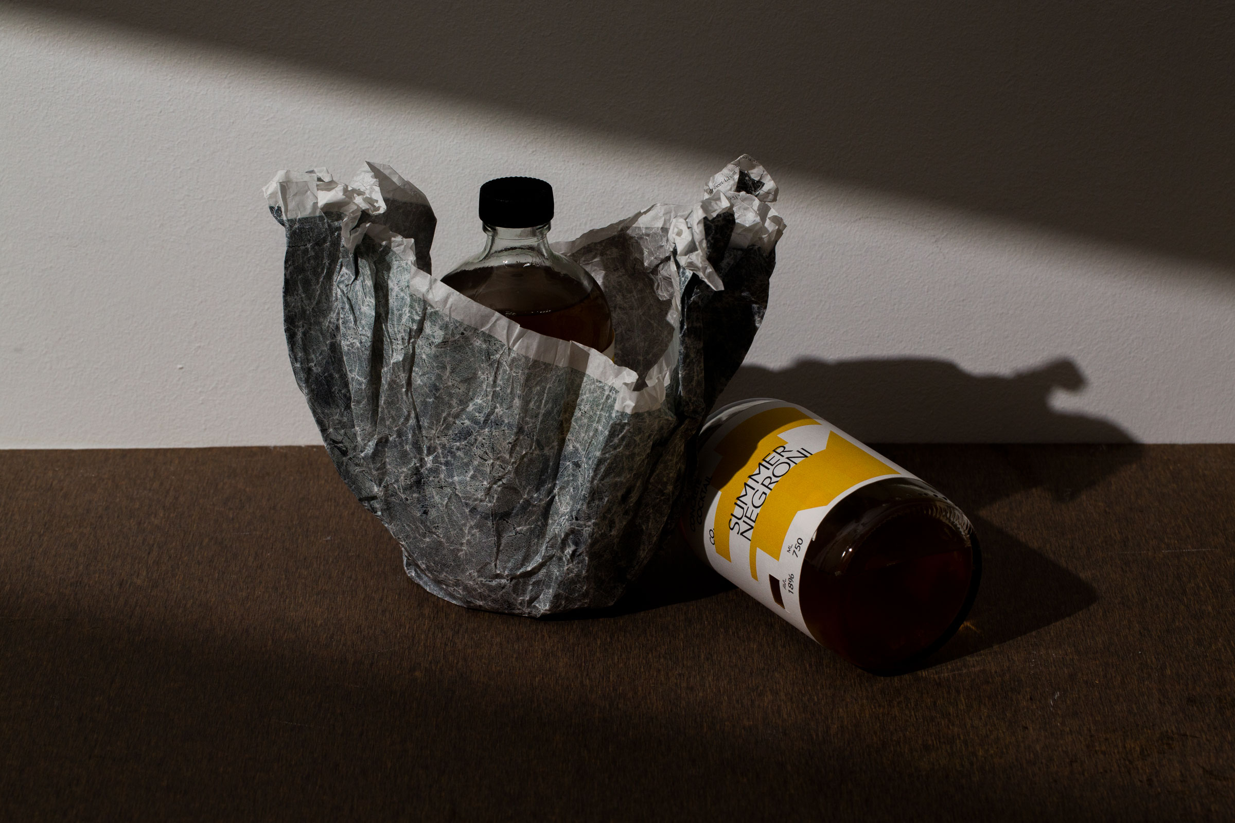
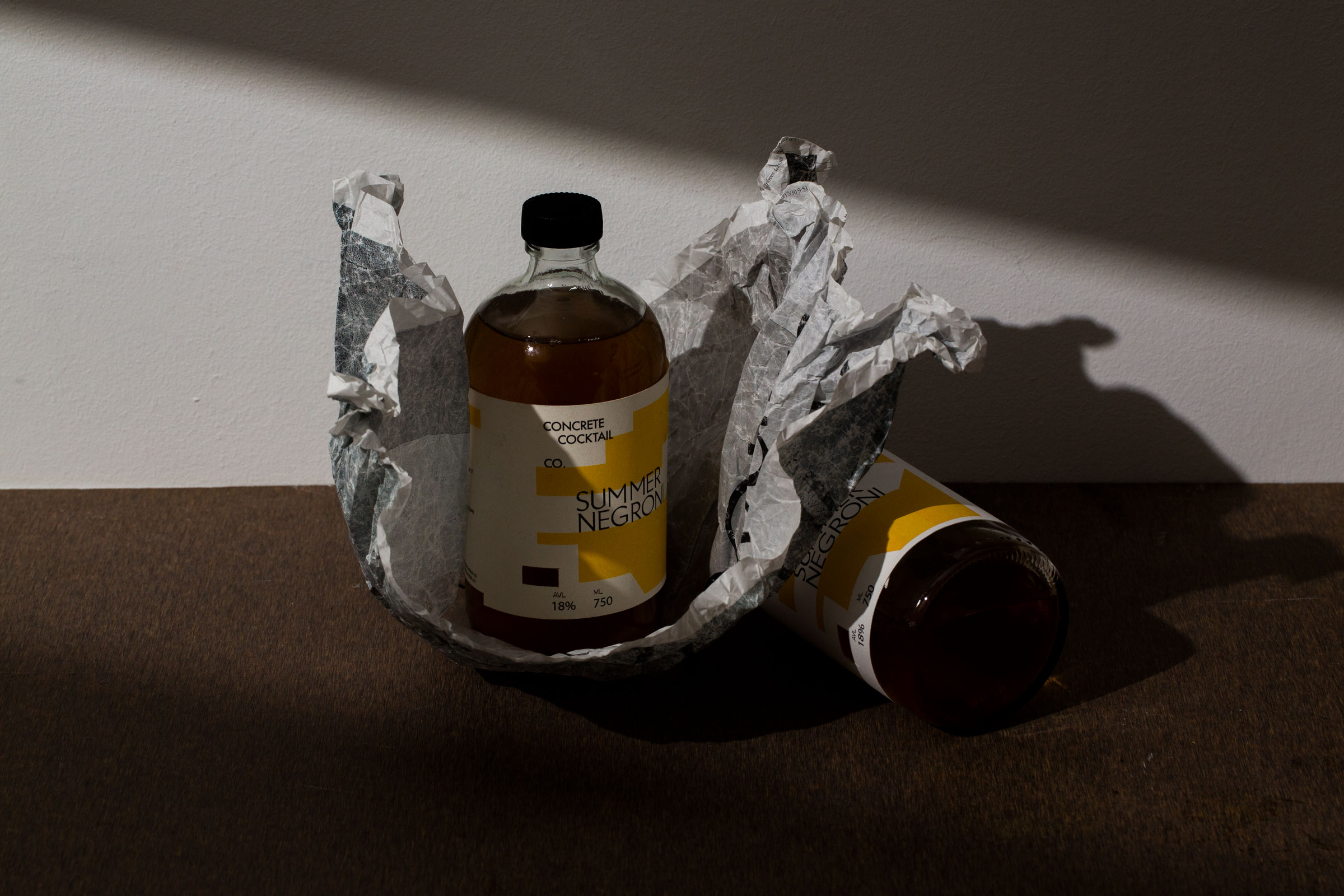
To create Save Hair’s packaging, we put careful thought into the little details— material and colorway. Along with an earthy colour palette, our approach focused on clean visuals with modern sensuality, paired with dainty illustrations of products on a dining plate. A simple representation of the value of haircare.


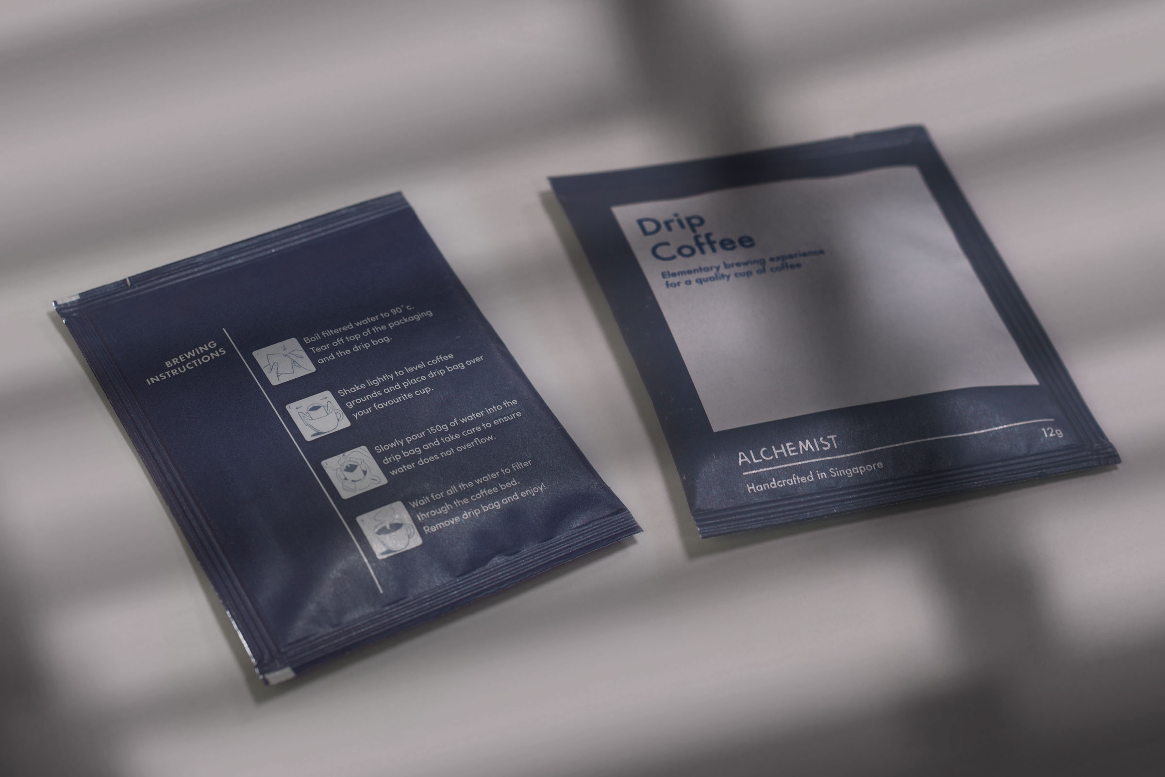
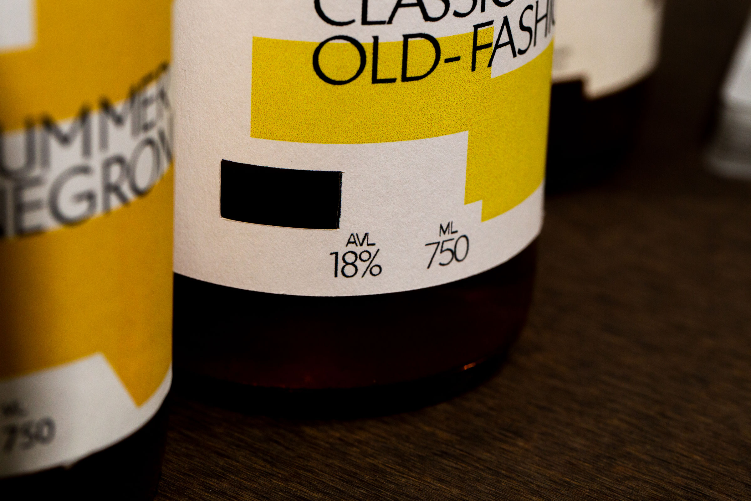
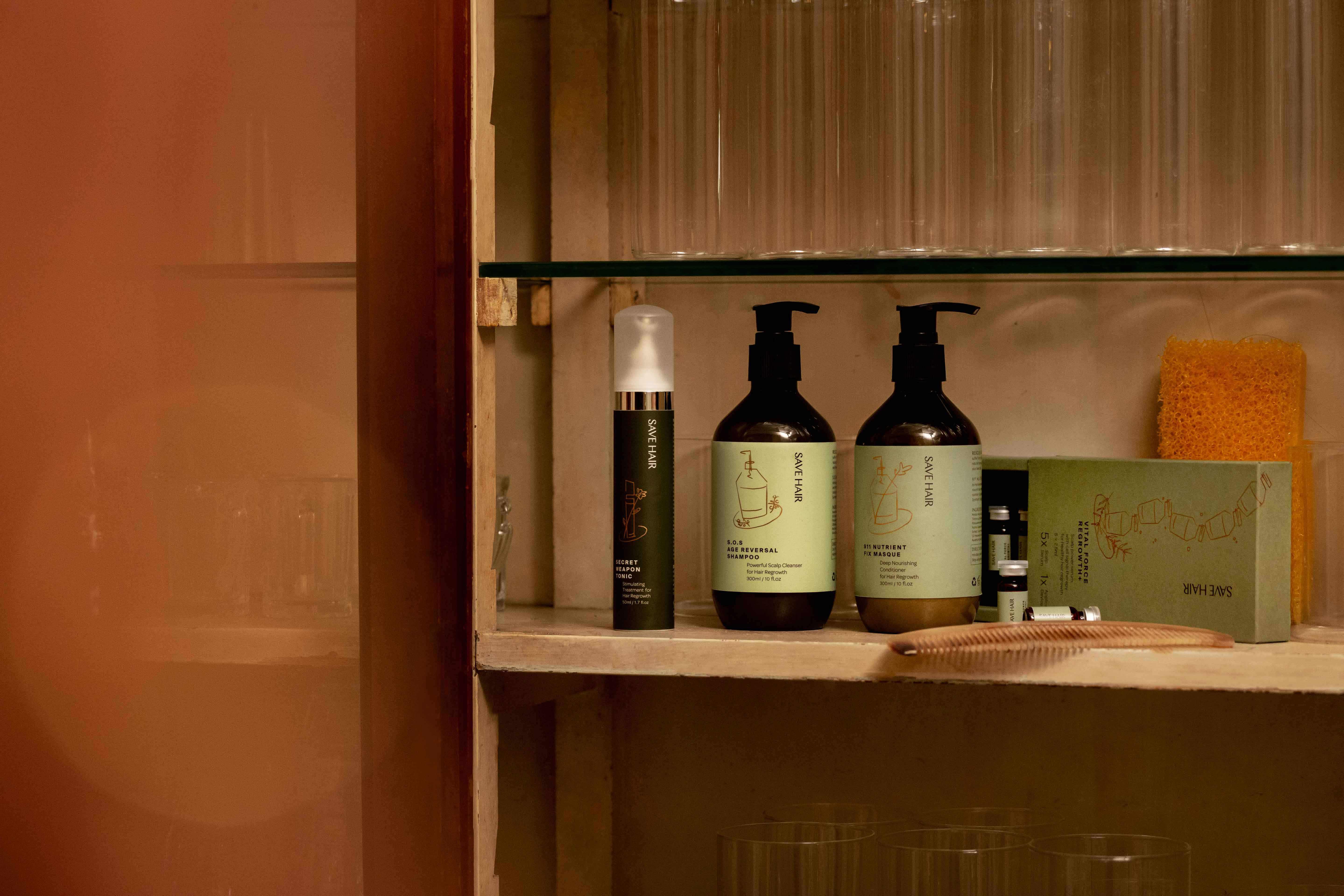
We maintained a simple, type-based label to ensure visual consistency while openly displaying the ingredients list to create a sense of transparency and reliability for the brand,

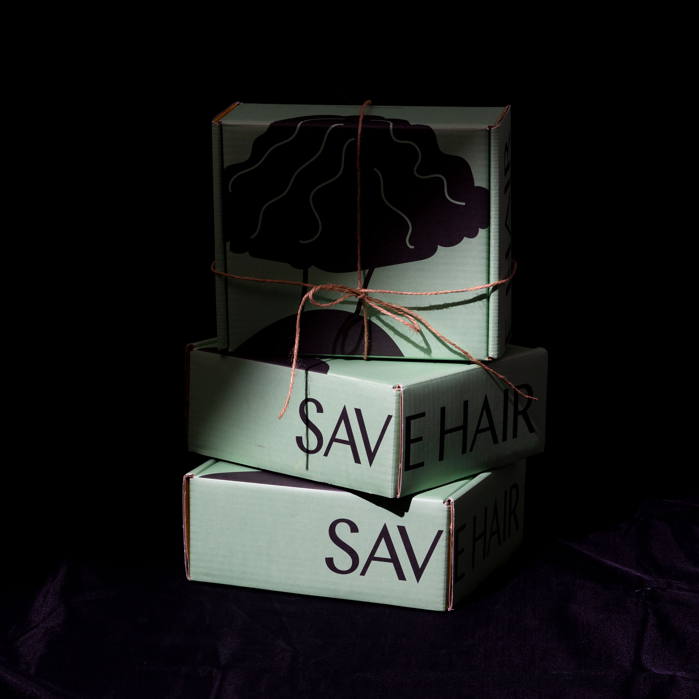
Save Hair is designed not just to sell itself, but to look good in your bathroom. Through deftly crafted details in its packaging, we created a contemporary packaging that exudes charm and elegance.

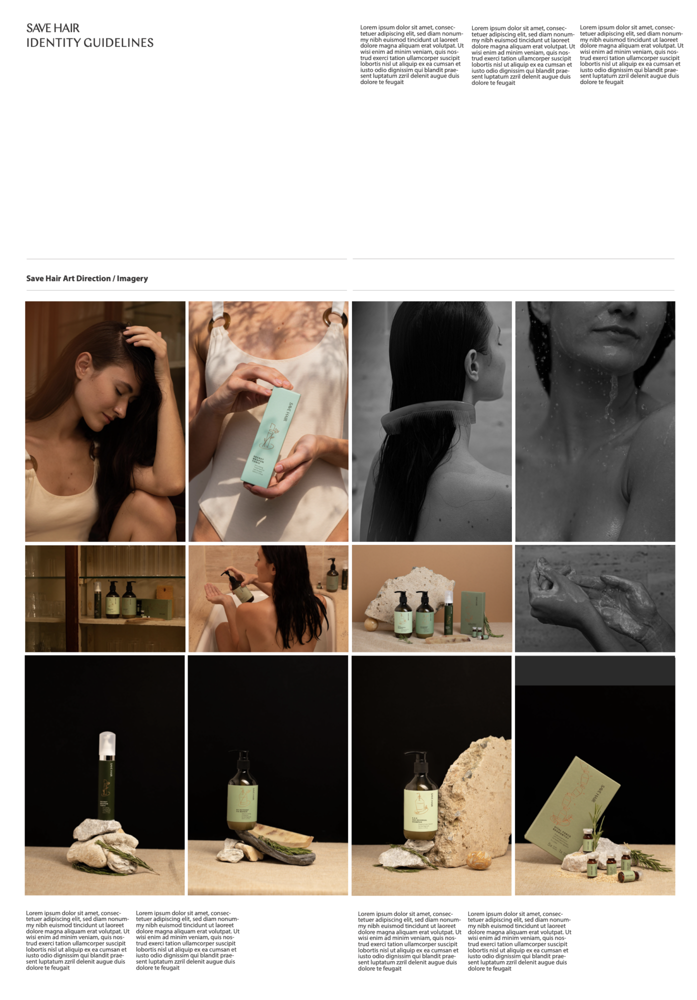
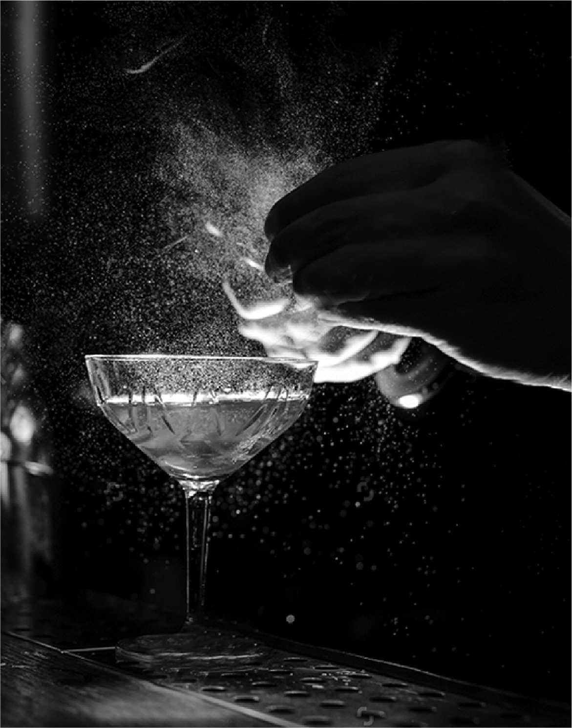
We worked with Hosanna Swee on a lighthearted photoshoot that would bring out the raw, honest beauty of Save Hair.

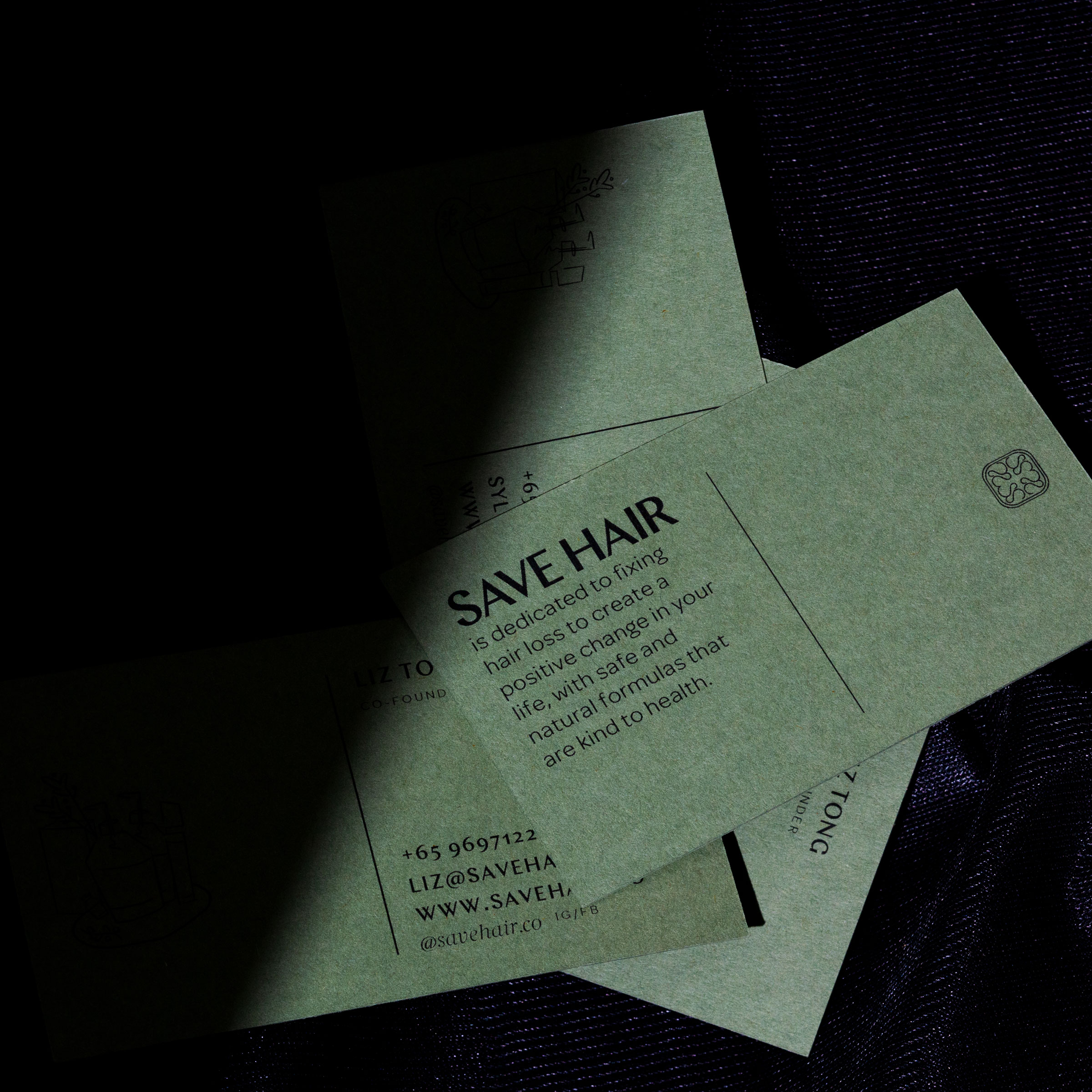
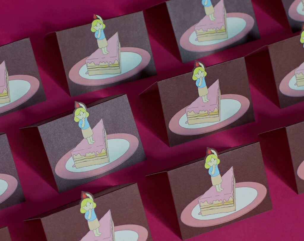
Classy and organic, even Save Hair's name cards encapsulate the quiet, understated confidence of the brand.

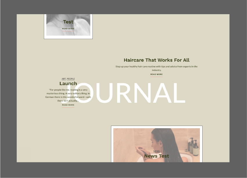
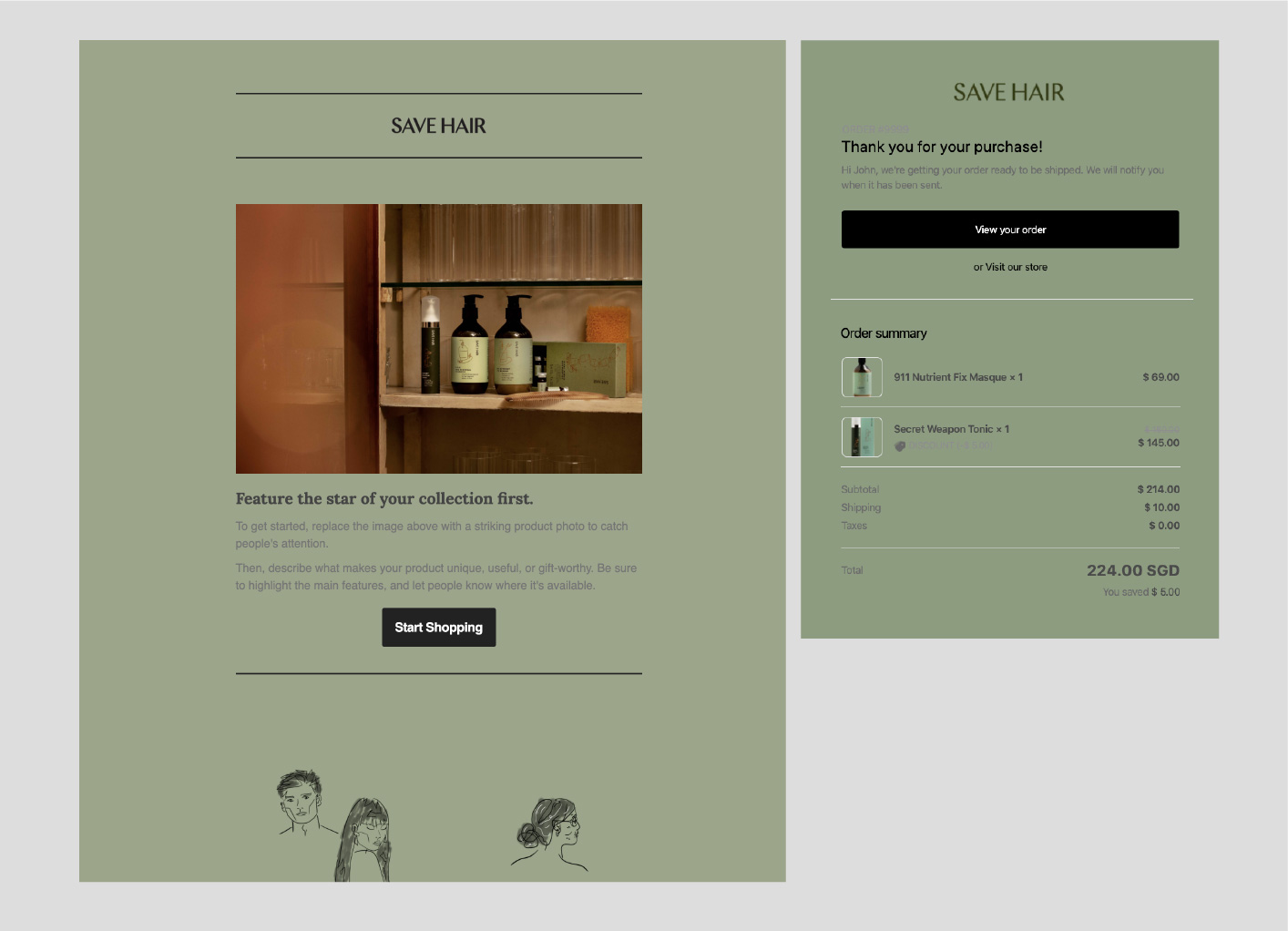
Down to its email collaterals, we wanted to create a unique visual identity that remained cohesive with the rest of the brand.

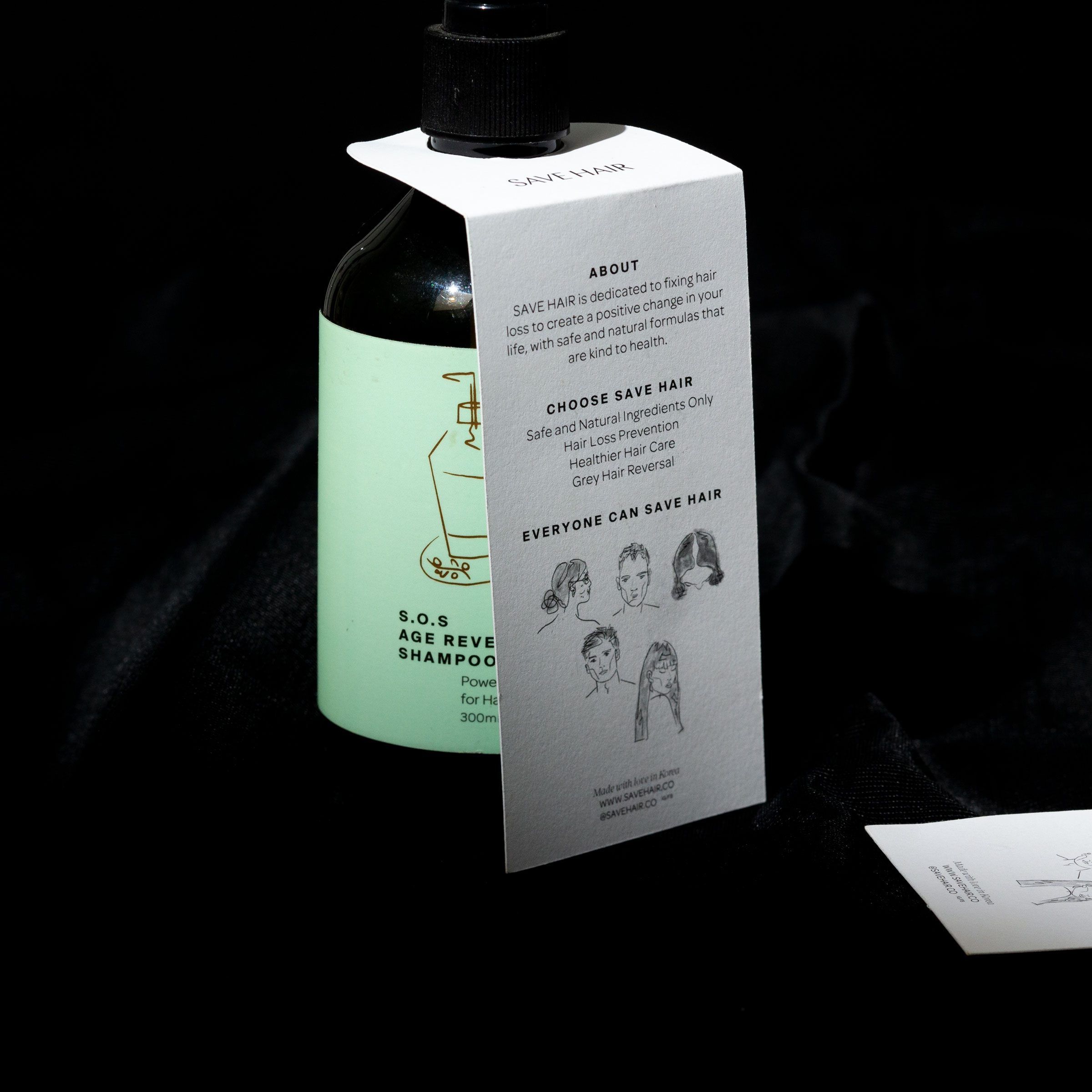
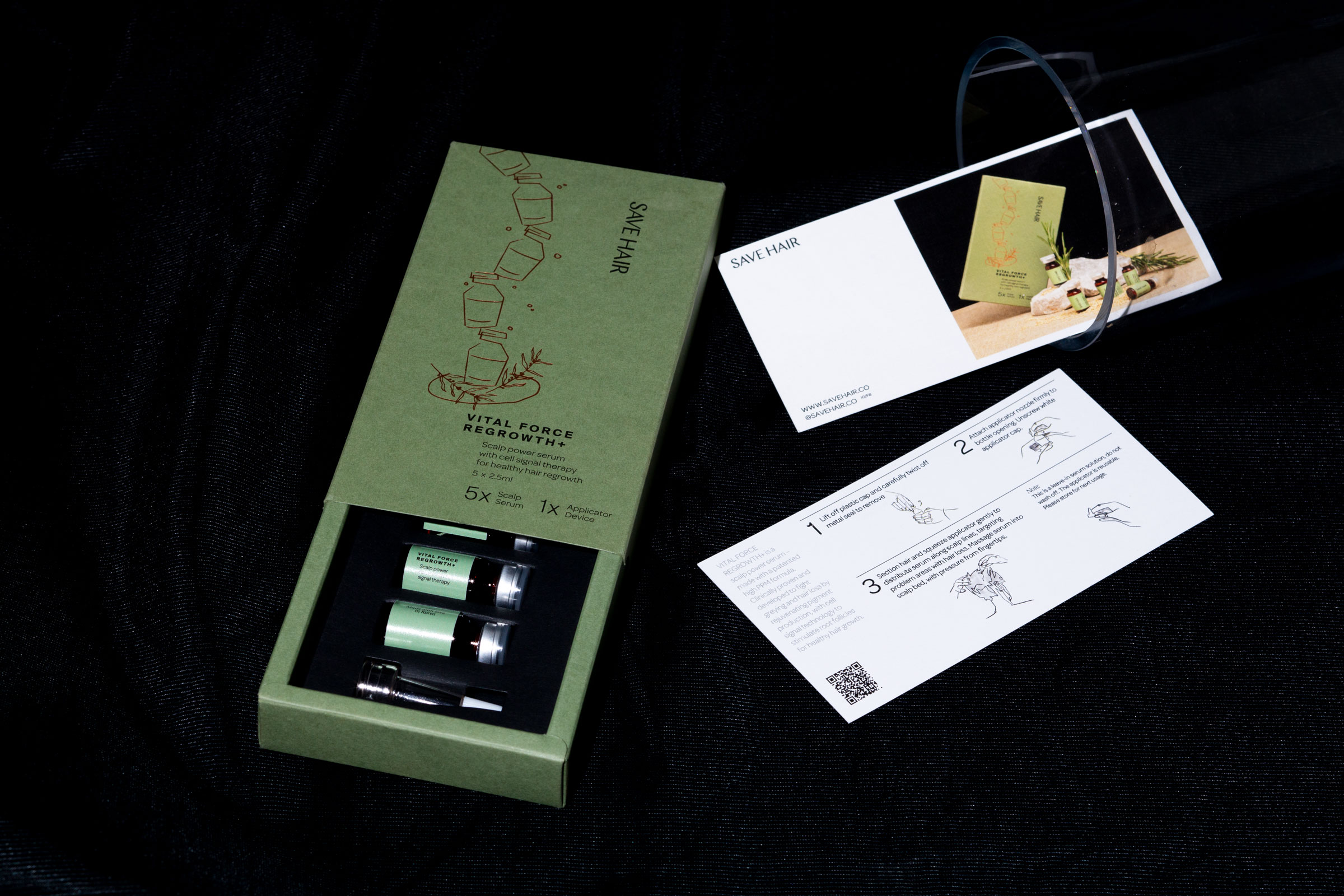
Save Hair’s product line speaks sufficiently for itself. By incorporating hang tags on the bottles, we provided information about the brand and its mission, while sharing a self-explanatory instructional guide that negates the presence of a salesperson.

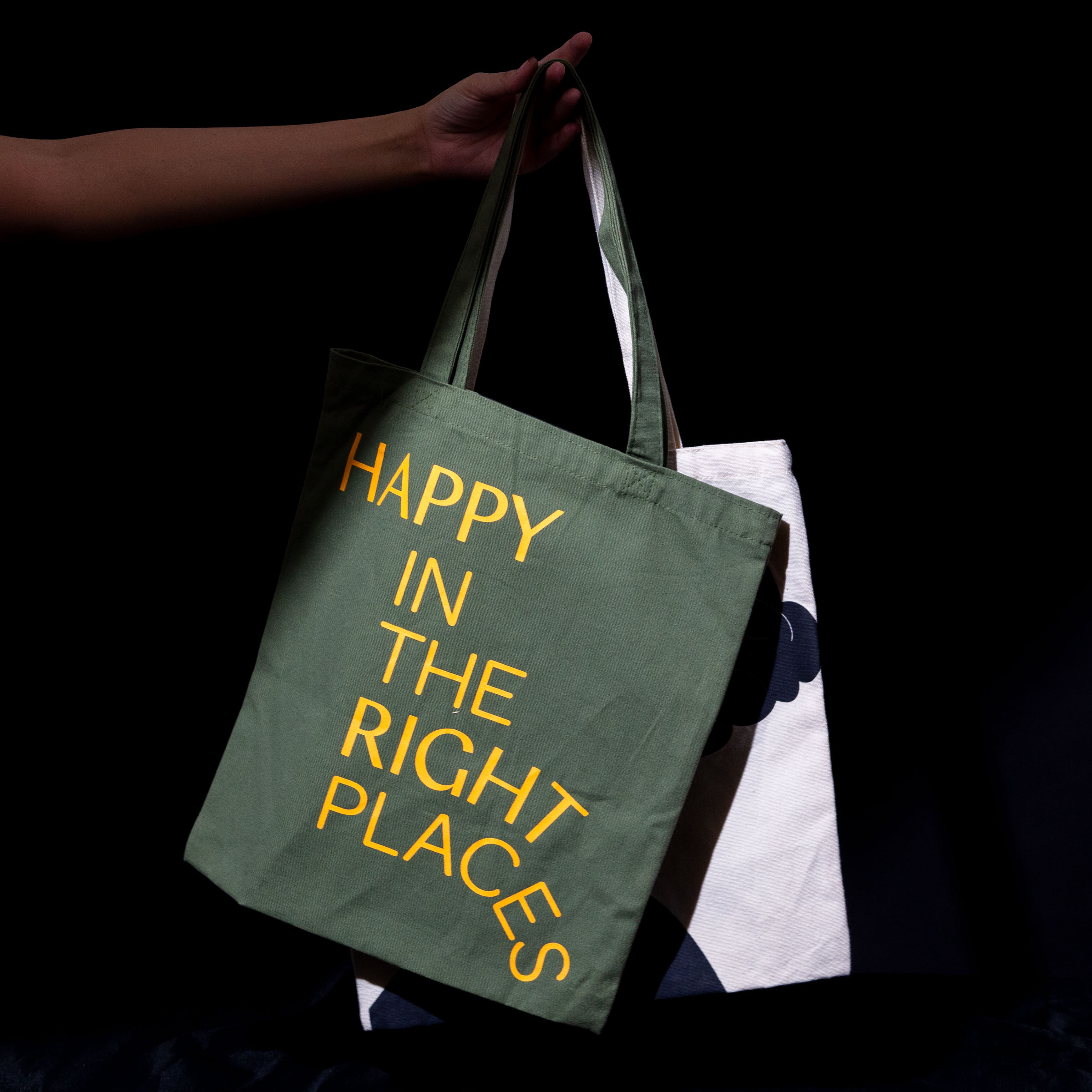
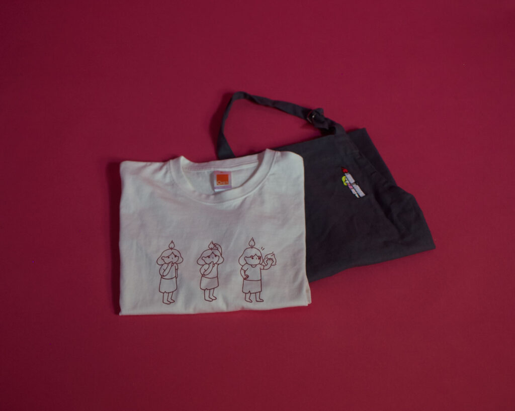
By replacing the use of shopping bags with a tote bag, this is our push for saving the environment, one bag at a time.


Do Not Design 

Work with us — write to we@donotdesign.com

©2009—2022

Do Not Design for Alchemist— an everyday affair meets sophistication for a growing coffee chain

Alchemist

Services

Research & Analysis

Brand Positioning

Brand Identity

Communication Strategy

Creative Direction

Design Direction

Wayfinding & Signage

Creative direction

Yanda


Design & Art direction

Yanda / Nicole Then / Tan Yie Xuan / Wee Yen 


Illustration

Tan Yie Xuan / Wee Yen

A project by Do Not Design   


Alchemist is a coffee chain that fuses the magic of coffee craft and science to create an authentic experience for its customers. 


In rebranding Alchemist, we sought to position the brand such that it could comfortably expand into new product categories and markets, while retaining its modern and distinctive touch.


As part of our strategy, we developed a distinctive visual language that exemplifies the precision and simplicity of Alchemist’s coffee. The designs are a harmony of classic and modern, evoking a sense of peace and calm that lets customers truly experience the magic behind thoughtfully brewed coffee.

Branching from the elements of alchemy, an ancient branch of natural philosophy related to magic, mythology and chemistry, Alchemist’s logo stems from a flask with a slanted opening (which is reminiscent of a potion bottle).

Alchemist’s colour palette consists of black and blue, with the occasional yellow hue that punctuates fun and personality where needed. More importantly, the signature blue shade that wraps the coffee chain’s walls and packaging was carefully selected to— you guessed it:  instil a sense of tranquility and calm while enjoying coffee.

Alchemist’s visual language is consistent throughout its distinctive metal countertop in all 6 outlets of café, coffee roastery and take-away kiosk. The design cohesion has also been translated through its coffee bean bag, business stationeries and retail menus to coffee drop bag boxes. 


With an extra flap around its opening to keep coffee staying fresh for longer, every little detail was taken into consideration during the design process.


Because mailer bags can serve as more than just a pocket for paper, we designed them too. Alchemist’s envelopes show off the store’s signature interior of metal countertops and minimalist furnishings. Who said envelopes can’t be a marketing tool!

A quick search of the hashtag 'Alchemist' would speak for itself, revealing a substantial increase in the number of people gramming the brand. Here's more: When Alchemist's canned coffee first launched, over 1300 orders were placed for the coveted coffees.

Visual merchandising involves being constantly being aware of how your store and displays appear to your customers, which affects sales! 

We standardised the layout of our curated shelves for the interiors of each store. Delicate items are generally placed on the top shelves while bigger, bulky items should be kept at the bottom to create a cleaner visual.


Do Not Design 

Work with us — write to we@donotdesign.com

©2009—2021

Do Not Design for Rachelrax Cakes - celebrating the fun and flavour in baking with an iconic mascot

Rachelrax Cakes

Services

Research & Analysis

Brand Positioning

Brand Identity

Communication Strategy

Creative Direction

Design Direction

Wayfinding & Signage

Creative direction

Yanda


Logo Design

Preston Tham / Jesslyn Sutisna


Design & Art direction

Yanda / Preston Tham / Delaphy Ng


Illustration

Jesslyn Sutisna / Delaphy Ng


Collaterals Photography

The Gentle Studio


Printing

KS Packaging / Pixel Tech

A project by Do Not Design   


Rachelrax is a carefree, fun and explorative brand selling pastries and cakes. In rebranding Rachelrax, the goal was to create a feast for the tastebuds and eyes through its experiential packaging and whimsical style. 


The new identity for Rachelrax took inspiration from the comic world of Tin Tin and Tim Walker’s whimsical photography to create a visual and packaging that reflects Rachel’s experimental and free-spirited nature. A combination of fun and freedom in both baking and serving, Rachelrax is truly a reflection of it’s founder. In bringing the brand to life, a visual surrealistic world; art direction system, typography, environmental graphics, tone of voice and creative guidelines were all considered. We created a flexible suite of elements fronted by Helvetica and staggered letterings. This served as a further identifier for the brand that can be combined in multiple ways to keep the brand’s image feeling fresh while maintaining a strong sense of consistency for brand recognition.

Rachelrax’s mascot is an embodiment of the bright and energetic, who are eager to change the world while having fun doing it. Alongside the main mascot are a collection of different postures and scenarios that add a touch of playfulness, quirkiness, and edge to the brand. We delivered over 10 scenarios that are expressive and joyful, from hugging candles, playing with oversized cakes and plates, to straight up chillin’ by a candle’s fire. 

Photography by The Gentle Studio

For the purpose of collecting and marketing, we created a wide range of branded materials— from cake toppers, tasting notes, thank you and gifting cards to collapsible boxes and paper bags. All in the name of designing an unforgettable experience for customers.

Additional strategic and creative support was provided in the form of interim product campaigns from Mooncakes to Bubble Tea, retail activation and customer defining strategies. 

To maintain a sense of comfort and functionality while serving the kitchen and front counter, the Rachelrax uniform was designed as a light T shirt and apron.

Additional strategic and creative support was provided in the form of interim product campaigns from Mooncakes to Bubble Tea, retail activation and customer defining strategies. 

Rachelrax's  front view is already famous, so want to make the back famous too. Playful and unique, the bottle shows off our mascot’s back view while utilising its clear walls/body to reveal the mascot’s front as one sips from the bottle. Talk about how her front view is already famous, so want to make the back famous tooPlayful and unique, the bottle shows off our mascot’s back view while utilising it.

Some say Rachelrax’s retail collaterals are considered collectible— but you didn’t hear that from us! With customers returning for their cakes only to keep the packaging, you wouldn’t be surprised to find that a quick search for #Rachelrax on Instagram would land you in a world of colours, cakes and fun.

With its instagrammable identity, Rachelrax also saw its numbers rise drastically. Since rebranding, @Rachelrax, has gained a 3750% increase in followers, rising from its humble beginnings of 400 to 15200.


Reviews from customers:


‘Taking mooncakes to another level, such a unique box!’
‘Super cute tart and messaging’
‘Everything about it is so whimsical’
‘Paper bag goals’


Social media posts and Instagram stories follow Rachelrax’s whimsical style. Whether it’s about shooting bubble tea pearls through your straw, taking a bite out of a literal moon cake, or galaxy glazed chocolate cakes, each post brings out the lively, carefree identity of the brand.

Rachelrax Cakes Social Media


Do Not Design 

Work with us — write to we@donotdesign.com

©2009—2022

Do Not Design for Revlon— redefining the world's most desirable beauty brand for the festive season, launching it into the Southeast Asian market

Revlon (South East Asia)

Services

Social Media Strategy

Creative Direction

Design Direction

Photography

Creative direction

Yanda


Design & Art direction

Elizabeth Zhang


Illustration

Elizabeth Zhang


Photography / Styling

Hosanna Swee

A project by Do Not Design   


A long established, global cosmetic powerhouse in need of a revamp. 


In creating Revlon’s festive season campaign in 2019, we wanted to disrupt the beauty landscape while repositioning Revlon at the forefront of womens’ minds. Our job was simple. Reign in the festive season with a series of social media posts, a popup store and photoshoot for its launch in Southeast Asia.

Revlon’s christmas festive identity needed to reinforce the brand’s core proposition to provide glamour, excitement and innovation. This looked like a lavish indigo unboxing experience and a series of blown-up red lip installments to showcase Revlon’s festive lippies.

Typography is the art and technique of arranging type to make written language legible, readable and appealing when displayed. The arrangement of type involves selecting typefaces, point size, 


Do Not Design 
Work with us — write to we@donotdesign.com

©2009—2022

Do Not Design for Concrete Cocktail— reimagining the cocktail experience, with accessibility and authenticity in mind

Concrete Cocktail Co.

Services

Research & Analysis

Brand Identity

Communication Strategy

Creative Direction

Design Direction

User Experience

User Interface

Website

Creative direction

Yanda


Design & Art direction

Yanda / Nora James Yee

Collaterals Photography

Anton Tang


Illustration

Ng Si Qi

A project by Do Not Design   


A balance of fresh goodness and sublime quality, Concrete Cocktail promises an authentic, distinct experience. No more pretentious, scam-ey cocktails— they mix, you pour. 


Cocktails are more than just a drink but rather, a start to a great night with friends, or alone (if that’s what you prefer). We crafted a bold, approachable identity for Concrete Cocktail. In a relatively small and niche marketplace, we needed to deliver a distinctive brand experience that would evolve their identity for the next era of growth. This translated even throughout the rebranding process, from its logo to the packaging of each bottle. Like its name, the new identity of Concrete Cocktail takes inspiration from, you guessed it— concrete!

To reflect a sense of flexibility and inclusivity, we created a logo that wasn’t strictly defined. Depending on the occasion (or not) the hand gripping the bottle can be replaced with one of many variations of hands. In the same spirit of ambiguity, the logotype consists of variations of scribbled-inspired typefaces, which is reminiscent of the name scribbles on an unfinished glass of drink at a bar.

Looking good is only the baseline. We take it one step further with our bold ideas.

Looking good is only the baseline. We take it one step further with our bold ideas, and create irresistible brands, each with a distinct personality that captivates and engages with its customers across the customer journey.
Wrapped in concrete. Just as its name suggests. Concrete Cocktail’s bottles reflect the brand at its essence: authentic and distinct with its concrete-inspired paper wrapping. Because design should never compromise function, we took the journey a bottle takes to its receiver into consideration. More than just its literal meaning of a ‘concrete cocktail’, the paper wrapping cushions the bottle giving users an unboxing experience that isn’t commonly known to cocktails.


Do Not Design 
Work with us — write to we@donotdesign.com

©2009—2022