Do Not Design for Archifest— reimagining Singapore's visual landscape for an architecture festival
Archifest
for Singapore Institute of Architects
Services
Festival Identity
Communication Strategy
Creative Direction
Design Direction
User Experience
User Interface
Website
Creative direction
Yanda
Design & Art direction
Yanda / Preston Tham
Website Design
Yanda / Damien Chong
Illustration
Preston Tham
Collaterals Photography
Anton Tang
Printing
Allegro Print
A project by Do Not Design
Archifest is an annual festival open to the public to celebrate architecture and the built environment in Singapore.
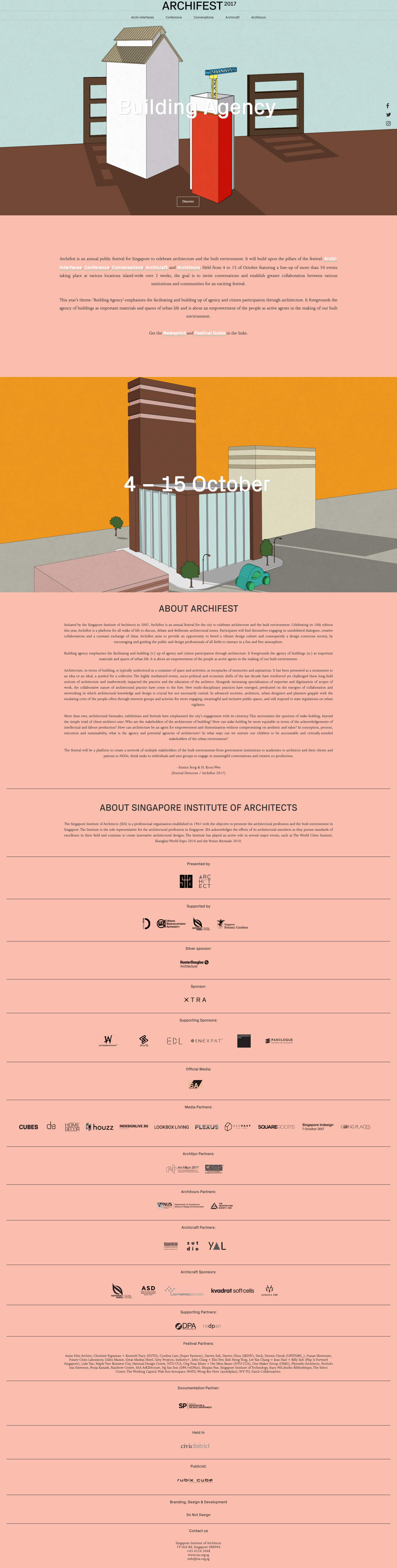
Do Not Design was commissioned to design and strategy the campaign and marketing collaterals for Archifest 2017. This year’s theme ‘Building Agency’ emphasises the facilitating and building up of agency and citizen participation through architecture, questioning the relationship between people and the built environment.
In order to celebrate the festive spirit and going with the theme, we customise the logo by adding a black figuring to the supposingly empty (and cold) building. This further ties back and link to the particular year when the festival’s partners are using the customised logo.

Initiated by the Singapore Institute of Architects in 2007, Archifest is an annual festival for the city to celebrate architecture and the built environment. Celebrating its 10th edition this year, Archifest 2017 is curated by Eunice Seng and Koon to offer a platform for all walks of life to discuss, debate and deliberate architectural issues.
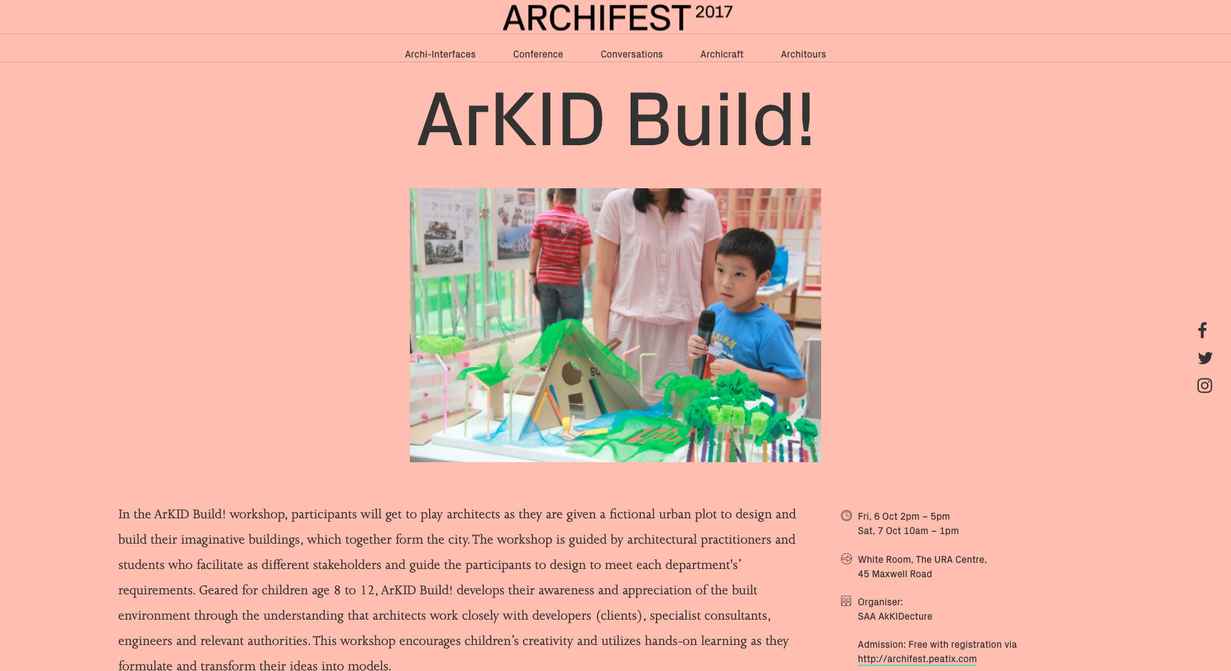
Held from 4 to 15 October with over 50 events in a span of 2 weeks, events involved includes curated exhibitions, talks, discussion panels, workshops to open houses, architectural trails and even a cake making session.

An expressive and familiar illustration style was developed based around the theme which serves as the campaign visual for this year’s identity. The campaign visual takes on a human-centric approach by examining buildings as everyday objects. Instead of a top-down approach where citizens rely on architects to construct a building, it should be a shared responsibility among both.
Collaboration with the festival partners was shown by encouraging and inviting them to create graphics based on the set direction which inlines with the festival's theme.


To encourage festival goers to attend all the events at Archifest, 30 different stamp designs were conceived to differentiate each individual event.
FESTIVAL SUPPLEMENT
Alongside the identity, promotional newsprint is introduced. Engaging interviews and essays are set as the primary focus whereas essential information on various events can be found alongside those content.


Inspired by colours from David Hockney’s impressionism, it has been derived as expressive, distinctive and complimentary, yet still in the family of the corporate colour — orange.


Photography by Anton Tang
Do Not Design
Work with us — write to we@donotdesign.com
©2009—2021